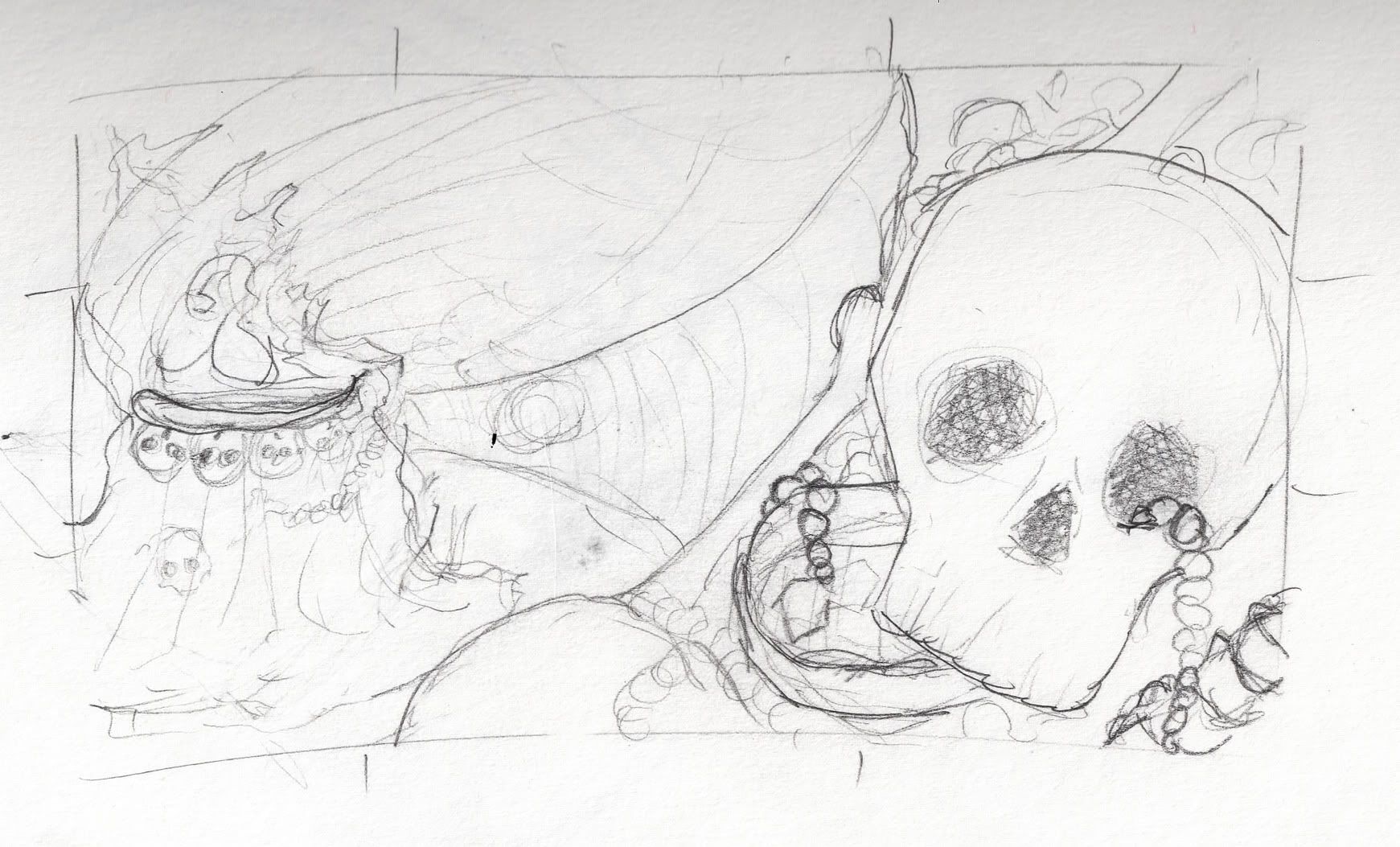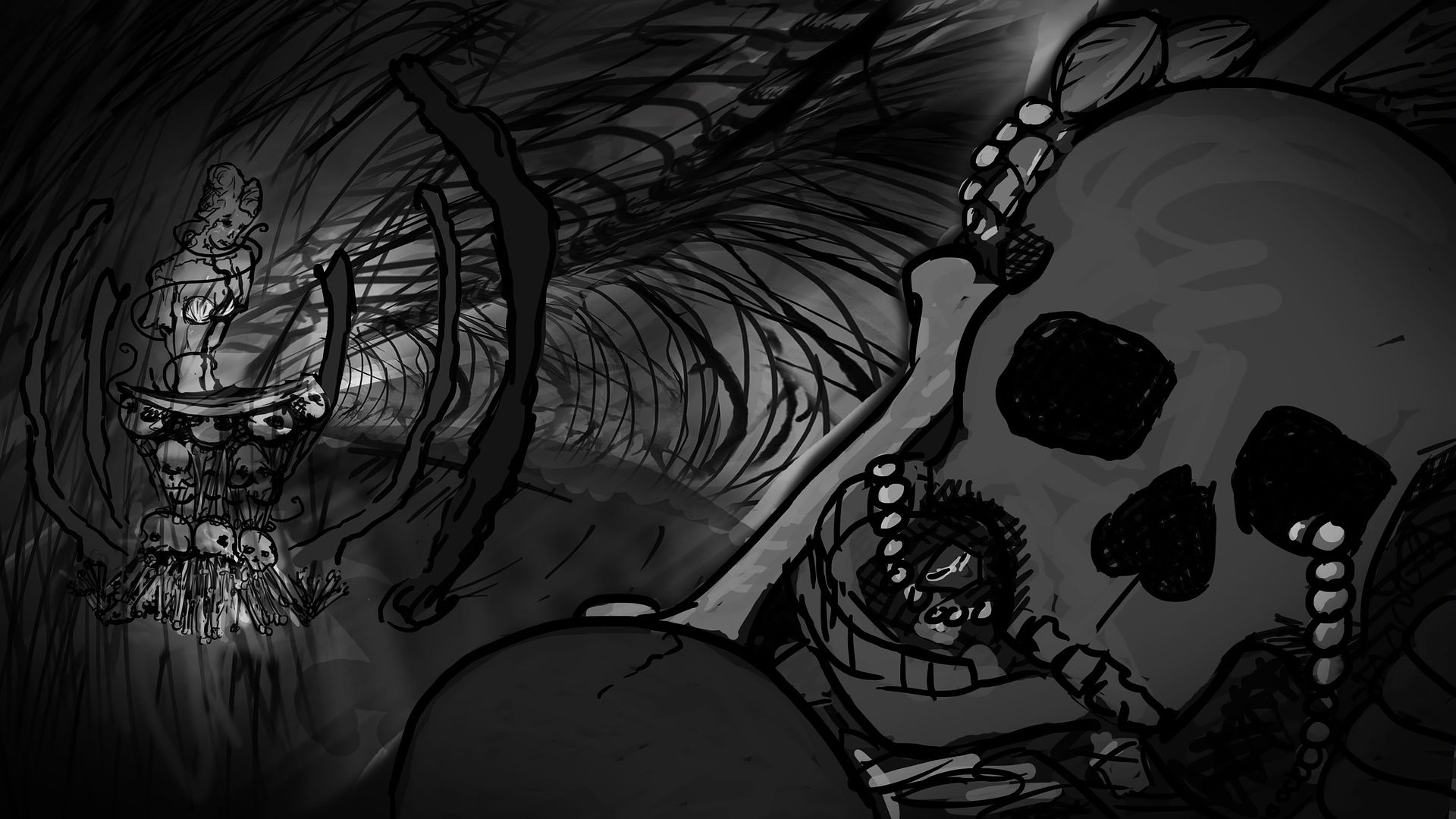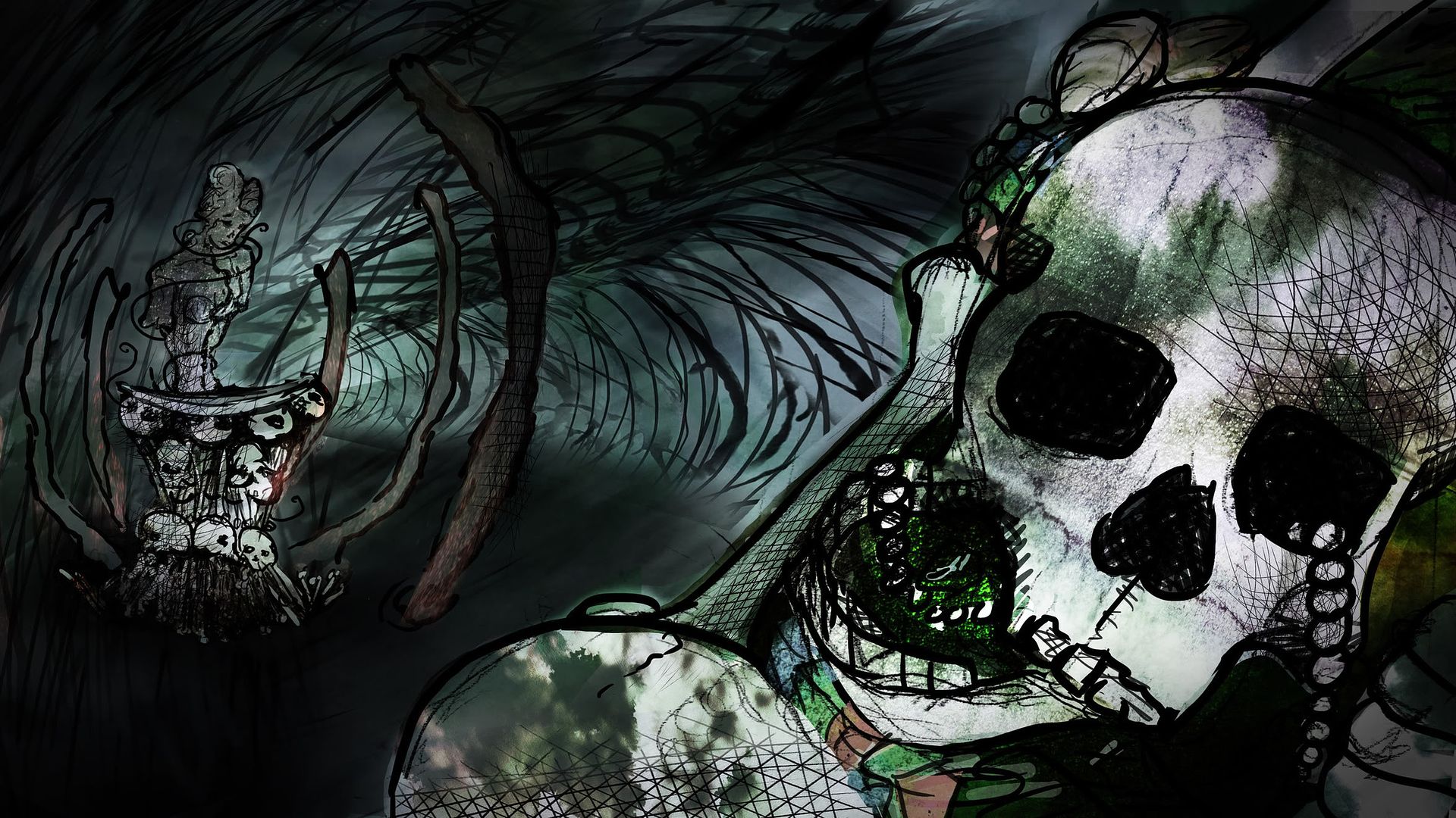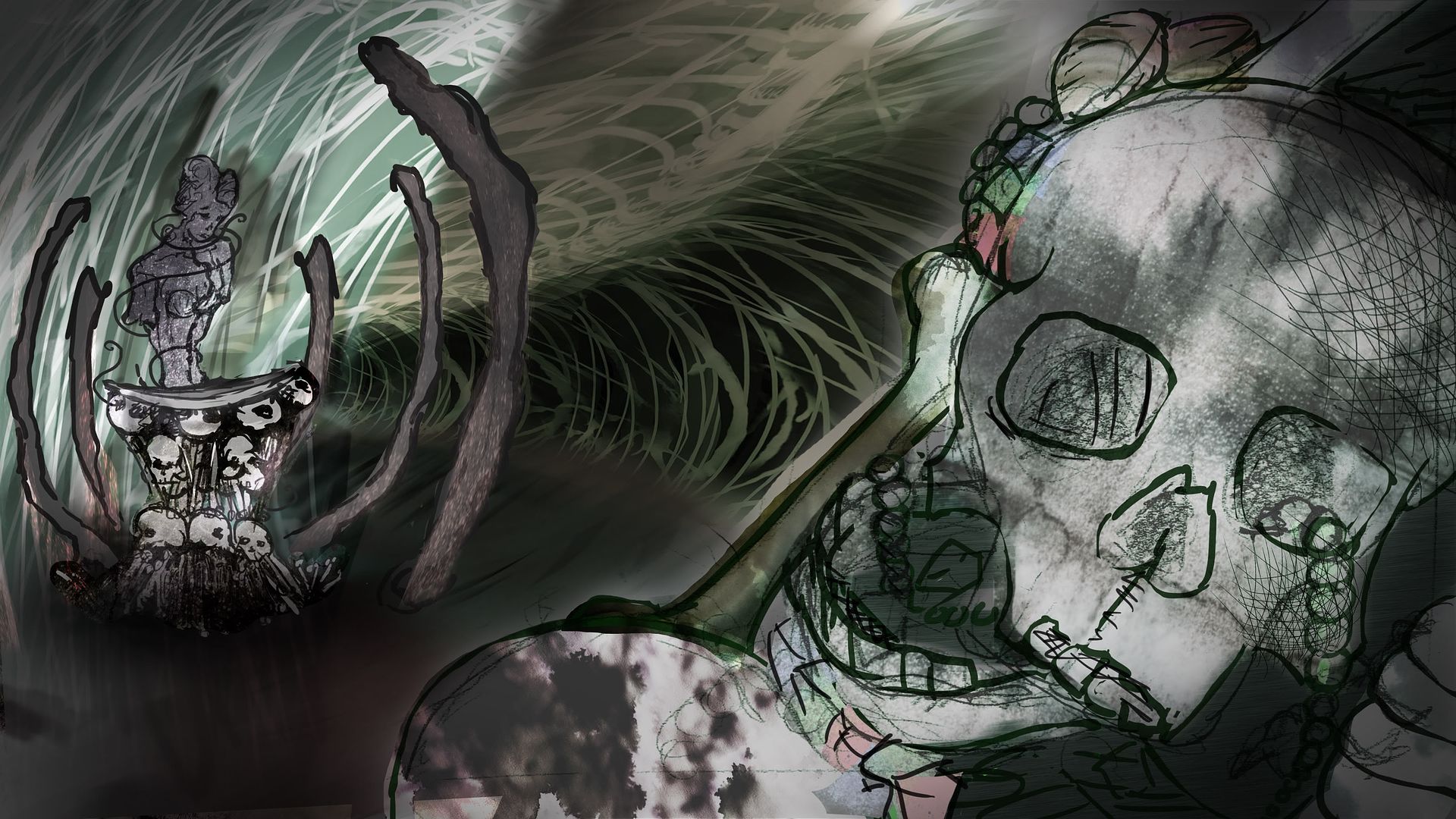


I thought I'd try the idea of having a rotting old ship figurehead watching solemnly over the pot as if she was previously cursed by the witch. I've also changed the pot to a large abalone shell so it's more of a shallow dish than a deep cauldron, and I've just realised there's nothing coming down from the ceiling yet. Overall, it's not working really, texture or content-wise, so I'll have another go with fresh eyes tomorrow. Fingers crossed it'll start coming together soon.

Hey Molly - why are you always on such a downer about this stuff? Personally, I really like the milky, washed out tones of the last image, and the old figure head is an evocative touch. I just think the skull etc. is taking visual priority over the cauldron area, which I'd suggest is a bit of mis-step in terms of the emphasis of your project (which is not to say that it doesn't make for a striking image in its own right, which it does). If you're experiencing difficulty in terms of composition, here's a few suggestions; how about installing either a) a sunken floor, in which the cauldron sits, with the rest of the environment up around it like an amphitheatre:
ReplyDeletehttp://upload.wikimedia.org/wikipedia/commons/c/cf/IMT_Ghaziabad_Amphitheatre.jpg
or consider b) raising up the cauldron area on some kind of circular dais, or similar. Raising or lowering a section of the cave floor will just give you some different perspective options maybe.
Remember, your role is to bring something fresh and arty to this scene, so please don't be afraid of using your instinct and applying some artistic license. Personally, I find all the mark-making really interesting, so texturally you're onto to something - so please be confident! I would make the cauldron area your main focus compositionally - that doesn't mean it needs to sit dead centre - but if you were to work in a kind of concentric circular way - with everything radiating out from the cauldron (the throne equivalent and site of witch's power), then a more symmetrical composition might work wonderfully. It occurs to me too that there's some great lighting opportunities here: obviously you've got what is wonderfully theatrical about 'god rays' - i.e. pronounced beams of light perhaps filtering through the cave roof to create strong 'spotlight' effects - one of which could be lighting up the cauldron area to suitably dramatic effect:
http://wallpaperdreams.com/wallpapers/a_forest_with_tall_straight_trees_is_pierced_by_powerful_rays_of_sunlight.1920x1080.8fd8a383.jpg
http://www.realsound.co.uk/wp-content/uploads/2011/03/Stage-lighting-6.jpg
http://www.stagedelights.com/images/image3.jpg
Another thing to remember is translucency (so for example, some of the seaweed etc) - remember this from Fantasia - and particularly the use of blackness (you might want to work up from a black background for example, to emulate the inky blackness at the bottom of the sea).
http://www.youtube.com/watch?v=CbPIbawLcCc
I really think that working with colour, into velvety black - and working your ideas up quickly and using expressionistic, bold colour schemes will just liberate you a bit and get the juices flowing
You need to think back to year 1, Molly - and all that you accomplished back then; I think you need to create many more thumbnails - produced digitally and quick and dirty - and just try and enjoy the 'imagineering' process. 1 hour = 12 line art thumbnails - numbered and up for some feedback.
So - to reiterate - the cauldron shape is working, the 'ribcage-like' projections are working, the figurehead is working, and the line-art style is working - so, lots of it is working nicely, so just knock out lots more compositional thumbnails until you hit on something a bit more dynamic in terms of space and lighting. Thumbnails are cheap, remember - keep them that way - make loads, so you can ignore and dimiss loads - don't overthink it, feel your way.
This project is well within your abilities, Molly - but you do need to be more productive and more open about your thinking. Try and have some fun again, Molly - come on, it's a witch's bloody cave for a cg animation - what fun! :)