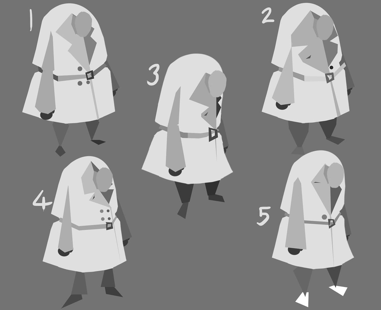
I think the scruffiness was perhaps an unnecessary addition because, as Phil pointed out, this character should be a kind of 'every man' and the advert should be universal so here are some tidier versions of the character:

Each is slightly different in shape and has different features on his coat. I think 1 may be too bulky, I quite like 2 though. It's very difficult to choose between them as I so like the bell shapes of 2 and 4.
I'll get onto some more face and hair tests and again, all feedback is much appreciated! :D

Agreed 2 and 4 have nice shapes to them, I also quite like 3. I suppose 4 stands out the most for me, maybe combine some of the best shapes from 2 and 4 to experiment further
ReplyDeleteGood Progress so far Molly :)
Yep 2 and 4 for me too
ReplyDeleteGreat! Thanks guys, I'll hop to it :D
ReplyDeleteoh - for me, it's 5 - he looks so sad, but i like the feet of number 4 and the buttons of 4.
ReplyDelete