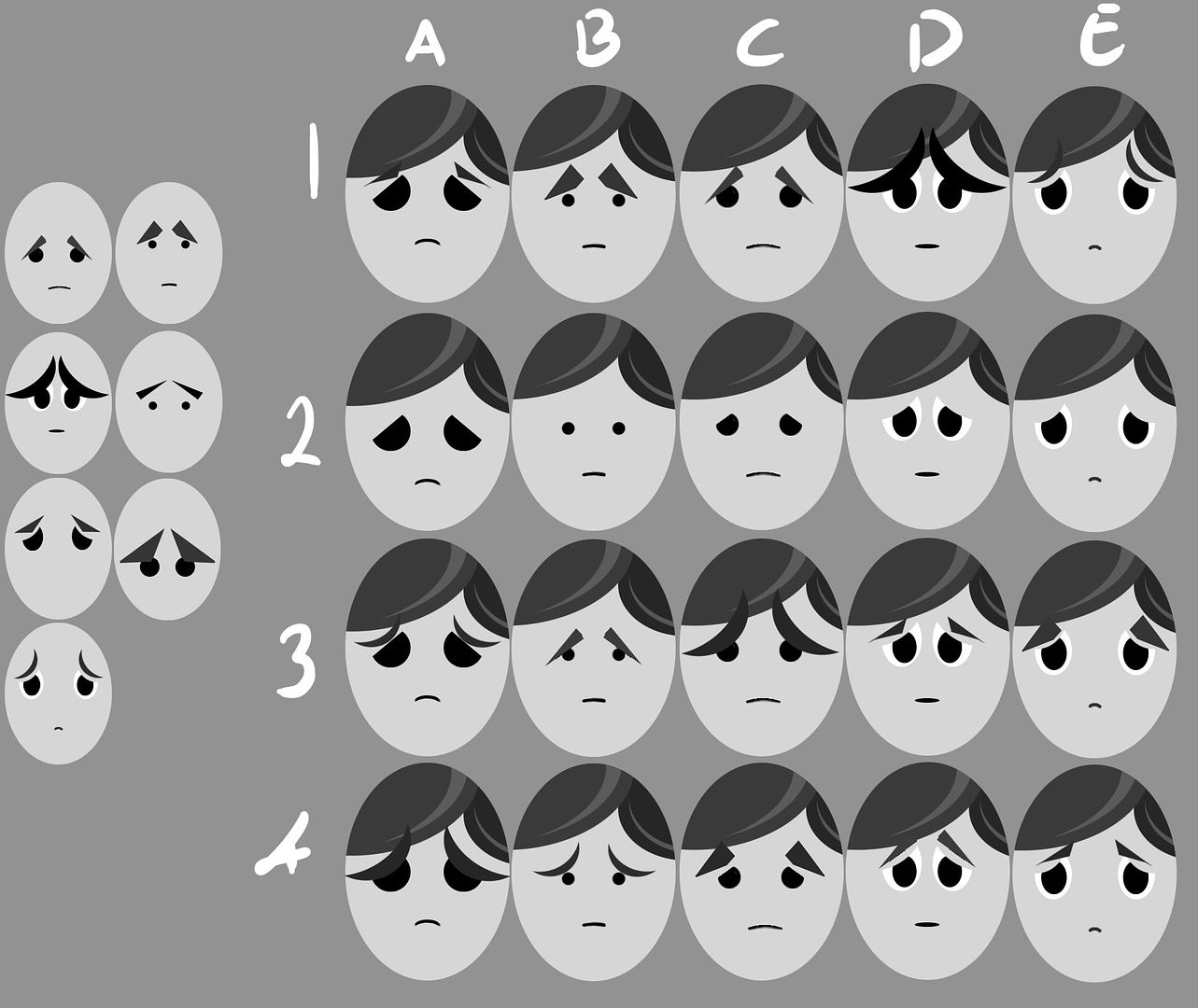
Here I've taken the favourite faces from the feedback I received, along with the recommended hair, and played around with different eyebrows on each as the proportions stay the same (except for 2A, I moved the face a little lower there). Here are the results:

I'm a little torn between keeping his face abstract to fit my style, which also allows the audience to project their emotions onto him, and still keeping him universal. Perhaps I'm reading too much into it and the two go hand-in-hand, either way let me know what your favourites are! :)


for me it's 1E! I think the hair is perfect too; I think you need to bring this face into a three quarter view of the whole character. It's just possible that the 'boil' effect of the black components may be less appropriate now - but that's really not an issue - your world might be 'matte' instead of textured in this sense. Put a tableaux together - your character + face + black thingy - think of it as concept art.
ReplyDeleteSure! Sounds excellent to me. I'll have a go at that next, and I'll also do a few more designs based around your feedback on my previous post, I agree that 5 looked the saddest. :)
Delete