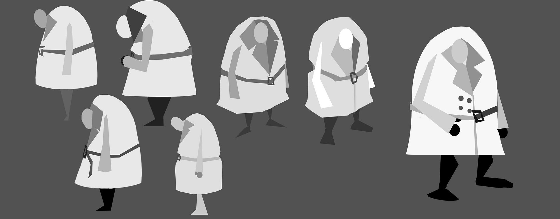
After getting my initial animatic done it's time to hone the design of hero of the story. Below are my most recent attempts at trying to understand and design this character:

They're nice and it's starting to come together now but it's still not quite there. To try and correct this I had a talk with Justin and he gave me a lot of great advice:


- To portray his anxious feelings he needs to seem more nervous, and more hunched over.
- On edge all the time like a deer or a bird.
- To support this his coat could also be dishevelled and untidy.
- He's too busy worrying about things to take care of himself.
- Coat could be lumpy, missing buttons, trailing belt, needs a good iron/clean.
- Reinforce the feeling of neglect.
- In the end the coat could be straightened out and clean to signify his control over his anxieties. Perhaps even adjust his proportions to seem more heroic.
- The collar could be representative of him and his state of mind.
- It could be a ying and yang to represent the conflict between the two states that are currently imbalanced. The collar could be dark and light greys instead of complete black and white to keep him visible in the black and white environment.
- This could even be literally one half of him the light side and one the dark.
- The final coat could again be different, perhaps more muted version of the previous coat using lighter greys.
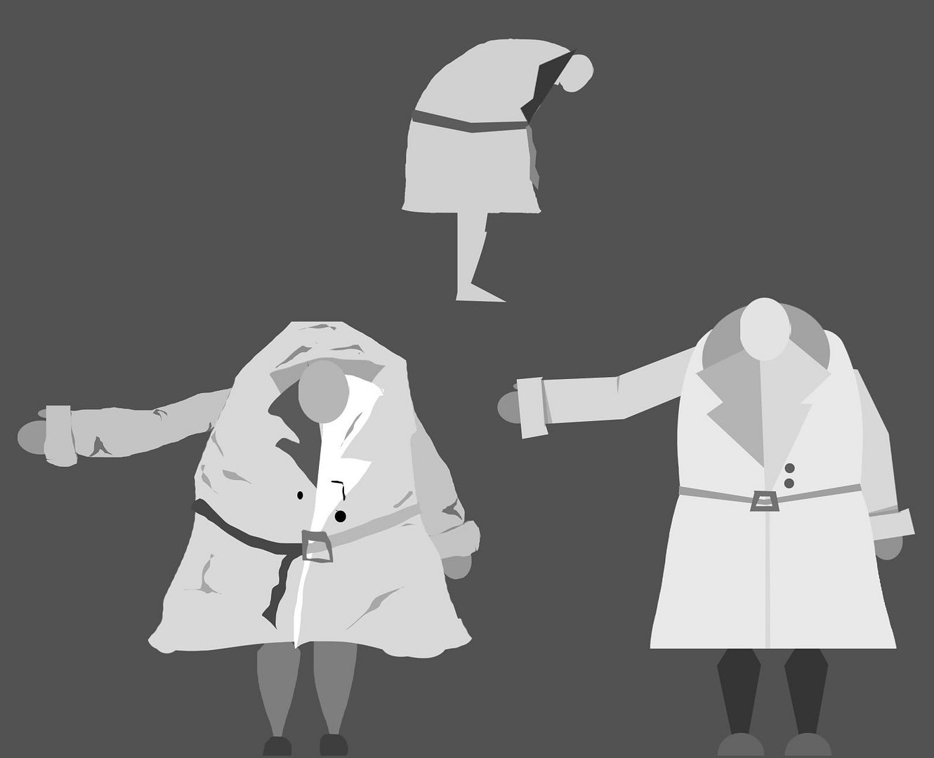
Here's my work after Justin's advice:

Here I tried to make him more hunched over, but perhaps it reads more like craning over rather than a hunched posture. The bottom two images are my first attempt at illustrating a before and after. The first is the more hunched and dirtied character and the second is the pristine, well balanced character at the end.
I think I need to do another page of illustrations based on Justin's help to really pin it down, but I also feel confident that I can take the advice and really run with it. Good stuff!

Hey Molly - okay, you haven't numbered these so I risk some confusion here, but the one that REALLY evokes melancholy is the smallest profile image on the first page (bottom row) - the second page, yes, I think he's too hunched now, too witchy - he's unhappy and weighty, not ancient or arthiritic. But I really like those 3 quarter views on the first page 2 - really make him begin to feel like he exists :)
ReplyDeleteHey Phil! Thanks for the feedback! I agree about that hunched posture, the last thing I want is for him to start feeling decrepit and unfriendly. I was really impressed at how well the 3/4 views turned out too so I'll be doing lots more of those, and I'll try to use the little melancholy profile design you mentioned as a basis :)
DeleteAlso, did you manage to catch my animatic post yet?
Hi Molly, these are looking really great. Also, I really like the concept behind the project as a whole. I think having the character hunch over too far makes him feel a bit too evil, but those perspective drawings are heading in a nice direction. How much detail are you planning to have on the character? I.e. facial detail or hands and feet etc? Or will he be modelled in this more simplistic style? I say this because a few subtle areas of the body really help convey emotion. So, large eyebrows for example instantly help set a tone for the character. As do arms that carry a certain weight. If he is depressed and anxious, weight could be an interesting path to go down. This sort of emotion causes you to feel heavy and dragged down, thus his arms could hang with a believable weight.
ReplyDeleteI don't know if it'll be any help but when I was creating my character for my Major project I tried to simplify everything down to the key emotive areas on the character. The 5th image down shows my first sketches. If you were to add detail to the face then this may be some help - http://jordanbuckner.blogspot.co.uk/2012/02/character-design.html.
Hi Jordan! Thank you for all the feedback, I really appreciate it!
DeleteAt the moment I'd like to keep his detail really minimal because I'm concerned that if I give him too much that it won't sit well with the environment. I would like him to have some facial detail though, whether that's only eyes or a mouth, I'm not sure yet, but I definitely don't want him to have a full face. I do like the idea of him having pendulous arms as well, I tried to capture that a little but I'll definitely take it further.
Thank you for sharing your character designs! I really love that 5th image, it's a lot of help. I'll definitely have a go at making a face sheet similar to that with my character, it'll help me narrow down what works and what doesn't really efficiently! :D