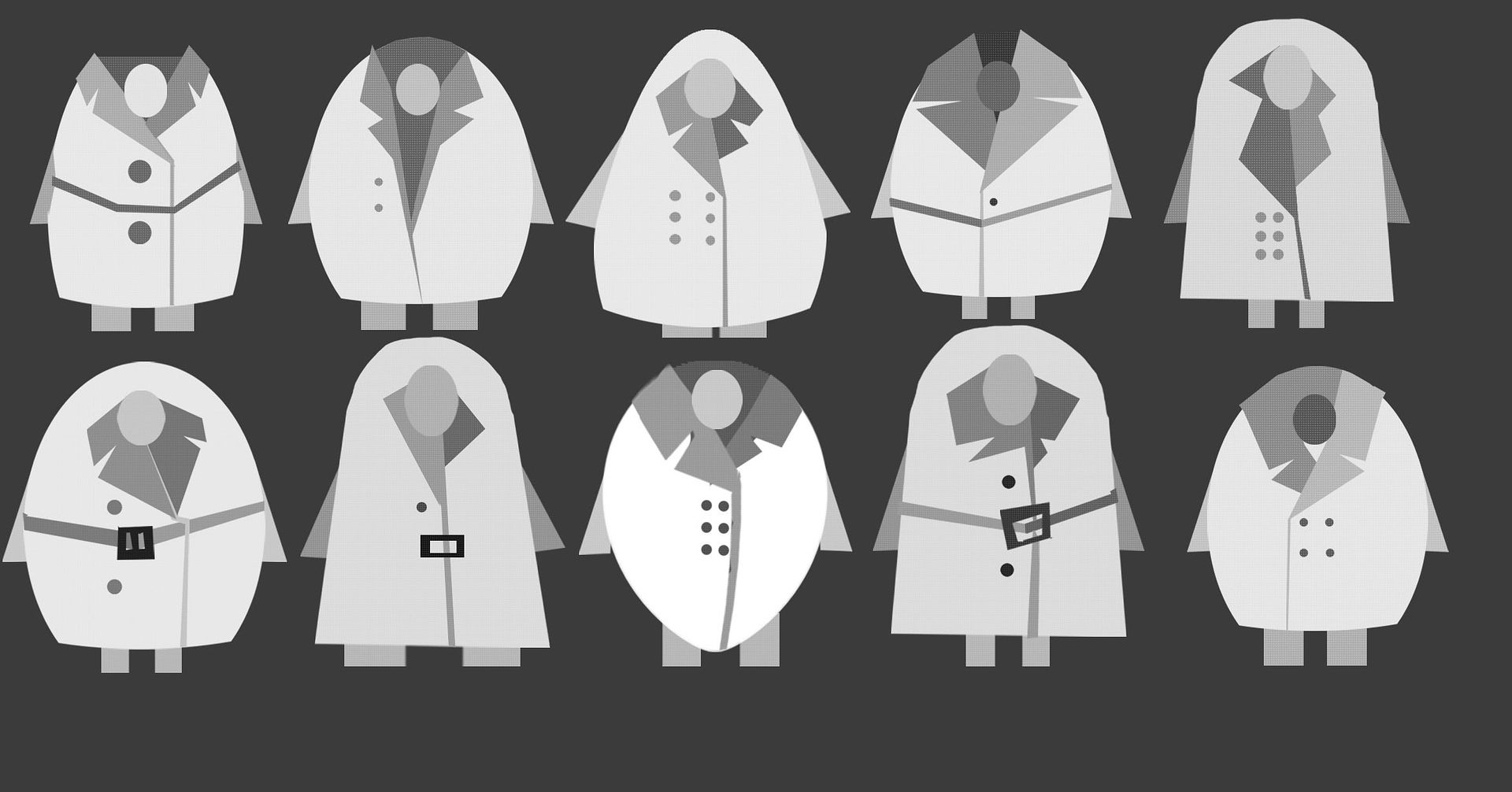
Here are the ideas I have so far. I forgot to number them so if anyone fancies leaving me some feedback row 1 is #1-5 then row 2 is #6-10 from left to right:


Using the idea that he's in a kind of trench coat and playing with the simple shapes from various trench coat styles. They're nice, although I think I prefer the bell shape more than the rounder ones and I quite like the more simplistic designs such as #6 and 7. Good stuff though! :D

Gosh - I really love these Molly - love this page, but I'm not sure any of them quite nail it yet, though number 9 is winking at me more so than some of the others - maybe another sheet or sheets, and I think you need to think about his legs a little more? I think you should come in on Tuesday and try and catch up with Justin Wyatt, who is back in with Year 2 students; I know he was able to give Andriana some time after 5? I might take the liberty of sending him this link for a quick look. But I REALLY like the approach here and I love this development sheet :)
ReplyDeleteThanks Phil! I'm glad you like them too, I definitely agree that none of them are quite there yet but I do like where they're headed. If Justin has the time then I'd love to get a bit of help here. I want to keep it simple but that gets me a bit caught up, as you can tell by the legs. I'll get started on another sheet tomorrow morning when I come in, see if I can get somewhere more interesting with its trousers :D
DeleteHi Molly,
ReplyDeleteSome interesting designs here. I definitely think that the bell shapes are better - the coats have more believable weight here - coats hang straight down, so you get the flat bottom look, rather than rounded. Of course, character design always starts with who is wearing the coat, so If we chat tomorrow, I can get a better sense of which image suits the character you want to design. Anyway, good stuff!