Thursday, 11 October 2012

Initial Newsprint Style Texture Tests...

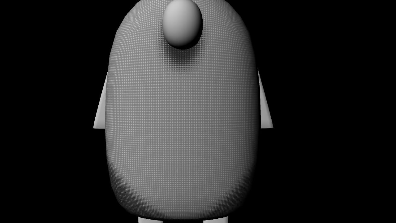
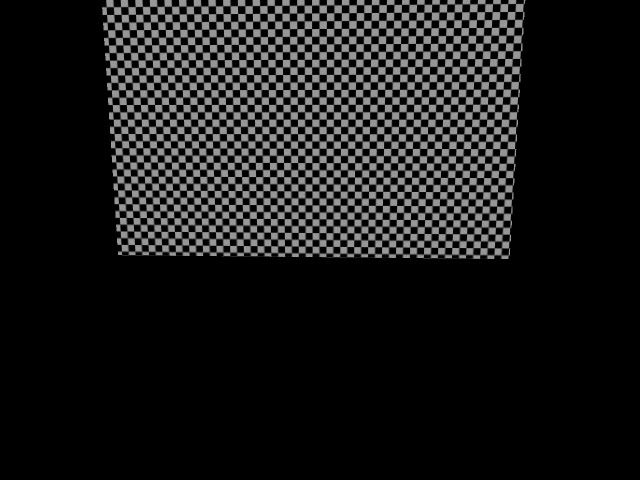
These were my attempts at making a newsprint style texture in Photoshop:
Photobucket

Photobucket

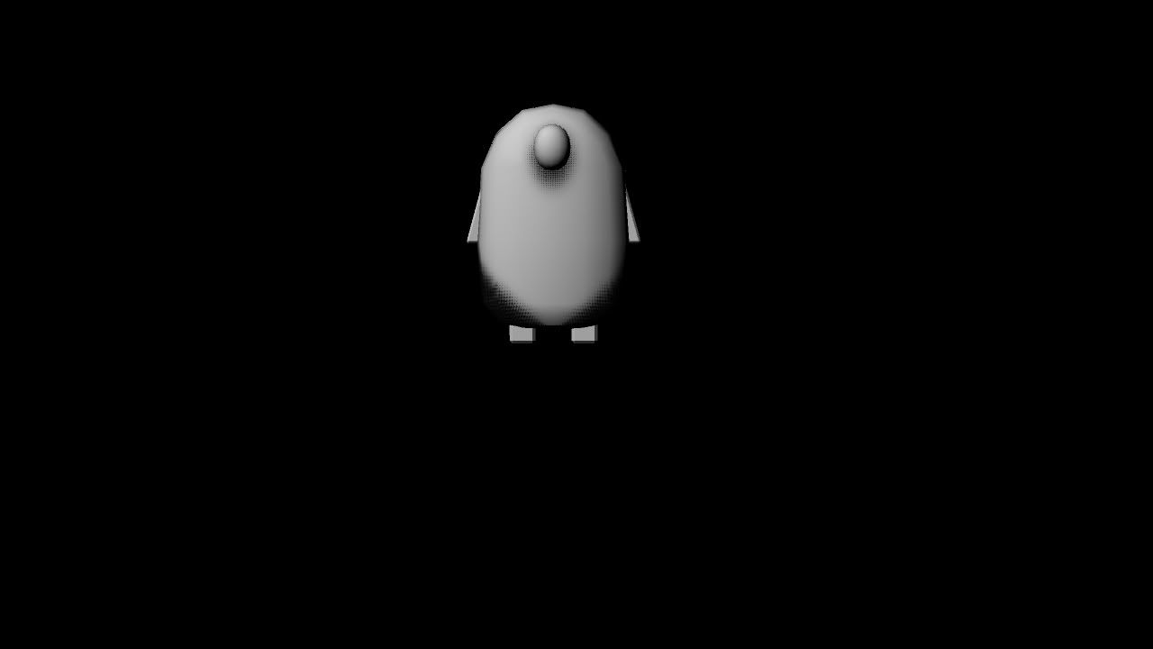
It didn't work well, I really don't like the idea of it being square so I downloaded some rasterizing software and it gave much nicer results:
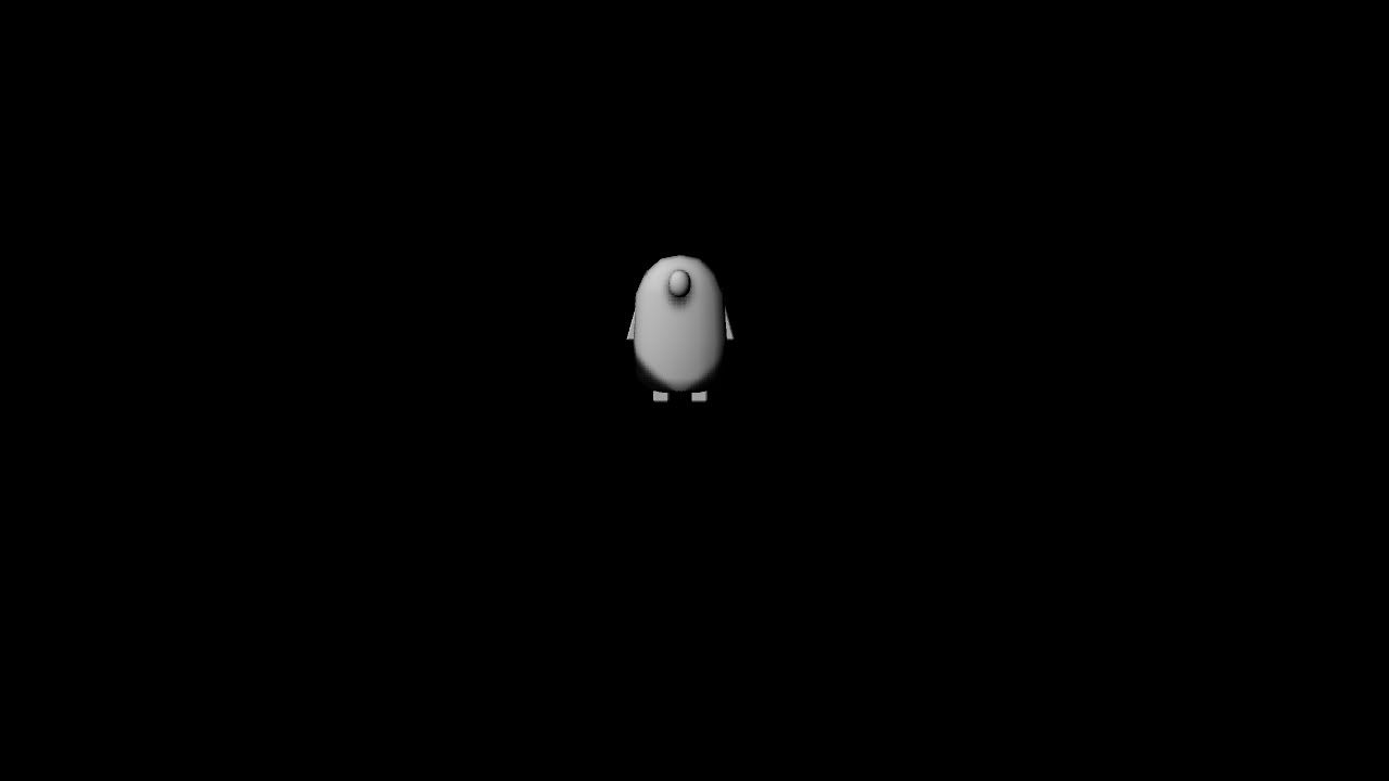
Photobucket

Photobucket

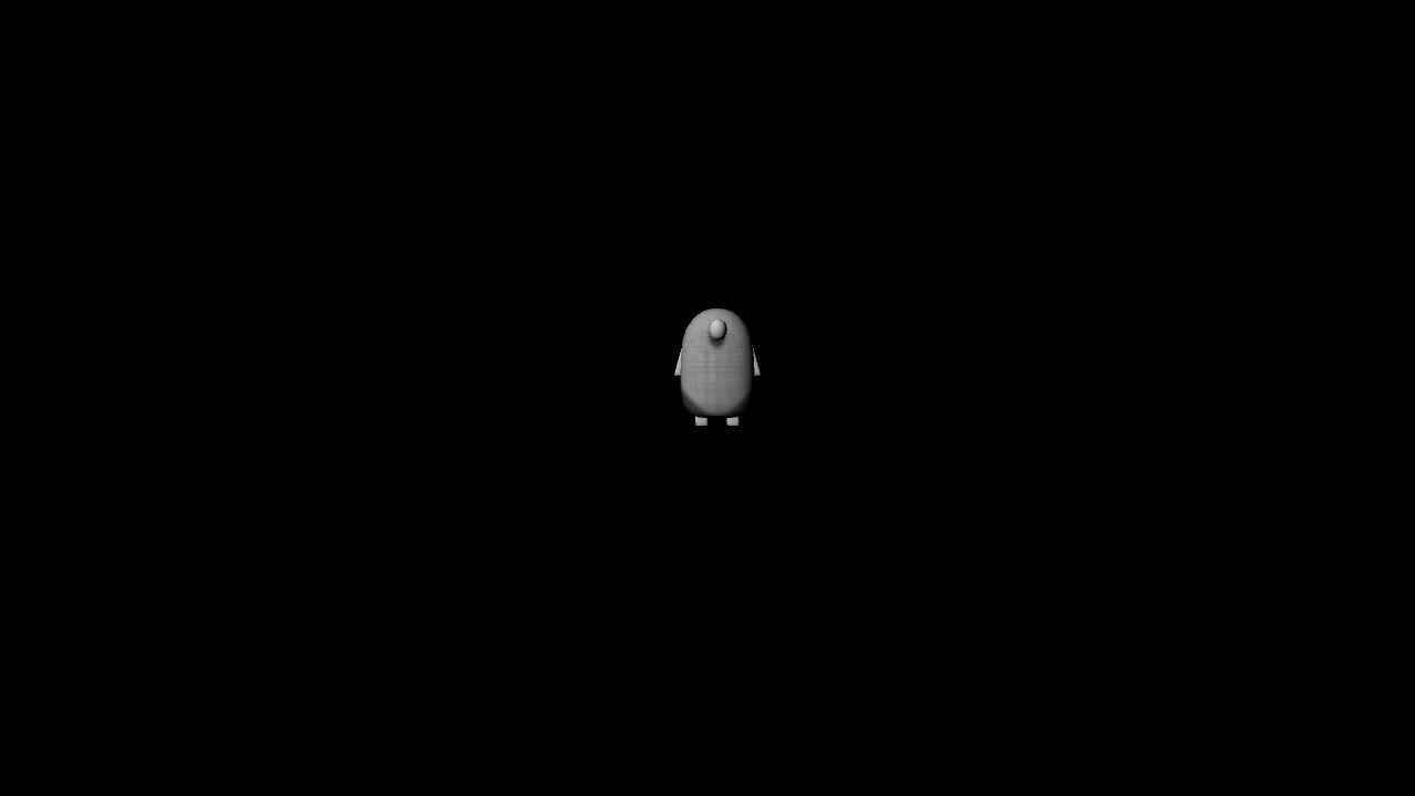
The white areas seemed too white so I added some more newsprint to the chest:
Photobucket

Photobucket

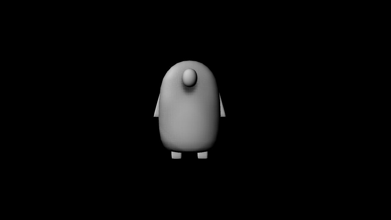
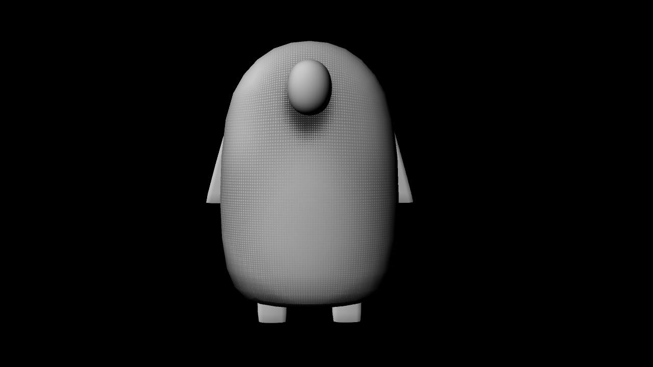
I tried to blend the dots a little better by making some areas lighter than others:
Photobucket

Photobucket

Photobucket

It's working well so far, even if it's a little blotchy at the moment, and I really like how the shadowed areas look. I didn't add any lights as I wanted to see if I could create the illusion of shadows and I think it's worked pretty nicely. I can see myself having a little trouble when it comes to keeping the dots matching up seamlessly but it should suit the world when it's done.

No comments:

Post a Comment