I've put the line up together now, alongside the villains, to see which colour group works best. Apologies for the list of images, Photobucket doesn't currently have a slideshow feature:
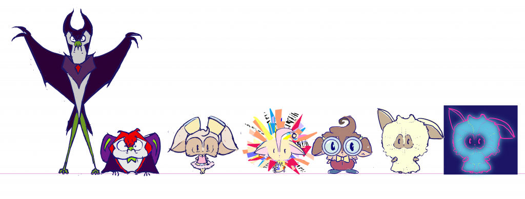
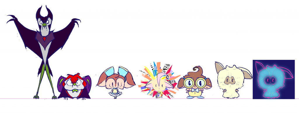
I'm drawn to 6 because of they feel the brightest in comparison to the villains, I do also like the pink theme in 5 though. They both link the characters through similar colours which is a plus, and the pastel colours also happen to look quite tasty! Let me know what you think though :)
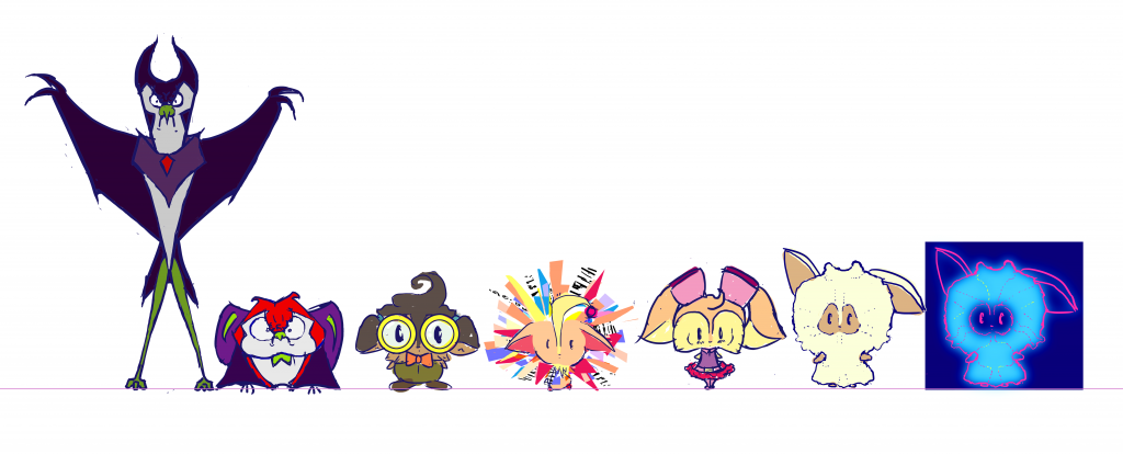 |
| 1 |
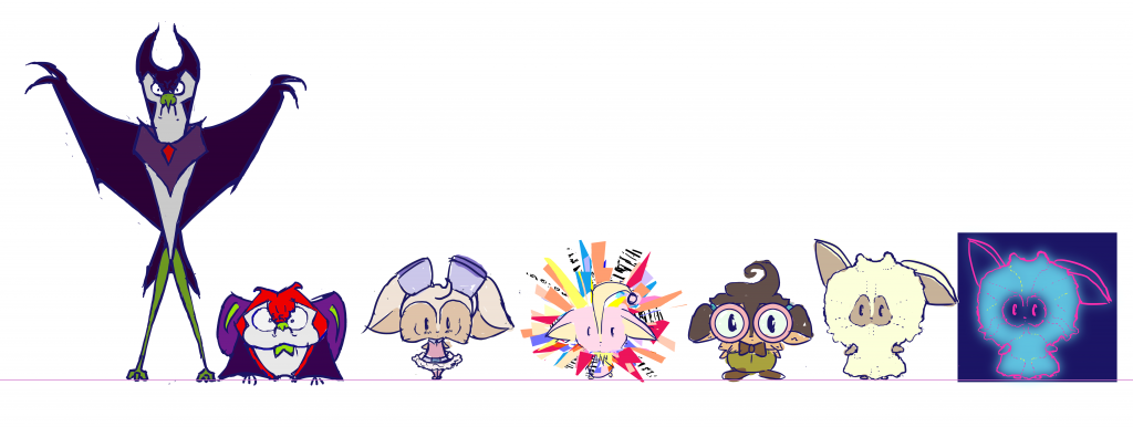 |
| 2 |
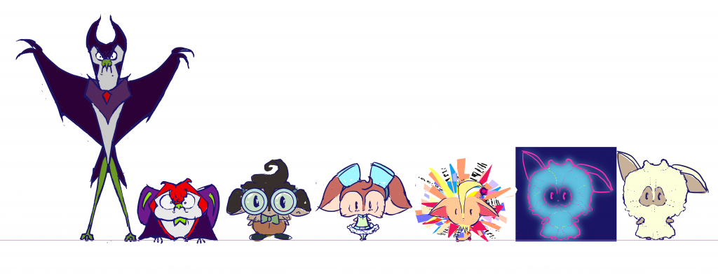 |
| 3 |
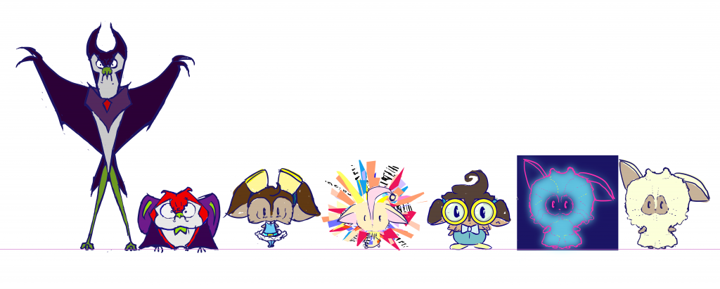 |
| 4 |
 |
| 5 |
 |
| 6 |
I'm drawn to 6 because of they feel the brightest in comparison to the villains, I do also like the pink theme in 5 though. They both link the characters through similar colours which is a plus, and the pastel colours also happen to look quite tasty! Let me know what you think though :)

Right, I like Six for sure the most.
ReplyDeleteThe spectacle chap would probably be better with a darker color instead of the Yellow from that one though. The girl is cute.
From here you need more refined stuff, but also some loose gestural stuff with poses and such. (you've done some of these before - but i'd say try to do them with pencil and paper and avoid erasing every wrong line and just go for it, confident strokes)
Also front / side / 3/4 detailed drawings to model from. Just remember the more prep and figuring you do in this stage, the faster and more efficient the modeling will be :)
Don't forget your references for how they tackle clothing and such, these will be small, certain elements may not read if it were in a real world figuring setting.
Good stuff.
Cool, thank you! I'm starting all the poses and 3/4 views now :D
DeleteHey Molly - yep 6, but with the darker body from 5 for the guy with the specs.
ReplyDelete