I currently have the character line up
HERE with amendments to the Villains shapes
HERE.
I've started making sheets of colours for the characters now, starting with the goggle-wearing and coloufully-maned characters
HERE.
It was mentioned that the fluffy creature was a little generic so I added a few extra fur tufts and hopefully his addition 'glow-in-the-dark' ability and patterns make him a little more unique.
Below are the colours for the rest of the 'goodies' with the villains to follow after:
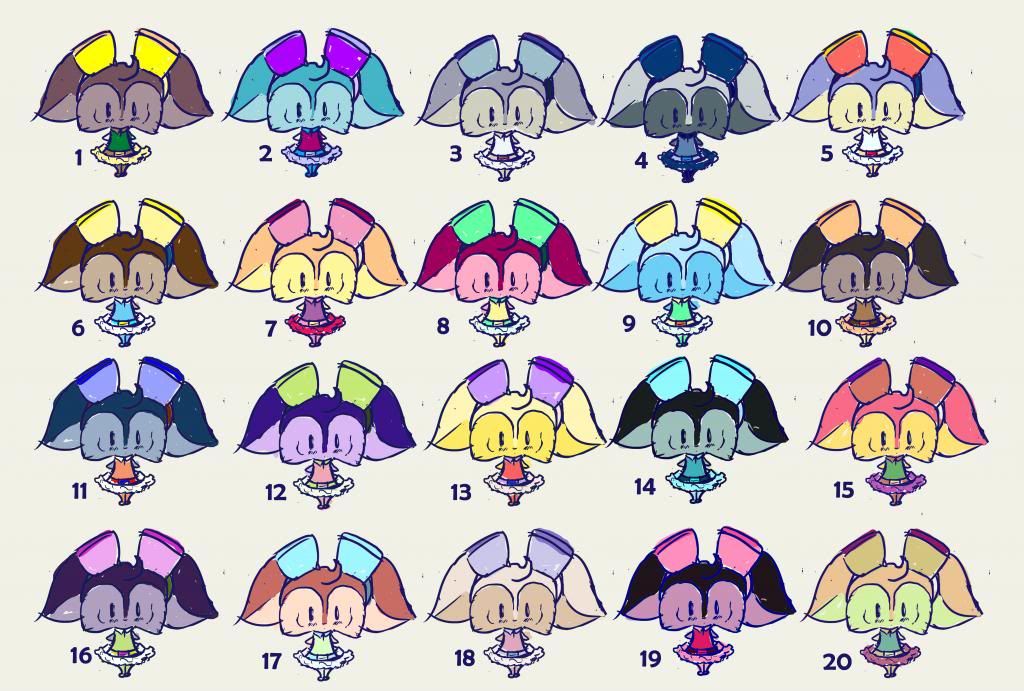 |
| I like 17 and 6. |
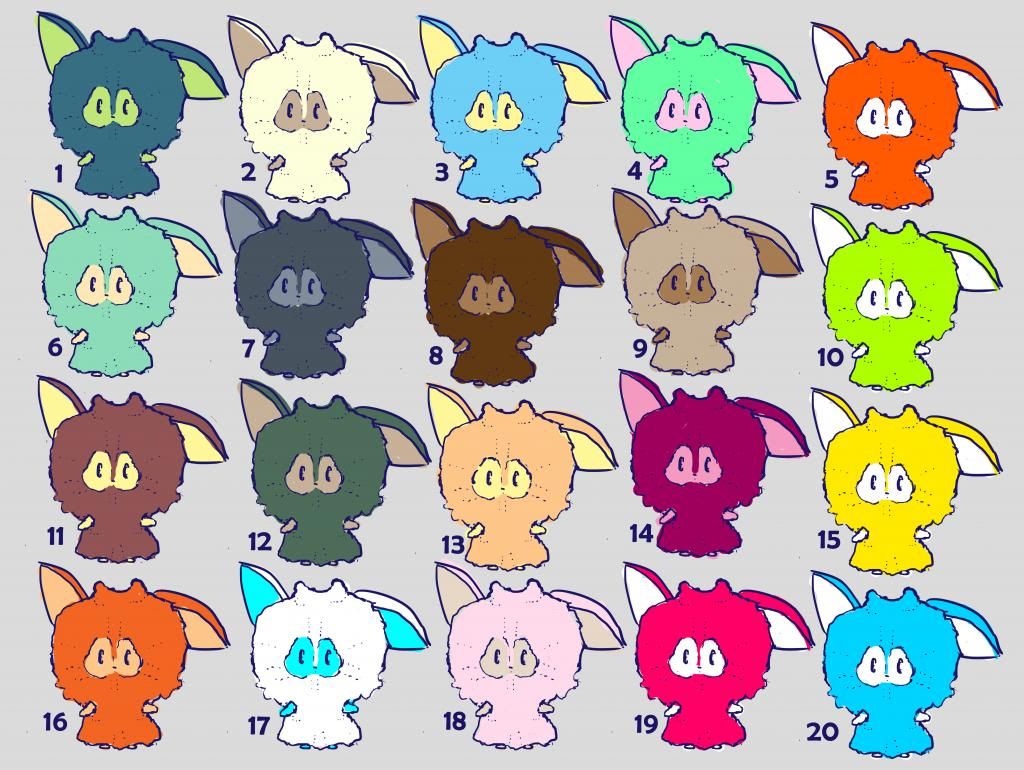 |
| I like the idea that he's a little plain so I quite like 11 or 8. |
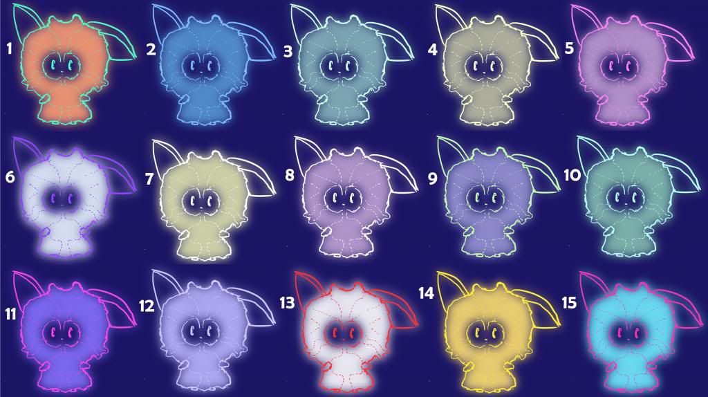 |
| But when a light source is near him he, and a pattern on his fur, light up in a brighter colour, such as 12 or even 6. |
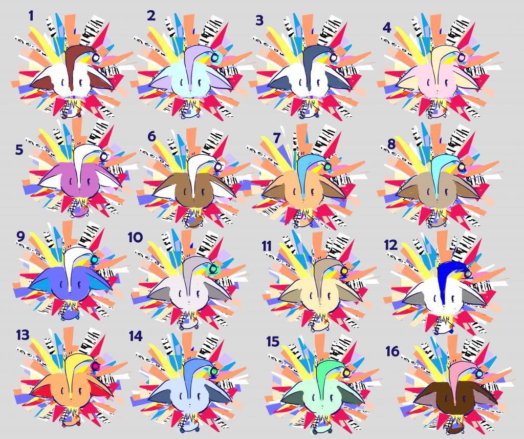 |
| Similarly, I like the idea that he's a little plain but lit up by its mane and lamp, so I quite like 16 and 8. |
 |
| I think my favourites here are 5 and 6. They definitely make a good pair though :D |
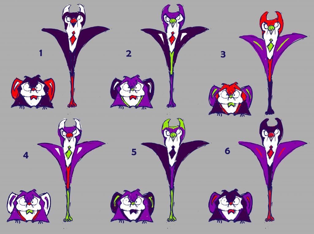
I didn't want to use any black in my world so I decided on the navy blue outline and a dark purple to represent darkness.
I'll be moving on to turnarounds next so I can start seeing them in 3D space, providing all the characters are up to scratch, design-wise. Any feedbacl is much appreciated! :D


hey Molly - okay, I'm not '@Alan', but I've got some faves in here; and in no particular order:
ReplyDeleteon the villian sheet, I really like the small one of 3 (he looks SO grumpy, he made me 'lol'), but the tall ones still need a few more iterations, because I don't think he's quite 'there' in any of them - he needs to be stronger somehow and I'm inclined to think he should be darker - but 2 of the tall one is the closest so far (for me at least).
top sheet - I like 6, 17 and 18 - very girly, but in an apposite way; i.e. this one would be very popular with girls.
ReplyDeleteGlowing critter - I like 2 when he's not glowing, because it just seems more fun if he'd be much more disco when he IS glowing.
Hamster with a mane - for it's 4 or 13.
okay - I also like number 7 on the top sheet - she's coloured like one of those old-school fruit salad sweets. I suggest you start combining people's faves into alternate line ups, because it's quite likely that the 'right' colour schemes will also be arrived at via the 'right' combination of colour schemes in relationship to each other as a harmonized 'team' of characters. Get these choices into some clean white space of their own and group them.
ReplyDeleteAlso - I'd really like to see your characters in 3/4 views, because I want to know a bit more about them in terms of their forms - especially the fluffier ones.
I always appreciate your feedback Phil, don't you worry about that! :D
ReplyDeleteI'll start putting all the successful character colours together and see what works best, and I'll take the tall villain back to the drawing board too and see what'll make him a bit more polished.
I also agree totally about working out 3/4 views next. As cute as they are I still need to work out how they'd look in 3D space so I can start thinking about how they would actually do what they do.
Thanks Phil! :)
Hi Molly,
ReplyDeleteThere are loads to choose from here (almost too many). I think it would be easier to have a chat about these with myself or Justin before making decisions. Perhaps also think about a story / rule reason to inspire the choice of colours - something simple, like they should all be bright colours because they are 'fighting / cleaning' against the darkness / nightmares etc. That eliminates all the blues.