Showing posts with label Major Proj. Ideas. Show all posts

Sunday, 26 May 2013

New Designers Improvement To-Do List...

Proportion:

  • It's awfully fast but it's hard to slow it down when it's working with the music. Cut certain sections out or trim them down perhaps?
  • The scene at 13secs camera could go up then lead into scene at 19secs then to scene at 17secswhich will zoom out to see the spiral scene. scene at 21secs needs to be somewhere but not sure where yet.
  • These changes could lead to a slightly longer stairs scene so the close up is not so rushed.
  • The deep breath at 28secs should be longer if possible, feels too rushed.
  • The final sequence needs to be more dynamic. More tweaking on the animation to make the struggle a little more violent but also more inter-cutting with close ups and different angles to build tension.

Dream Cleaners:
  • More 2D work. I have a nice selection at the moment but I feel like a few illustrations of the characters interacting would work well.
  • Get the models finished!
  • Get stickers and t shirts made!

Misc.:
  • Business cards!
  • Books!

Saturday, 4 May 2013

DVD Box and Disc Designs...

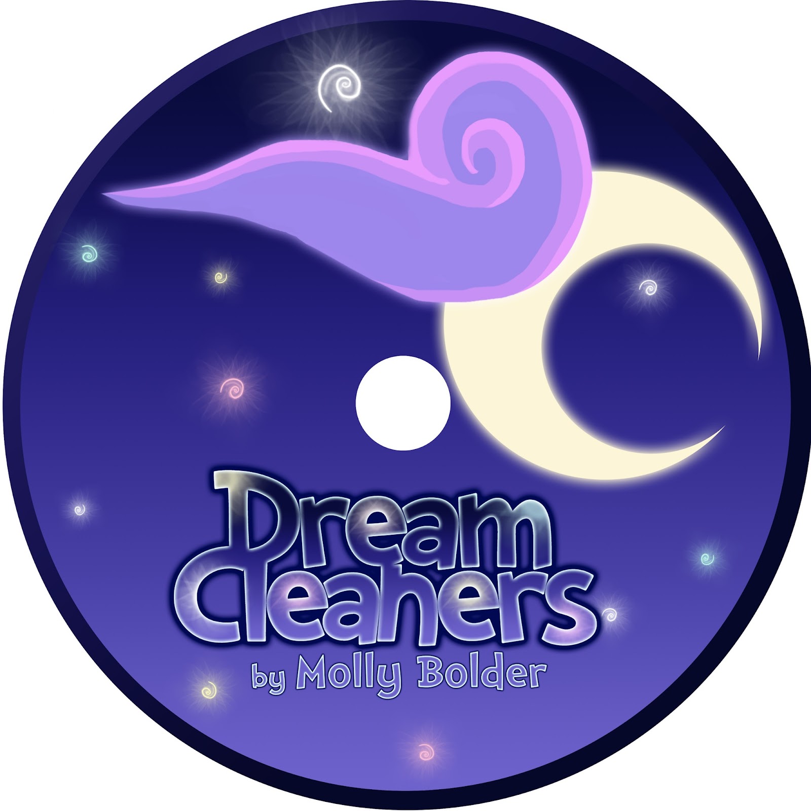
I haven't decided between these two discs yet:


Here's my rough DVD box cover:


I may change the back so there are a few nice images of the characters there. I like the use of the environment concept but I think it's unclear that it's the characters you want to see.

Monday, 29 April 2013

Dream Cleaners Animated Intros...

I managed to find some pretty fun pieces of music at freeplaymusic.com so I  thought I'd have a go at putting a rough intro to the show together. The first attempt was this piece with the melody of 'Little Piggy' in the background:


The second attempt had a melody called 'Great New Day':


The second is my favourite, although I'm not sure that the wipes work so well in both. I may try out some circular wipes instead to see if it's a little more fun. I'll also be looking to add a few sound effects too. Not loads but enough to make it a little more exciting :D

Let me know what you think!


Friday, 26 April 2013

Getting Walter's Attention...


Once I've got a rough animation for each character I'll then start adding sound effects and planning out a mildly animated title sequence. This has all been super exciting so far, with 3 out of 6 done, I can't wait to do more :D

Monday, 22 April 2013

@Everyone, Flossy Needs You!..

I'm having a go at making the colours for Flossy less aggressive and it's been a bit of a struggle. Here's what I have so far:


I think that both the first and third images work. I did try using blues but I wasn't too keen, I think she's definitely more of a pink character. I'll be stepping away for a bit to have a break and hopefully when I come back I'll have fresh eyes on the situation. In the meantime though, any feedback would be greatly appreciated :)


Saturday, 20 April 2013

Flossy III...

I've had a lot of great ideas passed my way, particularly the one where I have a smaller, bouncier side-kick for the team. I absolutely love that idea but I feel that this kind of character doesn't suit flossy at all and seeing as there's so little time left, I can't really give a new side-kick the time it needs to be as adorable and fun as it deserves. So, here's how Flossy currently looks:


I tried smaller swirls very roughly, I don't think they work quite so well.
I can't quite get her swirls to feel right yet, I think they'll take a bit more blending to make them really feel part of her model and not stuck on there.

I also feel this is the most appropriate version so far. I'll play more with texturing tomorrow to see if I can get something that feels softer but all going well I'm looking forward to making her little wool tutu glow.

Let me know what you all think though! This is probably the final model I'll have (bar a few tweaks here and there and texturing where it's needed), so I'll really appreciate any feedback you have at this stage. :)


Friday, 19 April 2013

Character Updates...

Okay so here's how Flossy currently looks:

She's wooly but in a much softer way now. There's been a lot of too-ing and fro-ing with Flossy, one of the simplest characters and yet she's been the most difficult to portray!

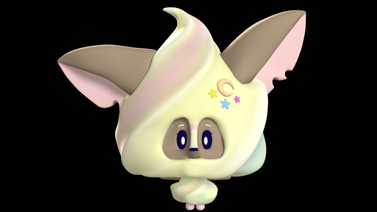
One suggestion Alan gave me is that she could be a bouncy head with ears, which is really cute, but I don't think it's quite Flossy as she's a meeker character that bounces about when no ones looking. However, I would like to use this idea and after thinking about still using my iced gem character it would seem they're a great match.  Below is a very rough mock up of how they could look:


I'd want these to be creatures that are found everywhere but are particularly drawn to well lit areas, and are especially drawn to Flossy when she lights up, and sometimes just in general. They're not quite pests but they aren't really pets either, they're just a cute and sometimes awkward creature in the Land of Nod. I think I'd get rid of the face space altogether and have maybe just eyes peeking out for these creatures, I'll get a few rough sketches together and see what comes out though.

To give myself a break from the Flossy conundrum I decided to go back to the previous characters and give them their new props and tweaks.  I've given Natty her magical (but mostly practical) sponge wand:
Sponge with holes.
Sponge without holes.
Which do you prefer? Sponge with holes looks more like natural sponge, but also like cheese, and sponge without holes looks nicer but does it say sponge?

I've also made a satchel for Walter:

His bag of endless possibilities is where he keeps all his gadgets. He has something for every situation in there!

And Clarissa is looking much livelier in her new pose:
I'll tilt her head a little more towards the viewer next.
It's still coming along nicely it's just getting down to crunch time and the nerves are bubbling away. Hopefully after this weekend I'll at least have Flossy finished! :P


Thursday, 18 April 2013

@ Everyone, Flossy Needs Feedback!..

Okay so Flossy is going back to her more woolly roots and I'm currently trying to make her a nice combination of both the before an after. However, I'm getting a little stumped on which ears to choose so have a nose below:


Previously she had an asymmetric version of B.

These are very rough tests so she'll go back to having variances in her ears and she's currently more asymmetric when it comes to the wool on her face too. I'm torn between the slightly more sunken and meek ears from A and the brighter ears of B. There's always the asymmetric option of having one upright and the other like A but I'll wait and see what people think. :)

Monday, 15 April 2013

Flossy Updates...

Here we have nature, demure Flossy:


Here we have the first version of disco Flossy in the dark:

Render
First Composition
I quite like her! I've made sure that the bright colours match the natural ones too, but I thought that the bright pink was much more powerful than the blue that I had previously conceptualised.

Let me know what you think though! :D


Saturday, 13 April 2013

Flossy Update...

I've made her a little softer and I think it's getting there now. Have a look below:


Her body's still a little harsh but it's nice that she's getting to a point where it's becoming about the details. I've also just seen a comment about making her ears hint towards wafers, so I'm thinking I'll make the one on the right ever so slightly more upright with the left hand one more lopsided to suggest that.

Pretty cool stuff and as always, let me know what you think! :)


Friday, 12 April 2013

Flossy Experiment...

Okay so seeing as I did something similar to Walter I thought I'd have a go at making Flossy more ice cream like too. Here's how she looks at the moment:

Quick sort-of-creepy Render
Walter for Comparison
I think it's cute and that it could work better than the wool. The geometry is still messy and she's obviously not textured but I think it could be a better solution than the previous lumpiness. One thing I'm not sure on though is that she kind of has a beard now because I tried giving her a mouth. I like the idea that she's got a mouth that's hidden until she smiles, so maybe the beardyness isn't such a bad thing if I tweak it enough.

It is REALLY hard to resist putting a cherry on top though...Anyway, I'll work on it more tomorrow and hopefully get some funky rough ideas of how this would look lit up too. Let me know what you think though!

Friday, 5 April 2013

More Branding Work...

I've had some feedback suggesting that my title isn't readable enough from far away so I had a few more attempts at tweaking it:


I decided on 5 as it suggests the stars without them causing too much trouble for your eyes. I then took this idea into the card designs and also created a more iconic logo:

The shapes match the 'D' and 'C' from  Dream Cleaners.

I then created a printable sized version on the cards in Photoshop. They'll measure 3" across and 4" down, allowing them to be big enough for young children but no too big for the packaging.  Here are the new backs:


I chose 5, 11 and 10 to combine with the 3 rough card fronts I designed:


I like the idea of 3. That you not only get a picture of your favourite character, but of the environment too, but I also like the simplicity of 1 & 2.  Let me know what you think! I'm going to go back and put those gaps back into the vowels in the title! :D

Wednesday, 3 April 2013

Possibly The Final Logo...

A very rough composition but here is the new logo for the show:


I think it feels sparkly and dreamy enough, but I'll check again tomorrow to see if I still think the same. If so, then I'll create a final group image and begin finalising the Trading card designs.  Below are a few quick examples of previous ones using the new logo:


They're still working quite nicely, although I think that maybe the top 2 are working best. I'll get a large sheet of them up tomorrow. :)

Logo Updates...

I've had some great advice from Pol Winandy about my logo, so here are the tweaks I've made:

I moved the words closer together and played with making the stars bigger and paler. The previous logo was too hard to read when made smaller so it was important to make it easier to read.

Here I took my favourite sets of stars and played with the inner glow to see how readable it was.

I found 2 to be my favourite, so I added the gaps between the letters and placed it on some of the more successful colour tests:


I think I'm happy with this! The next step is to put it into a scene with the characters, and then on the trading cards designs, and hopefully I'll be onto a winner :)


Tuesday, 2 April 2013

More Logo Colour Tests and Tweaks...

Here I've added more space between letters and then closed all the gaps with the same blue and placed them on the coloured backgrounds:


Although they're a little rough still, I think I prefer the logo with gaps. I think the colour coming through adds something to it that the blocked letters don't do. Let me know what you think though! :)

Logo Colour Tests...

I took a selection of colours from the characters and placed the logo against the various backgrounds:

Natty/Walter
Alistair
Walter
Clarissa
Natty
Nigel
Flossy

I like the two Natty backgrounds best, although I do quite like Alistair's powerful purple too :D

Sunday, 31 March 2013