
A very rough composition but here is the new logo for the show:

I think it feels sparkly and dreamy enough, but I'll check again tomorrow to see if I still think the same. If so, then I'll create a final group image and begin finalising the Trading card designs. Below are a few quick examples of previous ones using the new logo:

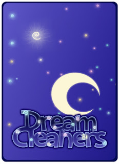


They're still working quite nicely, although I think that maybe the top 2 are working best. I'll get a large sheet of them up tomorrow. :)

I think it feels sparkly and dreamy enough, but I'll check again tomorrow to see if I still think the same. If so, then I'll create a final group image and begin finalising the Trading card designs. Below are a few quick examples of previous ones using the new logo:


They're still working quite nicely, although I think that maybe the top 2 are working best. I'll get a large sheet of them up tomorrow. :)
Awesome! :D Are you planning to animate these fellas at all? I am dying to see them bounce around with squeaky sound effects! I can see them coming up on kids television as a promotional trailer for the card game
ReplyDeleteAwww thanks Andi! I really wanted to but there were other things I wanted to concentrate on for this project. I definitely will after though! Fingers-crossed they'll be alive in time for New Designers! :D
DeleteThis comment has been removed by the author.
ReplyDeleteI love the style of it!
ReplyDeleteJust a thought, it feels like it would be hard to read standing further back because of the kerning of the text and the glow around it.
It also seems like -as a brand, it could benefit more if you made the logo a recognizable icon by itself, and had the text as maybe a separate thing to accompany it. So if people were trying to find the package in the shop they could recognise it a mile away.
Can't wait to see it all.