
Here's how they're looking at the moment:


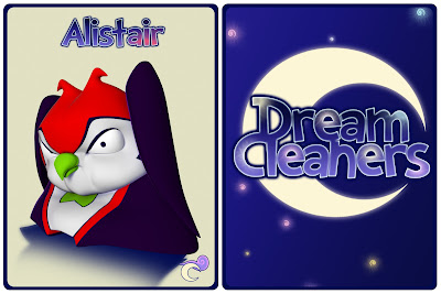
They're still not finishedm as the lighting and poses need more refinement, but it's really great to see them all together at least :D


They're still not finishedm as the lighting and poses need more refinement, but it's really great to see them all together at least :D
These are looking more and more like trading cards!! :)
ReplyDeleteI also like the Dream Cleaners logo, but do you think that your character's names should be presented in a sub-font to distinguish them from the Dream Cleaner's font?? To be honest, it works either way, but just a suggestion :)
Thanks Bharathi! :D
DeleteI think you might be right there, I'm going to have a play with varying to colours at least.