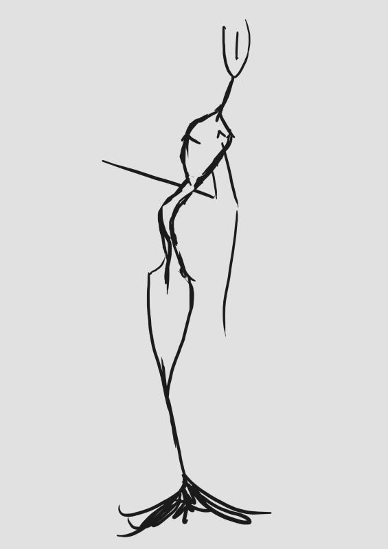
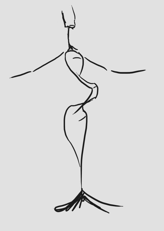
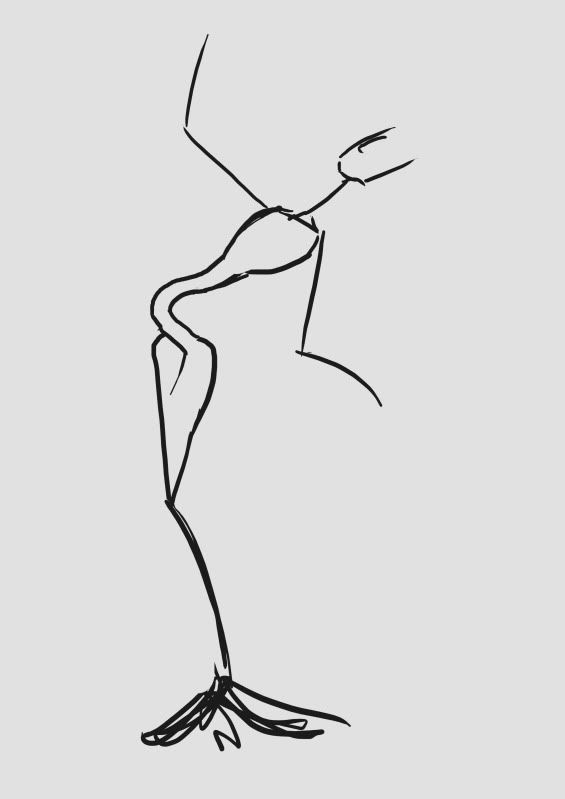
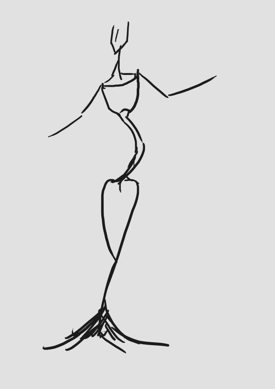
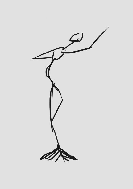
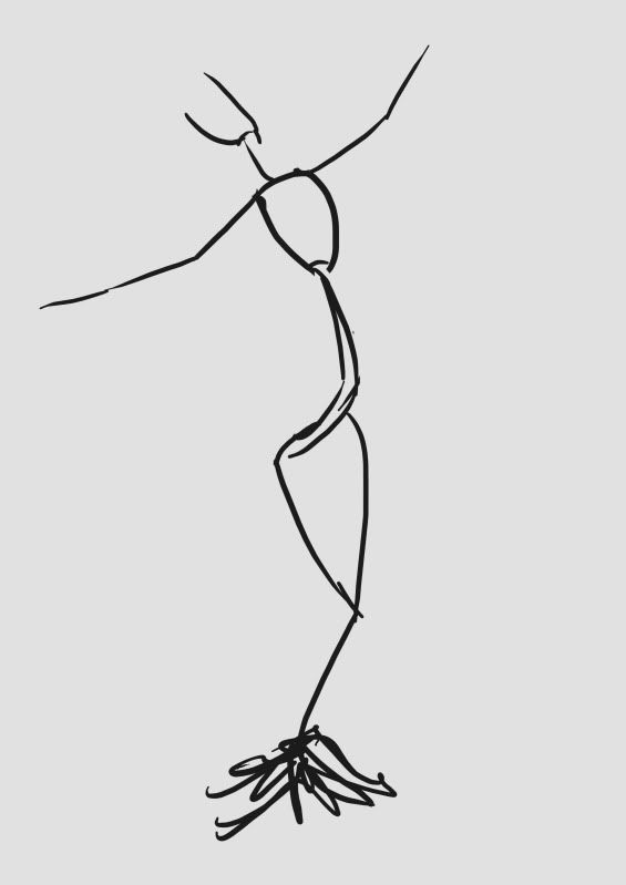
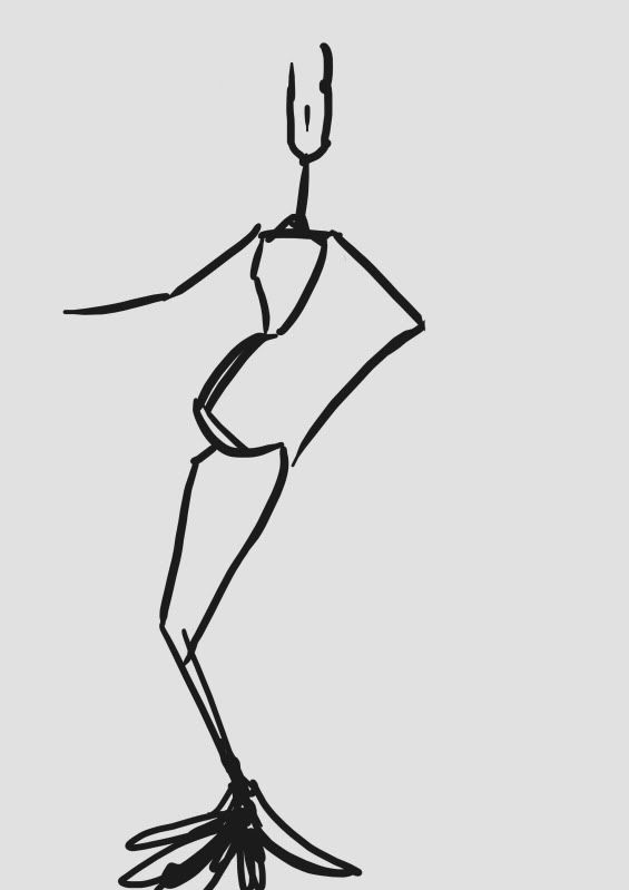
I tried to keep it fast and loose but that always disappears a bit when I'm working so I only ended up with 10 ideas, but they look pretty nice together side by side. I can really see what is more powerful and what looks a bit silly so it's going to be nice to take away and use when I start adding more detail, also I might block out my favourites into silhouettes to see if they work as well as I'd hoped. Lovely stuff! :D
Saturday, 6 August 2011
Testing Some Poses...
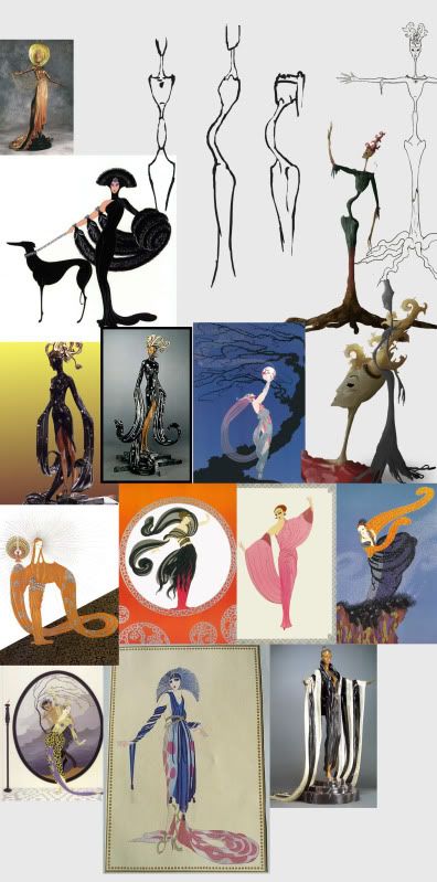
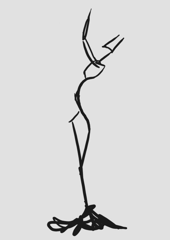
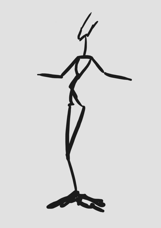
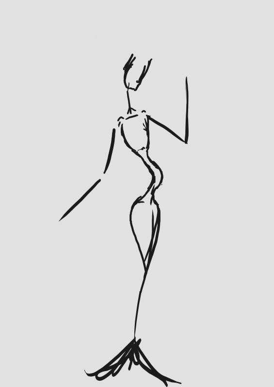
They are all fairly similar and very rough but it was nice to have images to base the poses from. Here's the image map I was using:
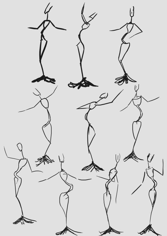
Lots of lovely images from Erte to base the poses on. The images are all quite similar but with subtle differences in the positioning of the head and the angle of the body. I wanted to try and achieve the same pride and strength the women in his illustrations seem to have in my poses, here is what I ended up with:
I tried to keep it fast and loose but that always disappears a bit when I'm working so I only ended up with 10 ideas, but they look pretty nice together side by side. I can really see what is more powerful and what looks a bit silly so it's going to be nice to take away and use when I start adding more detail, also I might block out my favourites into silhouettes to see if they work as well as I'd hoped. Lovely stuff! :D
Labels:
Summer Project
Subscribe to:
Post Comments (Atom)
No comments:
Post a Comment