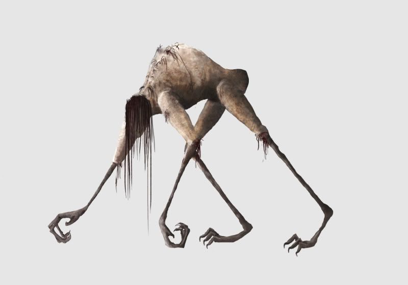
I decided to go in and tweak it a little, just finishing off the initial design below:
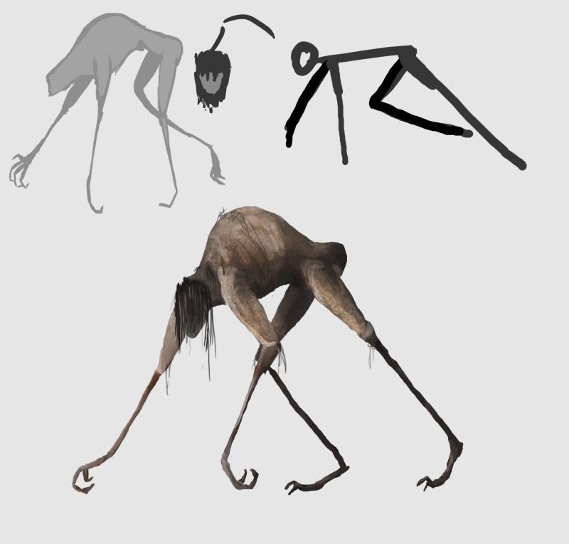
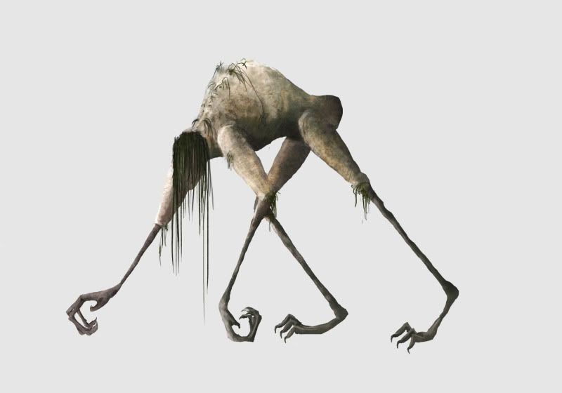
I want to make the hands and feet bigger so they're more rake-like and improve it's overall look:
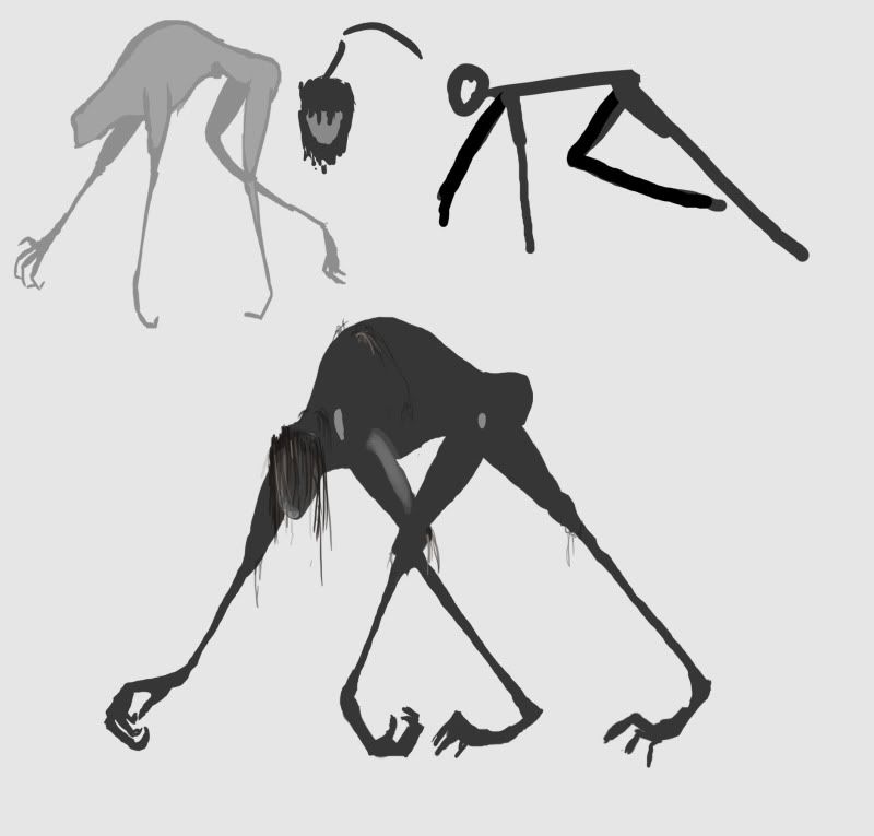
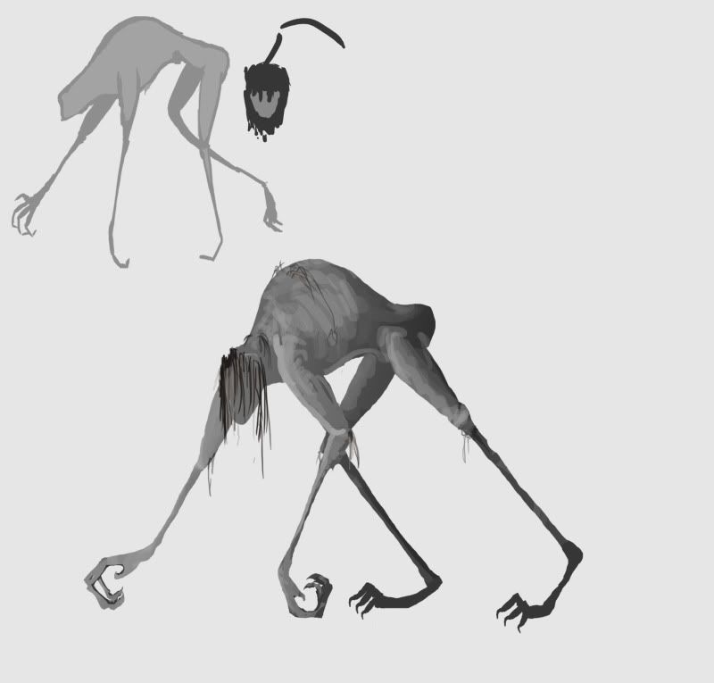
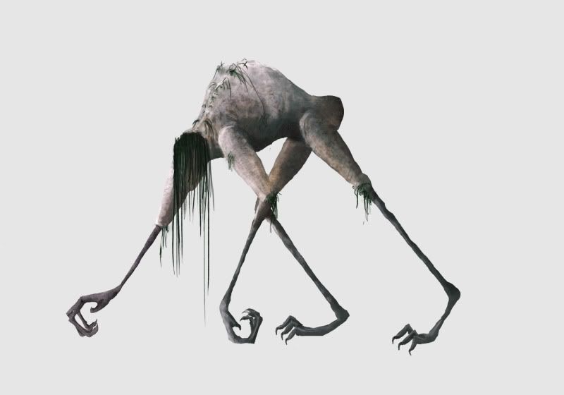
I've just about established The Collector's design so below I thought I'd play around with colours:
I think I prefer the brown and green design to the more adventurous colours and the hands and feet I think are better this size although now I'm unsure if they're too big? Feedback on what needs changing or which image looks best is much appreciated. I'll start working on the turnaround for this character next, probably then start looking at its anatomy to make sure it all works, and then I'll finally finish off the dragon and rodent creatures :D

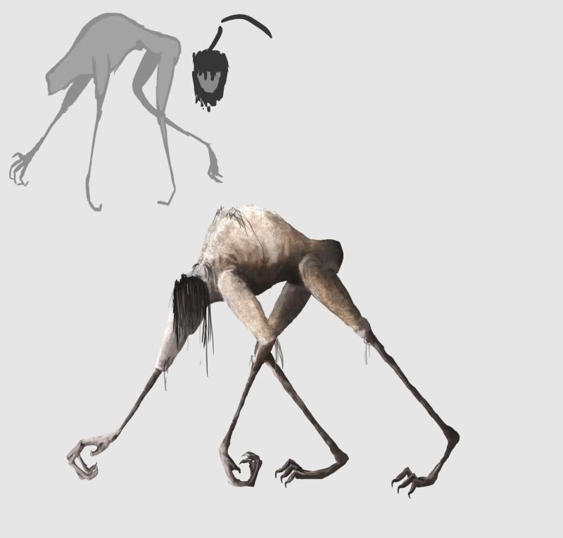

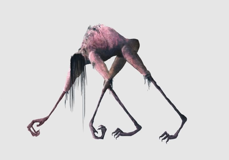
actually, molly - I like the last colouration; there's something sore and raw about him - maybe desaturate it a bit, to give it a clammy, dead flesh quality. I do want to see some close-ups now - I can imagine his skin full of old surgical stitches or staples - and I REALLY want to see its face! :D
ReplyDeletePs - could you drop me an email? I've got a favour to ask of you...
Okay! Sounds good to me! :D I like the 'stitched together' idea! I want the minions to look like Ursula's created them to perform one task so to make this minion all leathery and rotten sounds great! :D
ReplyDeleteEeep! I don't know what its face is going to look like yet! Maybe mostly empty except for some staring eyes and maybe an unnatural looking mouth? Time to experiment I suppose! :P