 |
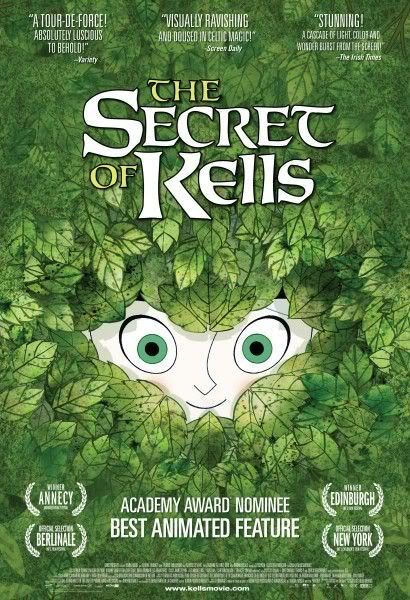
| Fig. 1 The Secret of Kells poster. |
The Secret of Kells is one of the most stunning animations you could watch. Its swirling imagery of thriving forests to child-like chalk drawings on slate can be too much for the eye to take in, but this just makes it all the more wondrous.
 |
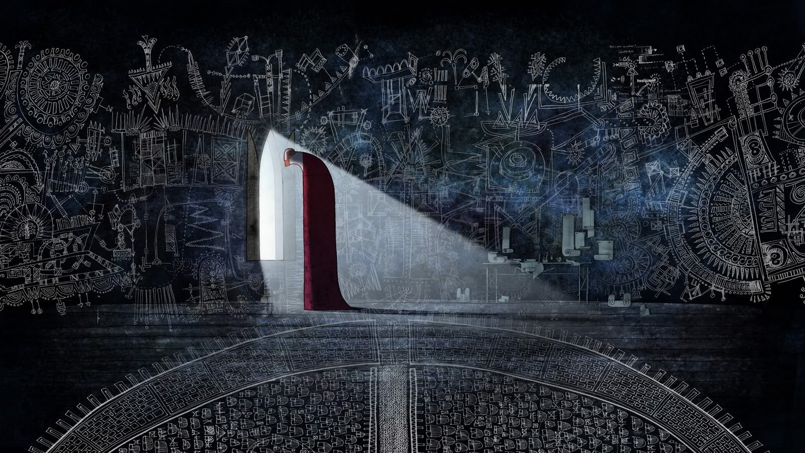
| Fig. 2 Dramatic visual style. |
The aesthetics running through this film are what makes it so fantastically unique. Deeply rooted in both Celtic mythology and Christian art, it is constantly re-using iconic shapes and imagery to make sure the authenticity is never lost. Empire's, Helen O'Hara explained that "the art is astonishing – real snippets from the Book are shown, and its motifs and themes echo through the film in tiny details, especially in the scenes where Aisling introduces Brendan to the glories of the forest.." (O'Hara, 2010) The 'Book' she mentions is the Book of Kells. A stunningly illuminated version of the New Testament, found in Dublin, Ireland. Its illustrations are so intricate that its unbelievable that they were made circa 800 by human hands. Each of the curling lines and intricate patterns is mirrored in all aspects of design. In the environments, such as in fig. 1, everything is made from circles and curled lines, much like the illustrations in the book, and found in Celtic design. The environments scream Celtic influences, all the complex patterns being suggested in everything from the seemingly 2D representation of space to the chalk blueprints s scrawled across the walls.
 |
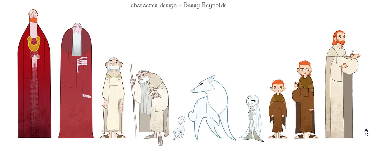
| Fig. 3 Character Design. |
Not only is the environment design stunning, but the character design is even more fascinating. Each character is specifically 'shaped' for their personality and purpose in the narrative. Some of the shapes are so visually simple but their impact on the viewer is instant and powerful. Sophie Ivan, Film4 critic, believes that "the abstract, stylized nature of the design - so far removed from the pristine hyper-realism so much popular animation strives for - creates an ethereal, numinous universe. It has hints of the magical silhouette animations of Lotte Reiniger, but is really unlike anything you've seen before." (Ivan, 2009) The design is incredibly simplistic, as simple as a well crafted silhouette, but just as powerful as a realistic portrayal of a person. Perhaps it is so much more effective because everything the audience reads from these designs is from a few suggestive lines and a well chosen shape. One of the most wonderful designs is Aisling, the spritely young forest spirit. She is as white as a ghost and flows around like one, her hair curling around as she spins and darts about the treetops. Her wolf form is as round and pointed as she is, with the same emerald oval eyes. Another is the Abbot of Kells' shape. He is the same shape as the window he watches from. As soon as the audience sees this, they know how long he must spend up there, with his neck already craned from the strain of watching over others. All these simple suggestions make for a wonderful set of designs.
The Secret of Kells is a beautiful film, and because of its qualities, was nominated for an Oscar in 2010, but lost out to Pixar's Up. One reason this nomination is so important is because it is such a small film. Zahra Dowlatabadi and Catherine Winder exposed that "Films such as The Secret of Kells...have achieved critical success with much lower budgets than those of the typical major studio release." (Dowlatabadi, Winder, 2011: 64) It was mostly made between Ireland and Belgium, within a small team. It is always fascinating to see what can be achieved in such a small group that are talented and driven. Although it is a shame to have lost out at the Oscars, the film has earned some very well deserved honours and can be held as an original and inspired chunk of Irish, and animation, history.
List of Illustrations
Figure 1. The Secret of Kells (2009) The Secret of Kells poster. At: http://www.impawards.com/2010/secret_of_kells_ver2.html (Accessed on: 29.04.12)
Figure 2. The Secret of Kells (2009) Dramatic visual style. At: http://cabinet-of-wonders.blogspot.co.uk/2012/01/secret-of-kells.html (Accessed on: 29.04.12)
Figure 3. The Secret of Kells (2009) Character design. At: https://blogger.googleusercontent.com/img/b/R29vZ2xl/AVvXsEg-g_sb3b0IqaU65Zrq76qa5WdP7fFBnTIs8imLdvtQXISWMmQGKFmnDaLGQVc4AsxwRkwewGJ2nU3EqqZCFDm8QCePuM4XScsbxU12kqfIX3iDQH_3WQjP8M9nrMkv-mWOQ9oZ2Cmb4w/s1600/secret_of_kells_size_comparison_11_barry_reynolds.jpg (Accessed on: 29.04.12)
Bibliography
O'Hara, Helen (2010) The Secret of Kells. In: Empire Online.com 28.09.2010 [online] At: http://www.empireonline.com/reviews/reviewcomplete.asp?DVDID=118529 (Accessed on: 29.04.12)
Dowlatabadi, Zahra, Winder, Catherine (2011) Producing Animation. USA: Focal Press
Ivan, Sophie (2009) The Secret of Kells. In: Film4.com. At: http://www.film4.com/reviews/2009/the-secret-of-kells (Accessed on: 29.04.12)


As an African American, I found the design of the characters fascinating as well. Especially the big black guy with the colossal doughnut lips. Filled my heart with warmth...
ReplyDelete