Below are the sheets I did when in the lesson:
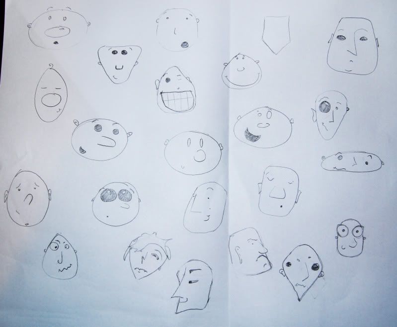
Sadly most of these faces are almost entirely the same, but it's because it took me a while to relax into trying different shapes, so there's about 3 on here that are actually pretty cool but other than that they're mostly just round-faced.
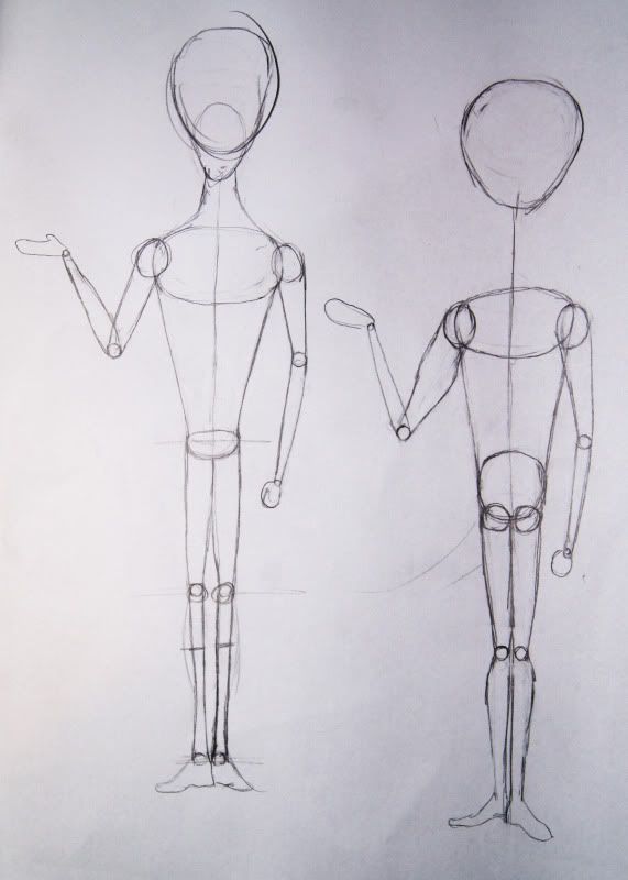
We then learnt about how to create varied body shapes using circles, we were then given a character each to work out the proportions of and how it would look in circles. Above is my attempt at creating Megamind and it's not too bad really! :D
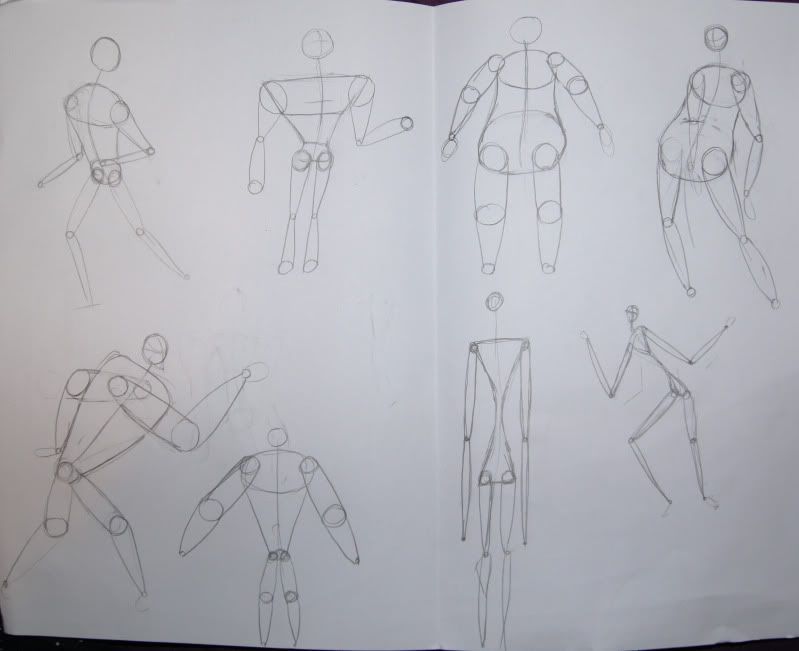
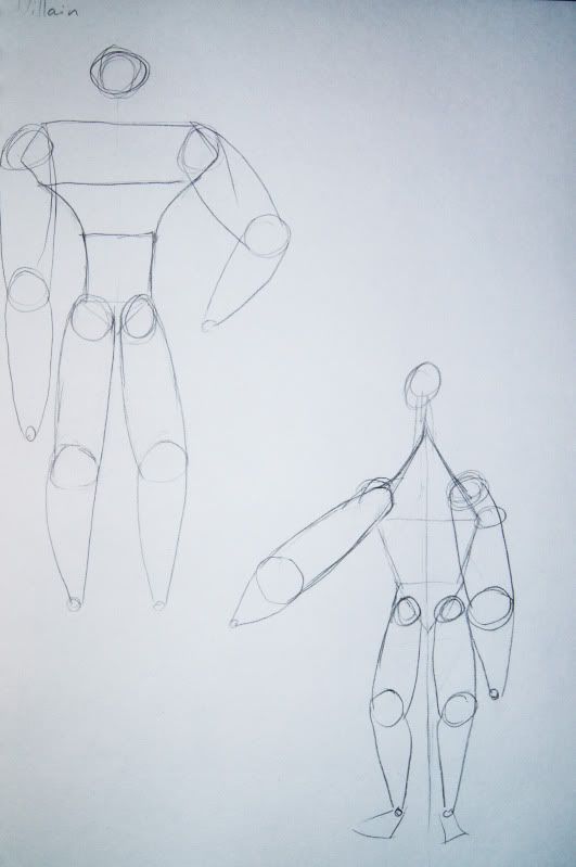
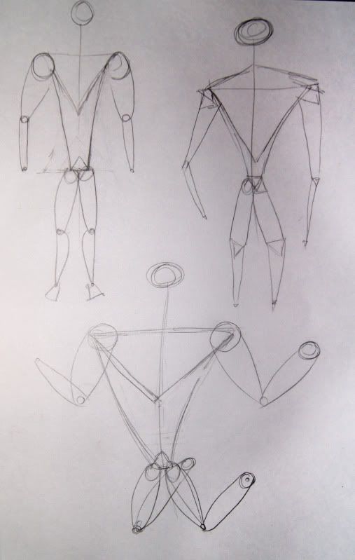
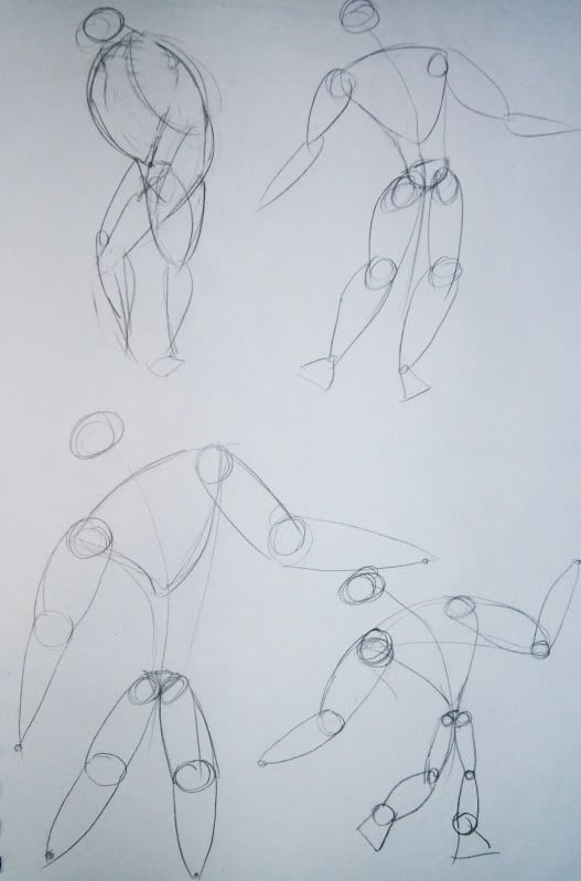
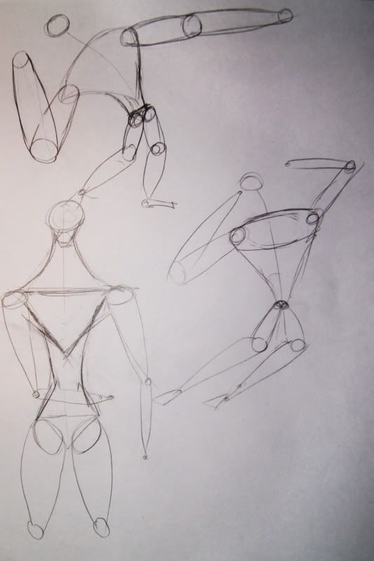
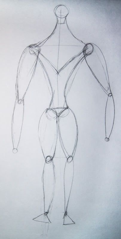
They're all pretty samey really. I was trying to create a villain with broad shoulders and triangles as his main shape but I don't really think any of them worked too well.
Hero:
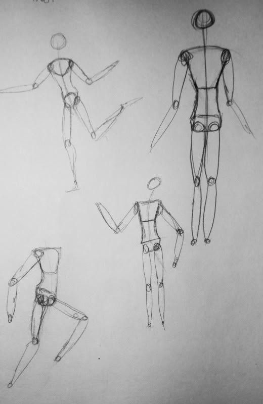
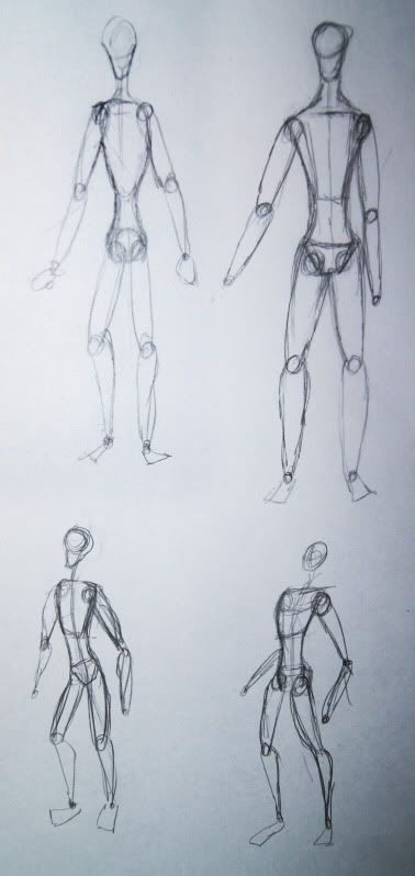
I want her body shape to be fairly normal, although I do want her to be more athletic than curvy so I tried using squarer shapes. Again, nothing too spectacular here, although I quite like the last one.
Sidekick:
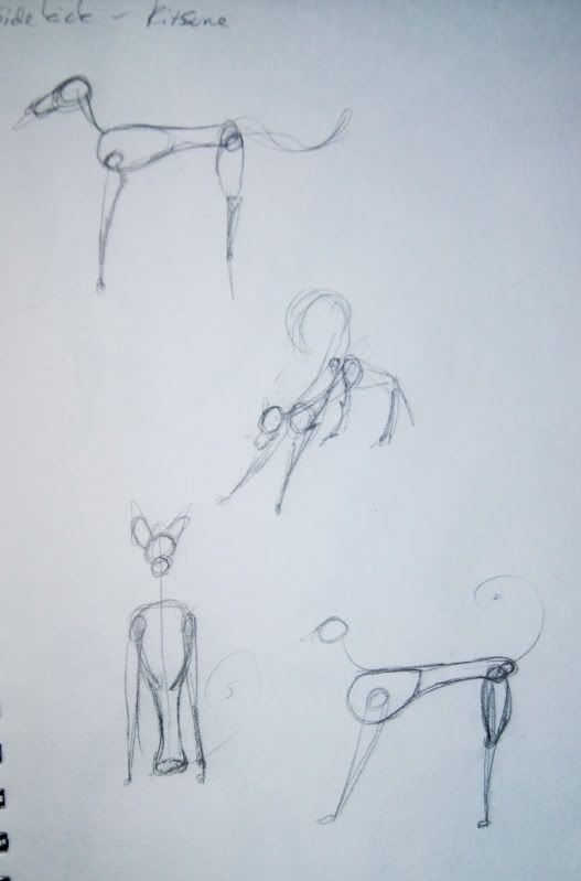
Yeah, definitely struggled with this one as it's supposed to be a stylised fox and I don't really know how to draw animals yet. I do know Justin's planning on covering it in a lesson though so that's all good! :D
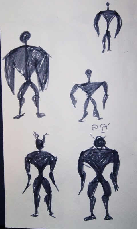
As I got a bit stale when I was experimenting with the body shapes I thought I'd have a go at some silhouettes, mostly for the villain as it's him that needs quite an exaggerated body shape.
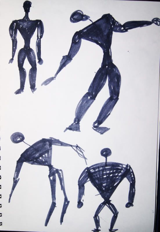
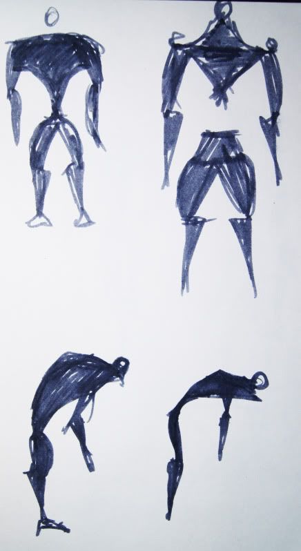
The silhouette on the right in the above photo is quite cool shapes wise, I'm just terrible at giving it the right shape waist, which is why it's empty at the moment.
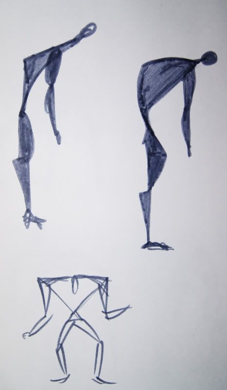
I think maybe a combination of the image I commented on and the above, right, hunched image would be something quite interesting. Needs a lot of work though!
As I felt I was getting staler I had a look in the Art of Zen book and just had a go at loosely drawing the hero in the below image:
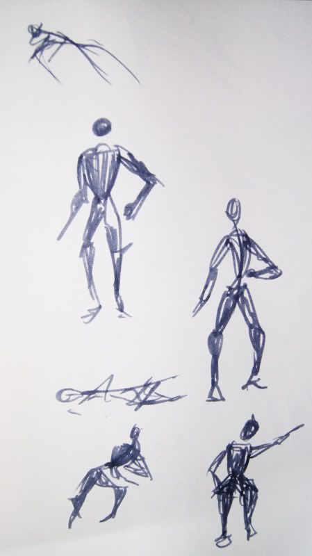
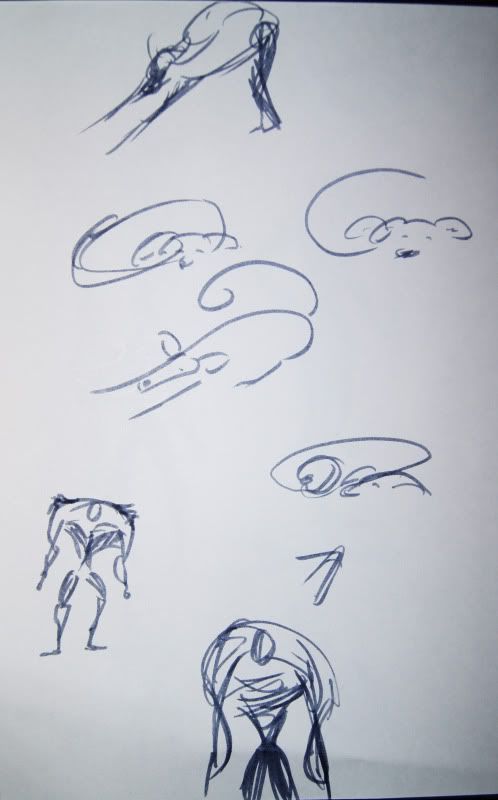
This image is of a few minimal and loose fox drawings and two hulking villain shapes. It's all nice but I'm not sure if it's that useful yet. I want to study the shapes in calligraphy a bit more really so I can finally get a style down. I think I like the mix of straight and curved lines, a bit Kim Possible-y in style would be pretty nice, but we shall see!

No comments:
Post a Comment