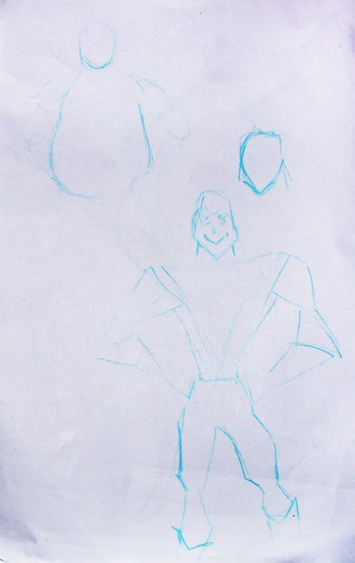
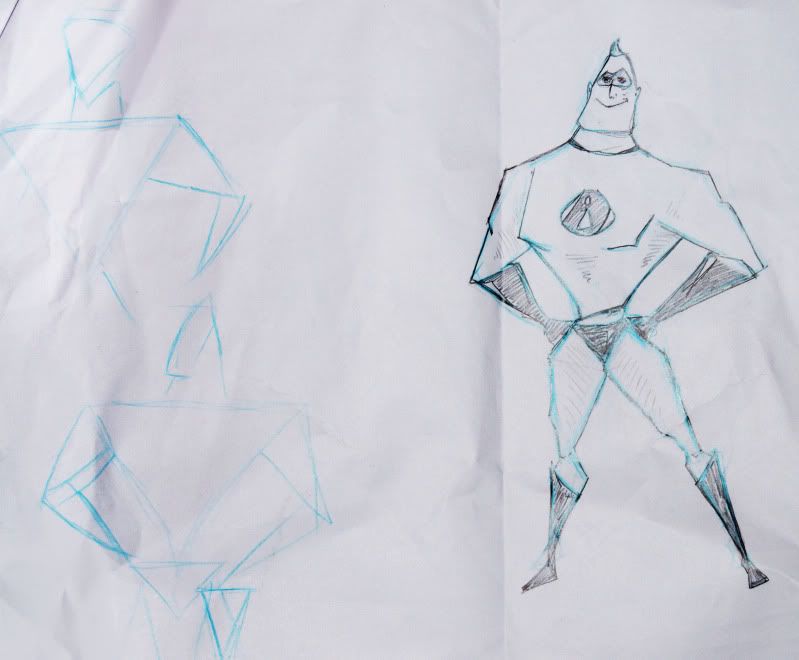
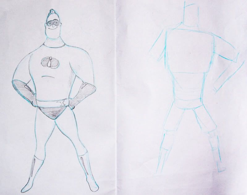
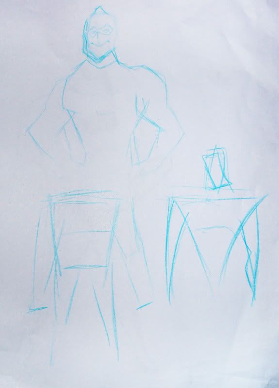
The first task was to draw a character we were given using one of the three shapes used in character design, but it had to be different to the original. My character was Mr. Incredible and I thought I'd use triangles:
Justin used the example of Hello Kitty as something that's completely simplified and below is my attempt at trying to capture it.
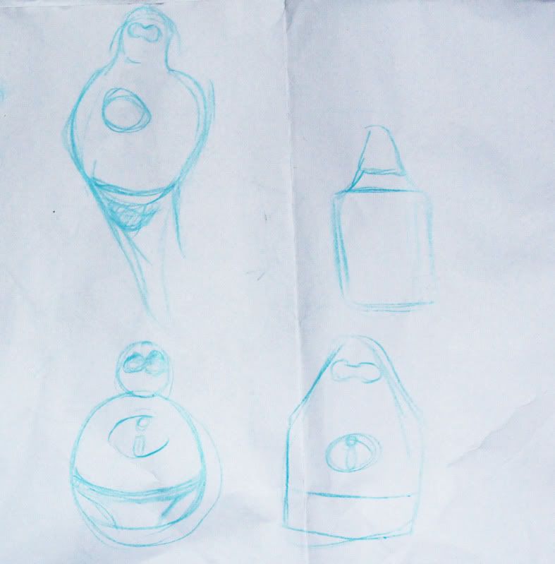
Again, I didn't really do so well and the tutorial ended shortly after this, but hopefully I'll be able to do much better work this week!

Its good to be challenged, i always think.Its especially hard to create an iconic image, stripping the character down to its essentails (about as anatomically correct as a lego man). I think your last two images are getting there. They still need limbs though -they are still essential to the character. South park is also a good example of iconic character design.
ReplyDeleteI definitely agree! You wouldn't learn anything if you weren't challenged so thank you for the feedback! Also, I can't believe I didn't think of South Park as an example! That'll be a great help so thank you! :D
ReplyDelete