 |
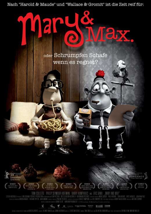
| Fig. 1 Mary and Max Poster |

Mary and Max is a wonderful example of how animation is for much more than entertaining children. It follows two very different characters as they share their lives with one another through their pen-pal relationship.
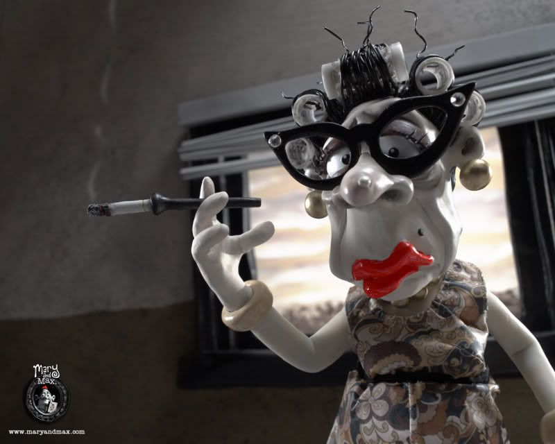 |
| Fig. 2 Character Design. |
These characters are that of an underprivileged and unfortunate small child, Mary (who ages through the film until adulthood), and a middle aged man, Max, that suffers from a serious form of the mental illness, asperger's syndrome. These characters are heartwarming and believable to the audience because they're so well written as well as designed. One of the most impactive parts of the animation is Elliot's choice of character design. The characters are very unique and stylised but they are still very realistic. Kenneth Priebe explains that "The
power of Elliot’s film lies in the brilliant writing, combined with
funny character design and a blend of humor and melancholy." (Priebe, 2010:54) It is this humour in the character design that makes the characters so believable, despite their styised appearances. All the characters are more caricatures of the personality they hold than realistic portrayals of people, but because of this the audience immediately grasps what kind of character they are before they have even spoken. The choice to have this caricature-like style also allows the film to cover some much more malevolent topics without it becoming too 'dark' for the medium. As Priebe mentioned previously, there is a well executed blend of 'humor and melancholy' that runs through the animation. This style of character design has allowed Elliot to discuss some very unsettling topics, from alcohol abuse to suicide attempts, subjects that wouldn't normally be found in an animated movie.
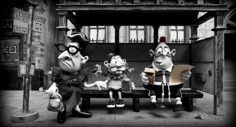 |
| Fig. 3 Melancholy. |
It is Elliot's unconventional choice for subject matter that not only effects the character design, but the mise en scene too. Mark Fischer expressed that "His
sombre-coloured claymation (all browns and greys) creates a world of
dysfunction, disorder and brutality, but even at its darkest moments his
film is suffused with a mordant comedy." (Fischer, 2010:66) This suggests that the dark, melancholic tone of the film is portrayed through the choice of colour and set design as much as it is the narrative. The set, especially in New York (see fig. 3), is
almost completely monochromatic, with the exception of certain
significant objects, such as an orange pompom that Mary sends to Max. The harsh grey tones emphasising the brutal reality of the city and allowing the audience into the world that Max sees. The audience watches as Max suffers from the consequences of his mental illness, his inability to lose weight to help his health and the permanent anxiety he suffers because of it. This dark and careless world that Max lives in is contrasted by the warmer, but just as drained of colour, world that Mary lives in. Their being at opposite sides of the world (as Mary lives in Australia) and different lifestyles are linked by the nostalgic, but discomforting, use of monochrome and sepia tones for them (as seen in fig. 1). They are like two different memories being stirred but for their significance rather that their fondness. The nostalgic tone is not necessarily just for conveying the film's tone, but because it is also based on a real story. Priebe discussed that "the film is dark, sad, poignant, and hilarious, all at the same time. [Adam] Elliot
drew from many personal experiences writing and directing the film,
basing it on a real pen-pal relationship he had and his thematic
exploration of people who are different." (Priebe, 2010:54-5)
The fact that Elliot based this on his own experiences supports the memory-like quality that the sepia and monochrome tones connote. This quality also adds to the poignancy of the subject matter. Elliot wanted to explore the theme of 'people who are different' and the difference in colour tone adds a visual representation of the differences between the two characters. It is these differences that make the comedy all the more enjoyable and poignant, and it is the comedy that makes the film that could be quite a heavy experience, a very enjoyable one for the audience.
List of Illustrations
Figure 1. Mary and Max (2009) Mary and Max
Poster. At:
http://images.moviepostershop.com/mary-and-max-movie-poster-2009-1020550958.jpg (Accessed on: 04.02.12)
Figure 2. Mary and Max (2009)
Character Design. At:
http://www.entertainmentwallpaper.com/images/desktops/movie/mary_and_max02.jpg (Accessed on: 04.02.12)
Figure 3. Mary and Max (2009)
Melancholy. At:
http://www.thefilmpilgrim.com/wp-content/uploads/2010/10/Mary-and-Max-Review.jpg (Accessed on: 04.02.12)
Bibliography
Fischer, Mark (2010)
Reviews: Mary and Max. In:
Sight & Sound 20 (11) pp.66
Priebe, Kenneth (2010)
Advanced Art of Stop-Motion Animation. USA: Course Technology.


nice review, Molly - good to see you keeping your usual standard nice and high! :)
ReplyDeleteThank you Phil! I feel like I'm getting a bit sloppy with them, so it's good to know I'm heading in the right direction again! :D
ReplyDelete