Monday, 28 February 2011
Princess Turnaround...
I think I accidently made her look older than I was hoping for, and I keep struggling to match the profile to the original face but at least she's almost in the right proportions :)
DVD Cover...
I thought I'd get this done so I could have a break between working and I think it's almost there:
I'm not sure if the image I used was too small and whether I need the text on there but I thought I'd just go for it. I wanted to keep it simple but this might be too simple, I'm not sure but I do know that it's and not too ugly relevant! :)
I'm not sure if the image I used was too small and whether I need the text on there but I thought I'd just go for it. I wanted to keep it simple but this might be too simple, I'm not sure but I do know that it's and not too ugly relevant! :)
Final Storyboard so far...
Sunday, 27 February 2011
@Phil , A little help please?
I'm starting to have a little panic now, so I thought before I start going mental I'd ask a couple of quick questions :P
I'm not sure what's been asked already so I'll just jump in:
I'm not sure what's been asked already so I'll just jump in:
- Music wise, I know you recommended using garage band, but I've never used it before so I'm a little worried about the idea of making my own music. Do we have to use it and make all our music ourself or could we pick appropriate classical pieces?
- On character sheets, is it just a turn around and the height comparisons we need to do or do we have to also include some facial expressions and other bits like that? I'll put in my silhouettes too I just want to know what we need.
- To do with the concept art, because I left it late I've done my concept art for the environments but I'm not sure if I have to then redo them as final environments or if I can just use the same images as long as I'm happy with them?
- Finally, for our presentation storyboards, are they the same ones we use for our animatic or are they different?
Sorry to ask so much I just really want to make sure I cover everything :S
Thanks for the help in advance! :)
Saturday, 26 February 2011
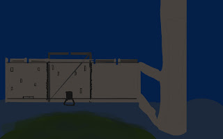
Kitchen Concept Art...
Not bad I think. It looks old and dirty and empty too which is also good as I want the King and Queen to look as though they're living beyond their means a bit.
Onwards to the storyboards! :D
Final Character Concept...
My guard:
I forgot to save as I went along with this one but he's pretty basic so there wasn't that much to see :)
Thursday, 24 February 2011
Penultimate Character Design...
My Miserable King and Queen:
I think their clothes need a lot of tweaking but the general premise is there I think :)
Third Character Developed...
Now it's the Prince's turn!
He's alright I think. Might need a bit more detail in his shirt but he's definitely got the right personality I think :D Very much like Gaston from Beauty and the Beast, but hopefully not too much :S
He's alright I think. Might need a bit more detail in his shirt but he's definitely got the right personality I think :D Very much like Gaston from Beauty and the Beast, but hopefully not too much :S
Subscribe to:
Comments (Atom)


