Tuesday, 30 April 2013

Dream Cleaners Intro *with SFX*...

I've got two versions, the first has lots of extra sound effects:


The second has none until the end:


I'm not sure which I prefer. It's important that I don't add anything unnecessary because I like the characters to speak for themselves with the music...so probably the second one really. Let me know what you think though! :)

Monday, 29 April 2013

Dream Cleaners Animated Intros...

I managed to find some pretty fun pieces of music at freeplaymusic.com so I  thought I'd have a go at putting a rough intro to the show together. The first attempt was this piece with the melody of 'Little Piggy' in the background:


The second attempt had a melody called 'Great New Day':


The second is my favourite, although I'm not sure that the wipes work so well in both. I may try out some circular wipes instead to see if it's a little more fun. I'll also be looking to add a few sound effects too. Not loads but enough to make it a little more exciting :D

Let me know what you think!


Saturday, 27 April 2013

The 'Dream Cleaners' Collection...

Here's round one of character intros:


There are still changes to be made and I'd like a moving group image if possible but it's an exciting step for sure! :D

Flossy!..


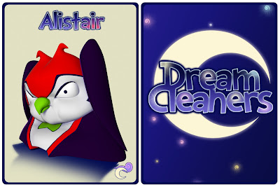
Cute! Alistair will be up shortly to complete the set :D


Friday, 26 April 2013

Nigel's Popped by to Say "Hello"..


Not entirely sure about the colour scheme for this one but that will be easier to work out once Alistair's introduction has been finished.

Getting Walter's Attention...


Once I've got a rough animation for each character I'll then start adding sound effects and planning out a mildly animated title sequence. This has all been super exciting so far, with 3 out of 6 done, I can't wait to do more :D

Clarissa Lives!..

Just a quick intro test again:


Cute! :D

Thursday, 25 April 2013

The Dream Cleaners Unite!..


The lighting still needs work, as do a few expressions, but overall they're a lovely bunch! :D

Updates and Animation!..

Today's been an interesting one for sure! I've got Clarissa's common and alternate trading cards:


The Natty model that may be almost ready for printing:


And last but definitely not least, I had a go at roughly animating a little introduction for Natty:


It's all becoming very exciting indeed! Especially after I saw her separated into all her parts and then how successful my quick animation was. It's starting to feel as if she's finally becoming a real toy and living character, and I can't quite believe it. Onwards!! :D

Tuesday, 23 April 2013

How Flossy's Texturing is 'Glowing'...

Ohhh puns, I must be tired :P

Anyway, here's how she's currently looking with and without glow:

It's important to visualise how she'd look if she were a toy version of herself that lights up. I keep forgetting to see it that way, but hopefully it'll help when I refine her a little more

The glowing image is still rough as I'd like to refine the curls a little more as well as the glowing moon and stars, but I do like that the spirals look like they're glowing now. I also made her a little lighter in tone which fits with her light yellow natural state, and I think I'll curve her body to look a little more energetic. However, I feel like she's slowly but surely getting somewhere I like and that's always reassuring at this late stage.

While I was having a break from Flossy I've been getting my Natty model ready for 3D printing. The plan is to get her printed in either 4 or 6 pieces which will then be moulded, cast, and put together. This will allow for a small amount of articulation which (all working out well) will add an extra charm to the toys. Fingers crossed for tomorrow! :)

Monday, 22 April 2013

@Everyone, Flossy Needs You!..

I'm having a go at making the colours for Flossy less aggressive and it's been a bit of a struggle. Here's what I have so far:


I think that both the first and third images work. I did try using blues but I wasn't too keen, I think she's definitely more of a pink character. I'll be stepping away for a bit to have a break and hopefully when I come back I'll have fresh eyes on the situation. In the meantime though, any feedback would be greatly appreciated :)


Sunday, 21 April 2013

Trading Card Updates!..

First off we have the newly improved Flossy both Natural and lit up:


I reverted back to the previous textures because, as much as I loved the girly pinkness of the earlier design, I think it was too much of a middle ground between the natural and lit states. This way she's still a cutie with a hint of the colours in the pastel spirals on her wool but you really don't see how bright she turns coming.

Next we have Natty, Walter and Clarissa:


Natty is sporting her sponge wand, Walter his unlimited bag of gadgets, and Clarissa is holding a much more energetic and cute pose.

Let me know what you think of the changes, I'm hoping to do an illuminated version of Clarissa soon and then another group picture finally! :D


Saturday, 20 April 2013

Flossy III...

I've had a lot of great ideas passed my way, particularly the one where I have a smaller, bouncier side-kick for the team. I absolutely love that idea but I feel that this kind of character doesn't suit flossy at all and seeing as there's so little time left, I can't really give a new side-kick the time it needs to be as adorable and fun as it deserves. So, here's how Flossy currently looks:


I tried smaller swirls very roughly, I don't think they work quite so well.
I can't quite get her swirls to feel right yet, I think they'll take a bit more blending to make them really feel part of her model and not stuck on there.

I also feel this is the most appropriate version so far. I'll play more with texturing tomorrow to see if I can get something that feels softer but all going well I'm looking forward to making her little wool tutu glow.

Let me know what you all think though! This is probably the final model I'll have (bar a few tweaks here and there and texturing where it's needed), so I'll really appreciate any feedback you have at this stage. :)


Friday, 19 April 2013

Character Updates...

Okay so here's how Flossy currently looks:

She's wooly but in a much softer way now. There's been a lot of too-ing and fro-ing with Flossy, one of the simplest characters and yet she's been the most difficult to portray!

One suggestion Alan gave me is that she could be a bouncy head with ears, which is really cute, but I don't think it's quite Flossy as she's a meeker character that bounces about when no ones looking. However, I would like to use this idea and after thinking about still using my iced gem character it would seem they're a great match.  Below is a very rough mock up of how they could look:


I'd want these to be creatures that are found everywhere but are particularly drawn to well lit areas, and are especially drawn to Flossy when she lights up, and sometimes just in general. They're not quite pests but they aren't really pets either, they're just a cute and sometimes awkward creature in the Land of Nod. I think I'd get rid of the face space altogether and have maybe just eyes peeking out for these creatures, I'll get a few rough sketches together and see what comes out though.

To give myself a break from the Flossy conundrum I decided to go back to the previous characters and give them their new props and tweaks.  I've given Natty her magical (but mostly practical) sponge wand:
Sponge with holes.
Sponge without holes.
Which do you prefer? Sponge with holes looks more like natural sponge, but also like cheese, and sponge without holes looks nicer but does it say sponge?

I've also made a satchel for Walter:

His bag of endless possibilities is where he keeps all his gadgets. He has something for every situation in there!

And Clarissa is looking much livelier in her new pose:
I'll tilt her head a little more towards the viewer next.
It's still coming along nicely it's just getting down to crunch time and the nerves are bubbling away. Hopefully after this weekend I'll at least have Flossy finished! :P


Thursday, 18 April 2013

@ Everyone, Flossy Needs Feedback!..

Okay so Flossy is going back to her more woolly roots and I'm currently trying to make her a nice combination of both the before an after. However, I'm getting a little stumped on which ears to choose so have a nose below:


Previously she had an asymmetric version of B.

These are very rough tests so she'll go back to having variances in her ears and she's currently more asymmetric when it comes to the wool on her face too. I'm torn between the slightly more sunken and meek ears from A and the brighter ears of B. There's always the asymmetric option of having one upright and the other like A but I'll wait and see what people think. :)

Monday, 15 April 2013

Flossy Updates...

Here we have nature, demure Flossy:


Here we have the first version of disco Flossy in the dark:

Render
First Composition
I quite like her! I've made sure that the bright colours match the natural ones too, but I thought that the bright pink was much more powerful than the blue that I had previously conceptualised.

Let me know what you think though! :D


Sunday, 14 April 2013

Flossy Update...

Okay we have two flavours of flossy currently:

Vanilla
Neoplolitan

She's definitely much more interesting now! I also want to make a few stars or spirals to go with her moon too. I can't decide whether to have her completely vanilla, and when she lights up she has the neopolitan stripes, or have them faintly on her from the start, but they glow much brighter when she lights up. I think the former would be a little more appropriate for her character. She starts off nothing special and vanilla and then POP! She's glowing pink and blue and yellow!

I also like her little pink booties but I'm not sure if the use of pink makes her a little too similar to Clarissa now? Let me know what you think though! :)


Saturday, 13 April 2013

Flossy Update...

I've made her a little softer and I think it's getting there now. Have a look below:


Her body's still a little harsh but it's nice that she's getting to a point where it's becoming about the details. I've also just seen a comment about making her ears hint towards wafers, so I'm thinking I'll make the one on the right ever so slightly more upright with the left hand one more lopsided to suggest that.

Pretty cool stuff and as always, let me know what you think! :)


Friday, 12 April 2013

Flossy Experiment...

Okay so seeing as I did something similar to Walter I thought I'd have a go at making Flossy more ice cream like too. Here's how she looks at the moment:

Quick sort-of-creepy Render
Walter for Comparison
I think it's cute and that it could work better than the wool. The geometry is still messy and she's obviously not textured but I think it could be a better solution than the previous lumpiness. One thing I'm not sure on though is that she kind of has a beard now because I tried giving her a mouth. I like the idea that she's got a mouth that's hidden until she smiles, so maybe the beardyness isn't such a bad thing if I tweak it enough.

It is REALLY hard to resist putting a cherry on top though...Anyway, I'll work on it more tomorrow and hopefully get some funky rough ideas of how this would look lit up too. Let me know what you think though!

Wednesday, 10 April 2013

Trading Cards: A Few Tweaks!..

Okay, so there's been a bit of additional tweaking to the characters over the last few days to refine them a little more.  Here's how they're all currently looking:


I've added eyelashes and eyebrows to their somewhat empty little faces. I've also added more refined spots and a super flash wristwatch to Walter, a few more sheep-like features to flossy; such as the ear tags (to represent her brighter colouring) and a bell tied around her neck with ribbon (to help her communicate and feel safer when the Nightmares are around). I've also added belt loops to Natty and a rather glamorous sash around Clarissa.  The latter two ladies also bear the logo on their belt and sash which adds a nice extra touch I think.

I'll put together a group image with the new changes soon, and this time with better lighting too I hope :)

Monday, 8 April 2013

Trading Cards: Walter's New Adjustments...

A new and improved Walter:


Following some feedback I've added some simple cuffs to his shirt, given his bow-tie a few jolly spots and adjusted the position of his arm to one that looks much better. I tried having the cuffs as different colours and the spots initially started as navy, but I felt that the darkness of the navy was too distracting and these cuffs seemed to be the only colour that matched the spots well. Good stuff though, let me know what you think! :)

Sunday, 7 April 2013

Trading Cards: Adjusting Walter's Hair Piece...

What has been seen cannot be unseen, so after a bit of feedback I've taken Walter's hair and tried to make it a little more ice cream-like. Here's how he's currently looking:


I've changed the position and added a few ridges based on the 99 ice cream shape, and also changed his facial expression a little so it's a bit clearer that he's a happy chappy. Let me know what you think! :D

Trading Cards: Update 01...

I've just tweaked the names to make them a little different to the title:


I really like the colours used. I also tried to make Nigel's a kind of inbetween, so he has his main colours but they're paler, like the Dream Cleaners are. :D


Saturday, 6 April 2013

Trading Cards: First Draft...

Here's how they're looking at the moment:


They're still not finishedm as the lighting and poses need more refinement, but it's really great to see them all together at least :D