Showing posts with label Film Review. Show all posts

Sunday, 29 April 2012

Tomm Moore's 'The Secret of Kells', 2009...


Photobucket
Fig. 1 The Secret of Kells poster.


Photobucket

The Secret of Kells is one of the most stunning animations you could watch.  Its swirling imagery of thriving forests to child-like chalk drawings on slate can be too much for the eye to take in, but this just makes it all the more wondrous.

Photobucket
Fig. 2 Dramatic visual style.
The aesthetics running through this film are what makes it so fantastically unique. Deeply rooted in both Celtic mythology and Christian art, it is constantly re-using iconic shapes and imagery to make sure the authenticity is never lost. Empire's, Helen O'Hara explained that "the art is astonishing – real snippets from the Book are shown, and its motifs and themes echo through the film in tiny details, especially in the scenes where Aisling introduces Brendan to the glories of the forest.." (O'Hara, 2010) The 'Book' she mentions is the Book of Kells. A stunningly illuminated version of the New Testament, found in Dublin, Ireland. Its illustrations are so intricate that its unbelievable that they were made circa 800 by human hands.  Each of the curling lines and intricate patterns is mirrored in all aspects of design.  In the environments, such as in fig. 1, everything is made from circles and curled lines, much like the illustrations in the book, and found in Celtic design.  The environments scream Celtic influences, all the complex patterns being suggested in everything from the seemingly 2D representation of space to the chalk blueprints s scrawled across the walls.

Photobucket
Fig. 3 Character Design.


Not only is the environment design stunning, but the character design is even more fascinating.  Each character is specifically 'shaped' for their personality and purpose in the narrative. Some of the shapes are so visually simple but their impact on the viewer is instant and powerful.  Sophie Ivan, Film4 critic, believes that "the abstract, stylized nature of the design - so far removed from the pristine hyper-realism so much popular animation strives for - creates an ethereal, numinous universe. It has hints of the magical silhouette animations of Lotte Reiniger, but is really unlike anything you've seen before." (Ivan, 2009) The design is incredibly simplistic, as simple as a well crafted silhouette, but just as powerful as a realistic portrayal of a person. Perhaps it is so much more effective because everything the audience reads from these designs is from a few suggestive lines and a well chosen shape. One of the most wonderful designs is Aisling, the spritely young forest spirit. She is as white as a ghost and flows around like one, her hair curling around as she spins and darts about the treetops.  Her wolf form is as round and pointed as she is, with the same emerald oval eyes.  Another is the Abbot of Kells' shape. He is the same shape as the window he watches from. As soon as the audience sees this, they know how long he must spend up there, with his neck already craned from the strain of watching over others.  All these simple suggestions make for a wonderful set of designs.


The Secret of Kells is a beautiful film, and because of its qualities, was nominated for an Oscar in 2010, but lost out to Pixar's Up. One reason this nomination is so important is because it is such a small film. Zahra Dowlatabadi and Catherine Winder exposed that "Films such as The Secret of Kells...have achieved critical success with much lower budgets than those of the typical major studio release." (Dowlatabadi, Winder, 2011: 64) It was mostly made between Ireland and Belgium, within a small team.  It is always fascinating to see what can be achieved in such a small group that are talented and driven.  Although it is a shame to have lost out at the Oscars, the film has earned some very well deserved honours and can be held as an original and inspired chunk of Irish, and animation, history.

List of Illustrations

Figure 1. The Secret of Kells (2009) The Secret of Kells poster. At: http://www.impawards.com/2010/secret_of_kells_ver2.html (Accessed on: 29.04.12)

Figure 2. The Secret of Kells (2009) Dramatic visual style. At: http://cabinet-of-wonders.blogspot.co.uk/2012/01/secret-of-kells.html (Accessed on: 29.04.12)

Figure 3. The Secret of Kells (2009) Character design. At: https://blogger.googleusercontent.com/img/b/R29vZ2xl/AVvXsEg-g_sb3b0IqaU65Zrq76qa5WdP7fFBnTIs8imLdvtQXISWMmQGKFmnDaLGQVc4AsxwRkwewGJ2nU3EqqZCFDm8QCePuM4XScsbxU12kqfIX3iDQH_3WQjP8M9nrMkv-mWOQ9oZ2Cmb4w/s1600/secret_of_kells_size_comparison_11_barry_reynolds.jpg (Accessed on: 29.04.12)


Bibliography

 O'Hara, Helen (2010) The Secret of Kells. In: Empire Online.com 28.09.2010 [online] At:  http://www.empireonline.com/reviews/reviewcomplete.asp?DVDID=118529  (Accessed on: 29.04.12)

Dowlatabadi, Zahra, Winder, Catherine (2011) Producing Animation. USA: Focal Press

Ivan, Sophie (2009) The Secret of Kells. In: Film4.com. At: http://www.film4.com/reviews/2009/the-secret-of-kells (Accessed on: 29.04.12)


Tuesday, 17 April 2012

Martin Rosen's 'Watership Down', 1978...


Photobucket
Fig. 1 Watership Down poster.
Photobucket

Watership Down has always been seen as a children's book.  Written by British author, Richard Adams, it is a tale of the extraordinary lives and adventures of a group of rabbits. However, the film carries some very mature themes and imagery that were perhaps not found in the book.

Photobucket
Fig. 2 Fiver and Hazel.
During the film, the audience is following a small group of rabbits that have narrowly escaped their almost certain deaths at the previous warren.  This was thanks to the unusually quirky young rabbit called Fiver.  He and his brother, Hazel are the main protagonists of the narrative. However, one of the reasons the rabbits are so compelling to watch is that they are voiced by wonderful British actors, such as the wonderfully talented John Hurt, as well as having well written ad likeable personalities.  Mary Trim explains that the characters, "In an ever rabbit way, they reflect human superstitions, struggles, hope and determination to survive against destructive elements. The characters are memorable: sensitive and clairvoyant Fiver, strong and aggressive Bigwig, witty Bluebell, hateful Black Rabbit who causes sickness and death, and the ever authoritative Hazel." (Trim, 2005: 121)  These characters, at first glance, are just rabbits.  With very few visual differences, they could easily be forgettable, but as Trim mentions, they are still memorable.  Their character traits, such as Bigwig's 'strong and aggressive' demeanour means that the audience always know that they, and the characters can rely on him to protect those that need it.
Photobucket
Fig. 3 Barbaric Woundwort.
Another reason the characters, and narrative, manages to be so gripping is the depiction of the struggles and  their consequences that the rabbits have to live through. Colin Manlove expressed that "Adams gives us a group of wild animals gripped by the imperative of survival, and a pastoral landscape bristling with threats, mostly from man. Death is always close, and reproduction its only answer: both these topics were unusual in children’s fiction before this time." (Manlove, 2003: 122) Due to this being a work of children's fiction, it would commonly be thought that it would be too simple for an adult audience to enjoy.  The lives of these rabbits though, are very similar to that of a struggling family, fighting everyday obstacles in order to get past each day.  However, these rabbits are faced with their own mortality, they are hunted and unintentionally killed each day either by farmers or wild animals.  These themes of death an violence really do make this an unusually mature piece of children's fiction.  Jerry Beck goes on to divulge that "The film is brutal at times, as is the book, not skimping on blood, and actually inserting two additional (and largely unnecessary) deaths not included in the original text. " (Beck, 2007: 307)  Not only are these rabbits faced with threats from outside sources, but they are even fighting threats from other rabbits.  One example, as seen in figure 3, is Woundwort.  This rabbit is violent and quick to hurt any other rabbit that should challenge his authority.  There are scenes in which this rabbit claws Bigwig, and another where it tears at another's throat.  These images, mixed with the very unsettling flashbacks from an exhausted and hallucinating rabbit, make for some very challenging and mature imagery for children. 

Despite its quite disturbing imagery, and the fact that it is seemingly about rabbits, Watership Down is in fact a very engaging and refreshing example of British animation.  Its solid voice casting and washed out colour palette really add to the tone of desperation and struggle that these characters are enduring, all in order to reach their safe-haven.  It was definitely the voice acting from John Hurt that makes it a 4* film though, excellent stuff!

List of Illustrations.

Figure 1. Watership Down (1978) Watership Down poster. At: http://204.244.128.121/assets/product_images/1020/313506.1020.A.jpg (Accessed: 17.04.12)

Figure 2. Watership Down (1978) Fiver and Hazel. At: https://blogger.googleusercontent.com/img/b/R29vZ2xl/AVvXsEjfGCJtOM18iMaBHFmQ4hYGYv4liGhWsZvwBhTcA8md4i5pEsr16lmzuUwzqK0q9u8UMil9zG0k9jQLIUnWnuTHQSdeJvoz0Zw1mZigLq9CUkKx95SqYJTCmpowoSbrL73jGV3ztwmdadG5/s400/Watership+Down+Pictures.jpg (Accessed: 17.04.12)

Figure 3. Watership Down (1978) Barbaric Woundwort. At: http://www.pastemagazine.com/blogs/lists/2008/12/15/watership-down.jpg (Accessed: 17.04.12)


Bibliography

Beck, Jerry (2007) Animated Movie Guide : The Ultimate Illustrated Reference to Cartoon, Stop-Motion and Computer-Generated Feature Films. USA: Chicago Review Press

Manlove, Colin (2003) From Alice to Harry Potter: Children's Fantasy in England. New Zealand: Cybereditions Corporation.

Trim, Mary (2005) Growing and Knowing : A Selection Guide for Children's Literature. Berlin: K.G. Saur.

Sunday, 8 April 2012

George Dunning's 'Yellow Submarine', 1968...

Photobucket
Fig. 1 Yellow Submarine poster.

Photobucket


Yellow Submarine was a surprising joy to watch and as charming as it is whacky, in visual style and narrative.

Photobucket
Fig. 2 Colours of Pepperland.


During the 1960's, when The Beatles were hugely popular in Britain, they had their own animated TV show. Sadly, it was not particularly endorsed by the band and because of that, they had little belief in the feature film that was to follow.  However, it was important to the film's production team that it was much more visually appropriate to their new style of music. This was all thanks to the discovery of German-born, Heinz Edelmann  Jerry Beck explains that "His flat, illustrative style that he utilized to design the characters of John, Paul, George, and Ringo, as well as all of the other creatures and locations in the film, was the perfect visual counterpart to the Beatles’ psychedelic music." (Beck, 2007: 321) The Beatles were just producing Sgt. Pepper's Lonely Hearts Club Band, their first album influenced by the psychedelia of the sixties and the producers of Yellow submarine had access to it before it had been relseased.  This allowed them to create a film that really is 'the perfect visual counterpart'.

Photobucket
Fig. 3  Abstraction.

The visual style of the film is very flat and illustrative, but this allows it to become something very psychedelic and transformative. Due to its psychedelic nature, the imagery used is completely unpredictable and seemingly random, but very charming in all its multi-coloured silliness. Caroline Westbrook believes that "Yellow Submarine’s deliriously silly humour, off the wall charm and wildly imaginative imagery (it might be billed as a family film, but there’s some seriously scary stuff here) paper[s] over any cracks in the storyline and most of the occasionally wayward vocal impersonations."  (Westbrook, 2006)  Yellow Submarine is wildly imaginative, it channels the same kind of unpredictable silliness that Terry Gilliam later used for the Monty Python animated sequences.  However, there are some particularly disturbing images, such as strange imaginary creatures eating each other and monsters with teeth in their bellies. Despite the few unsettling creations, this was made essentially for family viewing which is perhaps why it was so charming to watch.  Michael R. Frontani expressed that "the film is an inspired amalgam of animation styles that...provides the audience with a rich audio and visual experience while promoting the Beatles’ connections to a family-friendly counter-cultural ideal (lots of love; no drugs." (Frontani, 2007: 174) Due to The Beatles current success, it was important that the film contain all 'family'friendly' themes and images. The themes running through the film are ones of love and caring to others, leaving the only reference to any kind of drug in the psychedelic and kaleidescopic imagery.

Yellow Submarine is a great example of what can be achieved by a small animation team in Britain, that only has 11 months to produce a feature film in.  The constant morphing from one colourful creation to the next leaves the audience enthralled, confused but charmed and intrigued at the same time.

List of Illustrations.

Figure 1. Yellow Submarine (1968) Yellow Submarine poster. At: http://one1more2time3.files.wordpress.com/2009/10/edelmann1434.jpg (Accessed on: 08.04.12)

Figure 2. Yellow Submarine (1968) People. AT: http://img159.imageshack.us/img159/9830/ys05ow5.png (Accessed on: 08.04.12)

Figure 3. Yellow Submarine (1968) Funk room. At: http://img159.imageshack.us/img159/9499/ys02vg9.png (Accessed on: 08.04.12)

Bibliography

Beck, Jerry. (2007) Animated Movie Guide : The Ultimate Illustrated Reference to Cartoon, Stop-Motion and Computer-Generated Feature Films. USA: Chicago Review Press.

Frontani, Michael R. (2007) Beatles : Image and the Media. USA: University Press of Mississippi.

Westbrook, Caroline (2006)  Yellow Submarine. In: Empire Online.com 03.02.2006 [online] At:  http://www.empireonline.com/reviews/reviewcomplete.asp?DVDID=5112 (Accessed on: 08.04.12)

Saturday, 7 April 2012

Marjane Satrapi & Vincent Paronnaud's 'Persepolis', 2007...


Photobucket
Fig.1 Persepolis poster.
Photobucket

Persepolis is an autobiographical film full of as much heart as any traditional animation could need, but it carries a heavy soul with it too.

Photobucket
Fig. 2 Learning the cultural traditions.
The film is a personal telling of the escape of a young Iranian girl and her family from the chaos of the 1979 Iranian Revolution.  It was a time when the country was in a state of disarray, it's current monarchy under the  Shah, Mohammad Reza Pahlavi was about to be overthrown and replaced by a democratic Islamic Republic. The reason this film is so effective is because it is such a personal account.  Much like Waltz with Bashir, Persepolis is a first hand account of a traumatic experience for the protagonist and because of this, the audience can relate to and empathise with what is happening. Gillian Whitlock explained that   "These autobiographies are narratives of trauma that remain preoccupied with an experience of estrangement, a “little death” of the self and a painful loss of the known world." (Whitlock, 2010, 165) The film is about the struggle of the family and a young girl's efforts to try to fit in with a restrictingly religious influence around her and a new beginning in unfamiliar territory.  This estrangement is what makes her development so fascinating. She starts to be more and more influenced by western culture and begins to fall in love with the freedoms associated with it.
Photobucket
Fig. 3 Coming-of-age.
As well as being a story of the trauma of estrangement from your home into unfamiliar lands, it is also a story of a young girl's coming-of-age. The young heroine starts her life in the chaotic and restrictive country of Iran and spends her teenage years in France, a country full of freedoms and diversity.  For the first time in her life she is around the culture she has been so excited by and it allows her to become whoever she wants.  Hillary L. Chute believes that "Marjane Satrapi’s account of her youth in Tehran, Persepolis, along with work by a range of American authors, exemplifies how graphic narrative envisions an everyday reality of girls’ and women’s lives, picturing what is often placed outside of public discourse." (Chute, 2010:5)  Persepolis allows the audience to see the world that they would never get to experience otherwise.  The protagonist, Marjane, has provided them with a wonderful example of the life of a woman in her position. She is a refugee from her home country and she is struggling to fit in with a culture that holds her back from everything she wants to be.  Marjane is a confident and outspoken youth, that loves to live her life with the freedoms of western culture, she can't be restricted by her homes values, no matter how much she cares for her family.

Persepolis was a thoroughly enjoyable film that has a sense of humour even through the struggles Marjane and her family experience. One of the most enjoyable elements of this film is its visual style. Helen O'Hara expressed that  "This largely black-and-white, defiantly undetailed and sometimes stylised film could have been made at any point since the dawn of cinema, and yet it’s a thoroughly modern affair." (O'Hara, 2008) The themes of this film are entirely modern but its visual style is eye catching to say the least.  It originated as a graphic novel and its style has been translated to film perfectly. Its use of majoritvely monochrome colouring adds to the tone making is basic and clear to understand but the thick black adds to the atmosphere, especially at the more unpredictable times in the narrative.

List of Illustrations 

Figure 1. Persepolis (2007) Persepolis poster. At: http://i2.listal.com/image/301720/600full-persepolis-poster.jpg (Accessed on 07.04.12)

Figure 2. Persepolis (2007) Learning the cultural traditions. At: http://www.gamespite.net/img/blogart/0802feb/080203_persepolis02.jpg  (Accessed on 07.04.12)

Figure 3. Persepolis (2007) Coming of age. At: http://www.gamespite.net/img/blogart/0802feb/080203_persepolis03.jpg (Accessed on 07.04.12)


Bibliography

Whitlock, Gillian (2010) Soft Weapons: Autobiography in Transit. USA: University of Chicago Press.
Chute, Hillary L. (2010) Graphic Women : Life Narrative and Contemporary Comics. USA: Columbia University Press.

O'Hara, Helen (2008) Persepolis. In: Empire Online.com 05.04.2008 [online] At:  http://www.empireonline.com/reviews/reviewcomplete.asp?DVDID=117873  (Accessed on: 14.04.12)

Tuesday, 3 April 2012

Sylvan Chomet's 'Belleville Rendez-vous', 2003...

Photobucket
Fig. 1 Belleville Rendez-vouz poster.
Photobucket


Belleville Rendez-vous was a wonderful example of how traditional animation is still hugely charming and enchanting to watch.  One of the most enjoyable things about that film is its unabashed love of the extremes of animation, whether its in its character design or comically timed rolling cars.


Photobucket
Fig. 2 The Triplets of Belleville perform.
One of the first things the audience is introduced to is a nostaligc, sepia toned muscical sequence starrring the young Triplets of Bellville in a swinging 1920's club.  Chris Barsanti expressed that
"This films is best described as a chase with musical interludes, and as such is a free wheeling, foot-tapping delight." (Barsanti, 2011:182) This opening sequence is a great example of that. Before it feels like the film has even started the audience is introduced to this very catchy and 'foot-tapping' music.  The audience then realises what kind of film this is going to be and because of that the next most noticable feature of the film is its complete lack of dialogue.  Angie Jones and Jamie Oliff explain that "The Triplets Belleville (2003): dialogue the whole film. Proving adage about using dialogue as a last resort in a big way." (Jones, Oliff, 2006:280)  Although it is a very noticable feature of Chomet's film, it does not leave a hole for the viewer.  There is no need for the film to have any dialogue because the visual style and musical elements speak volumes for the characters.  Although the film would not have been ruined by having some verbal character interaction, which is proved by the few words that are exchanged in the film, it is a testament to the visual and aural narrative techniques that the audience is still enthralled in the film's development.

Photobucket
Fig. 3 Extremes of character design.

Although auditory elements of the film are very important to the success of the film, it is through the extreme and wonderful character design that its charm is secured.  This is where Chomet's use of extremes is really shown; one example is his having severely square henchman that are the same in everyway, including their movements. Jerry Beck divulged that "Chomet describes his style as being based on mime and character acting, and being influenced by live camerawork to animation." (Beck, 2007:292) One of the reasons that mime artists are so fascinating is that they manage to portray an extreme version of reality. They act more physcically than a traditional actor would because they are not to use any form of verbal language when performing. They are trying to portray a character without verbally expressing their personality.  When watching Belleville you soon realise that Beck has a point.  The characters don't speak at all during the film, all the words are in their actions.  One of the reasons their actions can be so over-the-top is because of the way they are designed.  The henchmen, seen in figure 3, move very blocky and efficiently. They are as stiff as their suits and as excited as their expression dictates.  Another great example are the cyclists in the Tour de France.  They have beyond huge leg muscles and long bony faces that scream with pain at their exhaustion.  The design of the characters reflects their movements, as the mime mimics their emotions.


Belleville Rendez-vous was an exciting, charming and beautiful film with an amazing ability to win over even the most difficult viewers.  Though there were menacing themes ,the film was light with a joyous heart and beat running through it.  A wonderful example of the magic of 2D animation.


List of Illustrations

Figure 1. Belleville Rendez-vous (2003) Belleville Rendez-vous poster. At: http://www.movieposterdb.com/poster/05828db5 (Accessed on: 03.04.12)


Figure 2. Belleville Rendez-vous (2003) The Triplets of Belleville perform. At: http://www.film4.com/images/belleville-rendez-vous-2002-01.jpg  (Accessed on: 03.04.12)

Figure 1. Belleville Rendez-vous (2003) Extremes of character design. At: http://www.dvdactive.com/images/reviews/screenshot/2004/4/triplets_of_belleville_4.jpg (Accessed on: 03.04.12)
Bibliography

Barsanti, Chris (2011) Filmology. USA: Adams Media

Beck, Jerry (2007) Animated Movie Guide : The Ultimate Illustrated Reference to Cartoon, Stop-Motion and Computer-Generated Feature Films. USA: Chicago Review Press.

Jones, Angie Oliff, Jamie (2006) Thinking Animation : Bridging the Path Between 2D and CG. USA: Course Technology


Monday, 12 March 2012

Ari Folman's 'Waltz with Bashir', (2008)...


Photobucket
Fig. 1 Waltz with Bashir poster.


Ari Folman's Waltz with Bashir is a fantastic and innovative way to portray a documentary film. From start to finish it grabs the audience by the throat and pulls them into a film covering some serious subject matter. The narrative that runs through this documentary is the need for the lead character, Ari Folman; who is also the writer and director of the film, to discover his past.

Before talking about the stunning art style and the innovative portrayal of a documentary, it is important to understand the context of this particular documentary. This film reveals a part of Israel's history that the country itself has struggled with. Waltz with Bashir is the first film to emerge from the country since the 60's and why they allowed it to be an animation is very intriguing, Perhaps due to the idea that animation is not taken as seriously as a traditional live action film is. It is only a cartoon so it can not be portraying real and serious issues. No matter what the reasoning, it allowed Folman to touch on some particularly important and shocking events in his and his fellow country men's lives. All of it stems from when Israeli military invaded Lebanon in 1982. The country was suffering from violent civil unrest and the current president "Bachir Gemayel” was believed to have been assassinated by Palestinian militants. This lead to a series of horrific murders by the "Lebanese Christian Phalangist militia, in the Sabra and Shatila Palestinian refugee camps in Beirut, Lebanon”. Ari Folman was part of the armed forces that were involved in   


Photobucket
Fig. 2 Soldiers firing flares.
Though the massacres are horrific, and something that could easily be represented with damning violence in a film, Waltz with Bashir instead focuses on a much more personal expression of the events. As writer, Alice Rothchild, expressed, that "Waltz with Bashir, by Ari Folman, explored an Israeli soldier’s search for his lost memories regarding his participation in the brutal massacres in Sabra and Shatilla, both damning the IDF and exposing us to the trauma that young soldiers experience fighting Israel’s wars." (Rothchild, 2010:261) Though the events displayed in the film are clearly distressing and horrendous acts of violence by a dominant and aggressive outside force, the audience is not being lead to only experience how awful the perpetrators are but how these actions effect those involved. For example, the audience follows around Ari Folman as a young soldier. As a matured man, he recollects his actions gradually as he discovers new memories. As film reviewer, Dan Jolin explains, "Here we see warfare not just on the sensory level but also on the subconscious: recollection, fever-dream and immediate experience all at once" (Jolin, 2008) The audience is welcomed into Folman's new world of memories first through a lucid vision that seems more like a dream than something that could have actually occurred. His body has prevented him from fully remembering his involvement in the massacre for over 20 years, now, as he pushes towards away at it, cracks start to appear, revealing memories he never knew he had. These memories are gradually more realistically portrayed as the film goes on, representing the writer's clarity of mind as he interviews more and more people involved in Beirut that day.

Photobucket
Fig. 3 Graphic novel style.
Ari Folman was discovering a huge and possibly devastating part of his and his country's past. To successfully represent this visuals is extremely important. As writer, Bill Nichols, believes: “The event haunts him for years afterwards and the animated images give graphic representation to the agony, isolation, and despair that he, and others, subsequently felt."(Nichols, 2010:111) This can be seen as showing Folman's complete success in getting across the documentary's tone and atmosphere to match the content. To represent these events in an animated style is very difficult as it would need to be as bold and powerful as the subject it is showing. Waltz with Bashir is a prime example of when style succeeds to match the heavy message it is trying to portray. Visually, its heavily inked graphic novel style makes it an incredibly modern take on the very typical documentary genre. Nichols went on to EXPLAIN that the animation style "clearly possess[es] a strongly subjective, even expressionistic, quality. They attempt to see war as the disoriented, confused Israeli soldiers, including the filmmaker, saw it...As a representation of subjective states of mind, the film achieves a high degree of plausibility even as it departs from any standard sense of documentary realism." (Nichols, 2010:13-4) Despite the film's use of a sometimes expressionistic quality as it tries to visually recreate the soldiers' state of mind, it still manages to retain the plausibility and power that the realism found in a traditional documentary would have.


The film is a brave look into the world of a soldier during that horrible time in Lebanon. It manages to portray the horror that every day warfare would bring, while accompanied by the blackest humour the soldiers would have to keep their spirits up. The final sequence is possibly one of the most powerful ways the film could have ended and because of that, on top of the stunning quality of visuals and writing, it deserves every reward it received.


List of Illustrations

Figure 1. Waltz with Bashir (2008) Waltz with Bashir poster. At: http://www.impawards.com/intl/misc/2008/waltz_with_bashir.html (Accessed on: 12.03.12)

Figure 2. Waltz with Bashir (2008) Soldiers firing flares. At: http://graphics8.nytimes.com/images/2008/12/26/movies/26bash.xlarge3.jpg (Accessed on: 12.03.12)


Figure 3. Waltz with Bashir (2008) Graphic novel style. At: http://collider.com/uploads/imageGallery/Waltz_with_Bashir/waltz_with_bashir_movie_image__2_.jpg (Accessed on: 12.03.12)


Bibliography

Jolin, Dan (2008) Waltz with Bashir. In: Empire Online.com 17.11.2008 [online] At: http://www.empireonline.com/reviews/reviewcomplete.asp?DVDID=118051 (Accessed on: 12.03.12)

Nichols, Bill (2010) Introduction to Documentary. USA: Indiana University Press.

Rothchild, Alice (2010) Broken Promises, Broken Dreams : Stories of Jewish and Palestinian Trauma and Resilience. GBR: Pluto Press

Monday, 5 March 2012

Hiromasa Yonebayashi's 'Arrietty', (2010)...

Photobucket
Fig. 1 Arrietty poster.
Photobucket


Arrietty was a visually beautiful film with a lot of heart and wonder for the mundane and everyday objects surrounding us. Every shot is a plethora of colour and life so vibrant that it becomes difficult to pay attention to the dialogue.  The viewers eyes are constantly finding new and wonderful things to look at, which were made all the more ingenious when you realise who they belong to.  The narrative is that of a family of miniature people, known as 'the borrowers'. Based on the book by English author, Mary Norton, the film follows Arrietty, a young girl that has just discovered the wonders of the human world in order to come of age.

Photobucket
Fig. 2 Arrietty's room.

Arrietty is unlike her parents, she sees the human world as a new adventure filled with undiscovered treasures to reveal. One of the first things the audience learns about Studio Ghibli's newest heroine is her agility and confidence when faced with an opposing force.  She is sprightly in her movement as well as personality, delighting in popping out and getting bits of plants to decorate her beautifully illustrated room.  The very first living space the audience is introduced to is Arrietty's room (as seen in figure 1). Filled with luscious greens, pinks and oranges, it shows not only Arrietty's youth but her innocence too.  She fills her room with flowers and berries of bright colours, which when contrasted to the rest of the much more practical house makes her seem even more charming and naive.  Another aspect of her room is the scale of it.  When she is in there you can see that her bed seems normal, but there are huge heads of wheat and berries the size of melons hanging from the ceiling.  Alerting the audience to the reality of her size difference to the rest of the human world we know.

Photobucket
Fig. 3 Extreme scale difference.
One of the strongest and most charming elements of this film is the use of scale throughout. The audience is lovingly introduced to the beauty of the giant size flowers and the huge leaves that protect Arrietty from the dangers around her.  Not only is the scale used to make something visually appealling but it is also used to portray extreme differences in size. As Dan Jolin from Empire Magazine explained that Arrietty's first "‘borrowing’ is breathtakingly realised, both in terms of how Yonebayashi convincingly portrays the mundane as gargantuan and through some astonishing sound design, as what would be tiny taps and clicks to us boom resoundingly for the Clocks. One scene imbues a kitchen with a vastly cavernous, cathedral-like awesomeness, whose sheer faces (cupboard doors, table legs) are scaled nimbly by Arrietty and her father." (Jolin, 2011) As seen in figure 3, Arrietty is delicately standing on the edge of what would be the skirting on an average food cupboard for us, but to her it is the only thing between her safety and the sheer drop below.  This cavernous kitchen echoes around the sounds that the audience would normally think nothing of, and makes them realise how dramatic they would actually be to someone so small.

Arrietty is a beautiful example of how 2D animation is still a stunning way of portraying animation as art while still portraying a lovable and charming story.  After watching these 3 films from Japan; Akira, Paprika and now Arietty, it's a great insight into the various themes that are emerging from that nation.   Akira contained themes from Japanese culture; youth that gone out of control and struggling to accept adulthood. They live in the shadow of the bomb but are too young to have felt any of the consequences, and thus feel even more estranged from the adults that do.  Paprika, which is influence by the surrealer elements from western culture (especially Terry Gilliam), is a dream-like experience filled with vivid life and colour. Its themes are more international as it shows the consequences of virtual terrorism but focuses more on the visual experience than the narrative themes. Finally, Arrietty is a luscious animation that is entirely influenced by western culture.  It is a lovely film with disney-like themes and visuals, focusing on the charm and wonder of a new undiscovered world.

List of Illustrations

Figure 1. Arrietty (2010) Arrietty poster. At: http://www.impawards.com/intl/japan/2010/karigurashi_no_arietti_ver2_xlg.html (Accessed on: ) 
Figure 2. Arrietty (2010) Arrietty's bedroom. At: http://alualuna.files.wordpress.com/2011/09/arrietty-9.jpg

Figure 3. Arrietty (2010) Extreme scale difference. At: http://genkinahito.files.wordpress.com/2011/08/arrietty-kitchen.jpg

Bibliography

Jolin, Dan (2011) Arrietty. In: Empire Online.com 25/7/11 [online] At: http://www.empireonline.com/reviews/reviewcomplete.asp?DVDID=118899 (Accessed on: 05/03/12)


Monday, 20 February 2012

Satoshi Kon's 'Paprika' (2006)...


Photobucket
Fig. 1 Paprika Poster.
Photobucket

Satoshi Kon's Paprika is a mind-melting dream-like animation that is much more of an experience than an exploration in narrative.  It is vibrant and thrilling with a fantastic soundtrack to support its very strange but wonderful visuals.  Paprika is only Kon's fourth feature length animation, but it is clear from the fantastical visuals that he is very talented at timing and creating atmosphere, whether it is an unsettling or dream-like one.  Mark W. MacWilliams explains that "Kon worked under Akira creator Katsuhiro Otomo...In fact, it was Otomo who recommended Kon as the director of Perfecmact Blue [Perfect Blue]. Kon has gone on to direct other critically acclaimed films, most recently, Papurika (Paprika, 2006)" (MacWilliams, 2008:58) Perfect Blue, an animated crime thriller, was Kon's directorial debut. The fact that Katsuhiro Otomo, a very successful director and writer himself, recommended Kon for the job is a big suggestion about how good he was, and his films since have been just as powerful whether for their visuals or narrative.


Photobucket
Fig. 2 Warped dream hallway.

The central theme in Paprika is the use of dreams as a vehicle into the minds of others.  A new machine has been invented that allows for the wearer's dreams to be recorded onto a computer and watched back.  This leads to the machine gaining too much power and, with sinister help, unleashing dreams into reality.  Frenchy Lunning expressed that "Paprika reinvents some well-known concepts— that dreams are windows into other realities and have great power, that the boundaries of self are not set by consensus reality, that troubles stew in the worlds revealed by dreams, and that dreams can be accessed like playing a DVD with the bio-psycho-electronic DC-Mini machine in the film." (Lunning, 2009: 326)  Dreams have always been considered significant when it comes to understanding the subconscious mind.  Although some believe them to be just jumbles of thoughts from the previous day, others consider them to be revealing of the person's inner desires.  To see a dream in the real world would allow the viewer to glance through a window into the dreamer's reality while they are sleeping. To then put this onto a DVD and watch it back combines the ethereal dream realm with a harsh mechanical reality that leads to a much more convoluted and unpredictable reality.  It is this convoluted reality that was caused by the twisted desires of the films villain. As MacWilliams divulged, that Paprika is "a disturbing science fiction feature film about the possibilities of psycho-terrorism." (MacWilliams, 2008:275) The film's villain, a crippled old man that desires power, wants nothing more than to take control of the world around him by removing all light and spreading his warped nightmarish darkness into the world.


Photobucket
Fig. 3 Dr. Chiba and her alter-ego Paprika.


The dreams in Paprika seem completely random to the audience.  Without any further examination they resemble a random collection of toys, household furniture and objects dancing around in a parade-like fashion.  However, when Lunning believes that "Dreams are a playground of primal needs, emotions, fears, and desires." (Lunning, 2009: 327) these seemingly random objects can be interpreted as having much deeper meanings.  One scene that is significant is when the central character, Dr. Chiba, confronts the villain of the film.  Lunning continues that"Of these, [desires] what the Freudians call “oral needs” are basic... in the crucial scene of the film, she/they cheerfully devours the now immense bad guy, Chairman— all of him— in one hugely hungry moment of pure incorporative appetite." (Lunning, 2009: 327)  Dr.Chiba, now combined with her alter-ego Paprika, take 3 huge gulps of the Chairman and swallow him and all of his dark energy up completely.  After every large gulp they age a decade or so, starting as a small adolescent child that develops into a grown woman with the final swallow of the chairman.  Though the defeat of the chairman and the complete destruction of his nightmarish rein is the main focus, the swallowing of him is also significant.  Sigmund Freud believed that there are several stages in a child's development, Nick Rennison explained that "Each stage is characterised by the particular ways in which the child gains sexual pleasure. The first stage is the ‘oral stage’ in which the emphasis is, as the name makes clear, on the mouth." (Rennison, 2001:35) This 'oral stage' is characterised in adults by a need to enjoy things orally, such as smoking or eating. In this scene Dr. Chiba develops physically through her eating of the chairman. She begins as a baby with the desire to consume through her mouth, and through the consumption she develops physically into a satisfied woman.

Paprika was thoroughly enjoyable and as Lunning puts it: "Kon’s film is a delightful fantasy/allegory about consensus reality versus freedom and creativity. In the end art and freedom win, and the film feels like springtime." (Lunning, 2009: 328) It was a glorious visual treat that revels in the colour, movement and chaos it portrays. It is a shame that Satoshi Kon will not be able to direct anymore films but with one more on the way it will hopefully be as energetic as the rest.


List of Illustrations

Figure 1. Paprika (2006) Paprika poster. At: http://www.impawards.com/2006/posters/paprika_xlg.jpg (Accessed on: 22.02.12)

Figure 2. Paprika (2006) Warped dream hallway. At: http://img406.imageshack.us/img406/1511/paprika2006dvdripxvidac.jpg (Accessed on: 22.02.12)
Figure 3. Paprika (2006) Dr. Chiba and her alter-ego Paprika.. At: http://animemovieguide.com/wp-content/uploads/2011/03/paprika.jpg (Accessed on: 22.02.12)

Bibliography

Lunning, Frenchy (2009) Mechademia 4. USA: University of Minnesota Press.

MacWilliams, Mark W. (2008) Japanese Visual Culture : Explorations in the World of Manga and Anime. USA: M.E. Sharpe, Inc.

Rennison, Nick (2001) Sigmund Freud. GBR: Pocket Essentials.

Sunday, 12 February 2012

Katsuhiro Otomo's 'Akira', (1988)...


Photobucket
Fig. 1 Akira Poster
Photobucket

Akira, very basically, is a story of military and scientific power gone horribly wrong. They have begun meddling with a source of power much greater than they could have foreseen, inevitably losing control and their lives to it.  One of the reasons that Akira is so poignant though is not just because it plays on people's fear of the unknown and uncontrollable, but the fear of past experiences.

Photobucket
Fig. 2 Obliteration of Neo Tokyo.
One reason the subject matter is so effective to Japanese audiences is due to the cultural context of it.  In 1945, Hiroshima and Nagasaki were bombed with nuclear warheads, which is an unthinkable and terrible memory for the country, and for anyone that experienced it.  The imagery seen in Akira (see figure 2) really resonates with that experience. In the opening sequence, and in the final one also, there is use of the silence and bright light, followed by a terrifying and powerful cloud that spreads across the city and leaves only destruction and death behind in its crater. This imagery evokes the fear and emotions associated with that period on Japan's history, but the film being released in 1988, a time when there's new generations of people that never experienced this event, means that this reference to the bomb could just be a conduit for other cultural issues at the time.  As Jerome Franklin Shapiro explains "the bomb allows for an exploration of adolescent crisis and fantasies about empowerment, rebirth, and regeneration within the contemporary Japanese sociocultural context...Akira is more about the crisis inherent in contemporary Japanese youth culture than what the bomb means" (Shapiro, 2002:258)  'The bomb' in Akira, although it does as much damage as a warhead, is actually the power from an adolescent boy.  Both times the viewers see the explosion it is coming from a child, the first we discover is pre-pubescent, the second however, Tetsuo, is at the peak of puberty, a time when his hormones are running riot around his maturing body.  This is a potent time for the teenager's mental and physical development, which is what makes it so powerful to use when discussing a sociocultural context.


Photobucket
Fig. 3 Tetsuo VS. childhood.


The context in Japan, and many other western cultures, is the fear of teenagers and puberty.  This potent period can lead to them becoming too violent, uncontrollable and unpredictable.  Their body is metamorphosing, along with their mind, into something different and until adulthood is attained and balance is restored these teenagers can be volatile to those around them.  Susan J. Napier explains that Otomo privileges "the notion of the adolescent body as a site of metamorphosis, a metamorphosis that can appear monstrous both to the figure undergoing it and to the outside world." (Napier, 2001:40) In Akira, the body of Tetsuo is literally reborn, physically, as a baby when his powers become too much for his body to control.  This is a monstrous baby, of giant, disfigured proportions, but it can be seen as a physical manifestation of Tetsuo's rejection of the oppressive restrictions of society's adulthood and instead choosing to embrace immaturity and childhood, to his own demise.  This can also be seen in the scene illustrated in figure 3, when Tetsuo is confronted by a child's toy, leaking milk from its pores, that turns from something cute and comforting, into something huge and ravenous. 

From the milk bleeding out of these monstrous cuddly toys, to the rolling and rippling cloth in the wind, Akira is a great acheivement of animation.  This was Otomo's directorial debut, and as it began as his graphic novel it was rightly so. Both the film and books show an elegant merging of sociocultural ideas and science-fiction genre conventions to make it as entertaining as it is culturally relevant.  Jerry Beck went on to explain that "It is considered one of the greatest animated features of any country, and one of the greatest science-fiction features, animated or live-action. It is one of the seminal titles that introduced Japanese animation to America as worthwhile adult entertainment rather than just kids’cartoons." (Beck, 2007:7)  As a representative of Japanese animation, Akira displays so much detail and movement in every shot that it can barely be classed as a traditional 'anime' cartoon.  Instead, as Beck mentioned, it has managed to not only bring Japanese animation to America and its mainstream, but to adult audiences as well.  This is an achievement that few western animations can take credit for, and for Beck to mention that it is one of the best sci-fi films animated or live-action proves how powerful the film is.


List of Illustrations

Figure 1: Akira (1988) Akira poster. At: http://www.movieposterdb.com/posters/05_05/1988/0094625/l_14946_0094625_2eb4ff00.jpg (Accessed on: 13.02.12)

Figure 2: Akira (1988) Obliteration of Neo Tokyo. At: http://img.listal.com/image/1554116/450full-akira-screenshot.jpg  (Accessed on: 13.02.12)

Figure 3: Akira (1988) Tetsuo VS. childhood. At: http://img.listal.com/image/1554116/450full-akira-screenshot.jpg (Accessed on: 13.02.12)


Bibliography

Beck, Jerry (2007) Animated Movie Guide: The Ultimate Illustrated Reference to Cartoon, Stop-Motion and Computer-Generated Feature Films. USA: Chicago Review Press.

Napier, Susan J. (2001) Anime from Akira to Princess Mononoke: Experiencing Contemporary Japanese Animation. USA: MacMillan Palgrave USA.

Shapiro, Jerome Franklin (2002) Atomic bomb cinema: the apocalyptic imagination on film. USA: Routledge.

Saturday, 4 February 2012

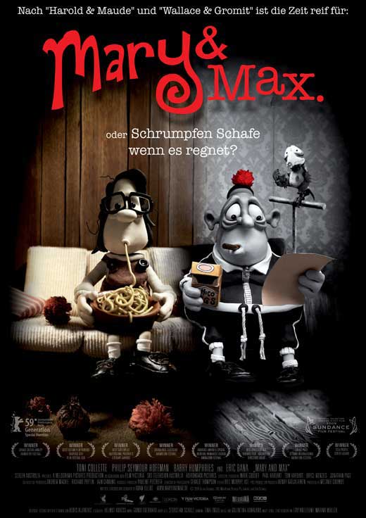
Adam Elliot's 'Mary and Max', 2009


Photobucket
Fig. 1 Mary and Max Poster


Photobucket

Mary and Max is a wonderful example of how animation is for much more than entertaining children.  It follows two very different characters as they share their lives with one another through their pen-pal relationship.

Photobucket
Fig. 2 Character Design.
These characters are that of an underprivileged and unfortunate small child, Mary (who ages through the film until adulthood), and a middle aged man, Max, that suffers from a serious form of the mental illness, asperger's syndrome.  These characters are heartwarming and believable to the audience because they're so well written as well as designed.  One of the most impactive parts of the animation is Elliot's choice of character design.  The characters are very unique and stylised but they are still very realistic. Kenneth Priebe explains that "The power of Elliot’s film lies in the brilliant writing, combined with funny character design and a blend of humor and melancholy." (Priebe, 2010:54)  It is this humour in the character design that makes the characters so believable, despite their styised appearances.  All the characters are more caricatures of the personality they hold than realistic portrayals of people, but because of this the audience immediately grasps what kind of character they are before they have even spoken.  The choice to have this caricature-like style also allows the film to cover some much more malevolent topics without it becoming too 'dark' for the medium. As Priebe mentioned previously, there is a well executed blend of 'humor and melancholy' that runs through the animation.  This style of character design has allowed Elliot to discuss some very unsettling topics, from alcohol abuse to suicide attempts, subjects that wouldn't normally be found in an animated movie.
 

Photobucket
Fig. 3 Melancholy.

It is Elliot's unconventional choice for subject matter that not only effects the character design, but the mise en scene too. Mark Fischer expressed that "His sombre-coloured claymation (all browns and greys) creates a world of dysfunction, disorder and brutality, but even at its darkest moments his film is suffused with a mordant comedy." (Fischer, 2010:66) This suggests that the dark, melancholic tone of the film is portrayed through the choice of colour and set design as much as it is the narrative.  The set, especially in New York (see fig. 3), is almost completely monochromatic, with the exception of  certain significant objects, such as an orange pompom that Mary sends to Max.  The harsh grey tones emphasising the brutal reality of the city and allowing the audience into the world that Max sees.  The audience watches as Max suffers from the consequences of his mental illness, his inability to lose weight to help his health and the permanent anxiety he suffers because of it.  This dark and careless world that Max lives in is contrasted by the warmer, but just as drained of colour, world that Mary lives in.  Their being at opposite sides of the world (as Mary lives in Australia) and different lifestyles are linked by the nostalgic, but discomforting, use of monochrome and sepia tones for them (as seen in fig. 1).  They are like two different memories being stirred but for their significance rather that their fondness. 
 
The nostalgic tone is not necessarily just for conveying the film's tone, but because it is also based on a real story.  Priebe discussed that "the film is dark, sad, poignant, and hilarious, all at the same time. [Adam] Elliot drew from many personal experiences writing and directing the film, basing it on a real pen-pal relationship he had and his thematic exploration of people who are different." (Priebe, 2010:54-5)  The fact that Elliot based this on his own experiences supports the memory-like quality that the sepia and monochrome tones connote.  This quality also adds to the poignancy of the subject matter.  Elliot wanted to explore the theme of  'people who are different' and the difference in colour tone adds a visual representation of the differences between the two characters. It is these differences that make the comedy all the more enjoyable and poignant, and it is the comedy that makes the film that could be quite a heavy experience, a very enjoyable one for the audience.


List of Illustrations

Figure 1. Mary and Max (2009) Mary and Max Poster. At: http://images.moviepostershop.com/mary-and-max-movie-poster-2009-1020550958.jpg (Accessed on: 04.02.12)

Figure 2. Mary and Max (2009) Character Design. At: http://www.entertainmentwallpaper.com/images/desktops/movie/mary_and_max02.jpg (Accessed on: 04.02.12)


Figure 3. Mary and Max (2009) Melancholy. At: http://www.thefilmpilgrim.com/wp-content/uploads/2010/10/Mary-and-Max-Review.jpg (Accessed on: 04.02.12)


Bibliography

Fischer, Mark (2010) Reviews: Mary and Max. In: Sight & Sound 20 (11) pp.66

Priebe, Kenneth (2010) Advanced Art of Stop-Motion Animation. USA: Course Technology.

Wednesday, 11 January 2012

Tod Browning's "Freaks", 1932...

Photobucket
Fig.1 Freaks Poster.

Photobucket


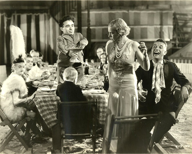
Freaks is a horror film, but not in the conventional sense.  Its main focus is on the day to day lives of the performers in a freak show and not their actual performances. These performers are absolutely incredible because they are all real-life members from a freak show.  This is absolutely fascinating for the viewers as it is completely unexpected, but it also caused a lot of trouble for the director.  The display of these 'freaks' was considered a great worry, as Joan Hawkins explained that "Confusion about the film seems to have stemmed largely from the use of real freaks to play the parts. 9 Critics worried that the film merely replicated the most unsavoury aspects of the “Freak Show.”" (Hawkins, 2000:142) This is perhaps the main concern for a film covering this kind of subject matter. Freak shows are a completely barbaric and unpleasant business that profit from taking advantage of the vulnerable and unfortunate sufferers of deformity. Any film that would include such an 'unsavoury' topic might also be doing it to earn money from the audience's disgust at those unnatural 'freaks', but this is not at all what the film is trying to do.

Photobucket

Though it does contain many people with varying deformities and disabilities, they are not there to be laughed at or mocked, they are there to show the audience that their reality is almost exactly the same as the viewers'. One of the most delightful things about this film is the comradery and love that's seen between the performers.  Their abilities vary from the extremes of the 'The Human Torso' (a man that appears to have nothing more than a torso with no limbs) to an 'average' man that just wants to make people laugh. It is possible that this conveying of the 'freaks' humanity was the trigger to so many critics outrage towards the film, as Colin Odell and Michelle Le Blanc divulged: "It is easier to dismiss them as grotesque side-show entertainment than contemplate the horror of an active loving mind being subjected to the casual cruelty of the gawping public." (Le Blanc, Odell, 2001:51)  This film is one of the first times that the audience members have been able to see these 'freak show' performers as they are behind the curtain. Before this film they were mere forms of entertainment to be revolted by, but this film allows the viewer to see who they really are and how wonderful their life together is because there they can live without judgement.  The humanity they show through their love for one another is truly heart-warming. The performers each have an innocence that seems to make them more human than any audience member at their show.


This is particularly clear when the performers' comradery is juxtaposed by the selfish and vain trapeze artist. She's beautiful and 'normal'. She has no physical deformity but her absence of compassion and sincerity is far more monstrous and inhuman than anything these performers could have. This is where the real horror of the film lies, not in the 'unnatural' deformities of the performers but in much more malevolent realities of human nature.  Ina Rae Hark expressed that "The status of what defines an abnormal monster, the role of violence in society, and the place of community codes of conduct, all timely themes, were also in play in the year’s most reviled film, Freaks." (Hark, 2007:76) This shows support towards the idea that the definition of an 'abnormal monster' is challenged in this film. It is no longer the traditional deformed monster that seeks to tarnish everything that is good and pure, but is replaced by the far too ordinary reality of human selfishness and greed. The mention of 'community codes of conduct' also plays a part in the horror of this film. The last section features the performers act of punishment on the trapeze artist and her partner for being deliberately horrid and abusive towards the 'freaks' as she called them. Sadly, most of the sequence is lost because it was deemed too terrible to be shown, but the aftermath at the end is quite terrifying. Another shame is that the performers had to stoop to the level of becoming things of horror in order to do this, but the viewers are still undoubtedly on their side.


List of Illustrations

Figure 1. Freaks poster. At: http://movieart.net/wp-content/uploads/2011/05/full.freaks-vert-23x29-16444%20.jpg

Figure . Table: At: http://farm1.staticflickr.com/44/146686936_c0c26a8e0e_z.jpg?zz=1


Bibliography

Hark, Ina Rae. (2007) American Cinema of the 1930s : Themes and Variations. USA: Rutgers University Press.

Hawkins, Joan. (2000) Cutting Edge : Art-Horror and the Horrific Avant-Garde. USA: University of Minnesota Press.


Odell, Colin; Le Blanc, Michelle (2001) Horror Films. GBR: Pocket Essentials.


Sunday, 4 December 2011

Robert Zemeckis' 'Who Framed Roger Rabbit', 1988...

Photobucket
Fig. 1 Who Frame Roger Rabbit poster.
Photobucket

Robert Zemeckis' Who Framed Roger Rabbit is a wonderful example of how a hybrid of 3D footage and 2D animation can be completely successful.

Photobucket
Fig. 2 Roger and Valiant.
Before discussing the impressive nature of this hybrid of animation and 3D sets it is the hybrid nature of the film's genre that runs along side these elements that will first be discussed. Roger Rabbit is a parody of the film noir genre.  It contains much of the same visual language as the traditional noir film but it takes these conventions and subverts them into something much more comedic. Thomas M. Leitch believes that "The film repeatedly plays for laughs the conflicts between the mock-noir logic of its live-action world, from its moody lighting to its period costumes, and its cartoon world, jammed with puns, pratfalls, and cameos of Disney and Warners cartoon characters" (Leitch, 2002:270)  What Leitch is expressing is that the film has taken the visual language of film noir, the atmospheric shadows that cast across characters and sets, and the 1940's private investigator's suit and fedora costume, and made fun of it by contrasting it with the bright and slapstick world of the drawn animation characters from the worlds of Disney and Warner Brothers. Another example of why the use of cartoon logic in the world of film noir is so interesting is, as Leitch discussed in Film Adaptation and Its Discontents, "The scene in which Jessica knocks out her husband deftly combines cartoon imagery...with the noir visual vocabulary appropriate to the film’s nominal genre and fictional setting (the atmospheric shadows cast over Roger’s face, darkening his overalls, and in the darkened alley by his unknown assailant). The result is a double visual matrix that produces not a coherent noir cartoon but a running series of comical quibbles on the inconsistencies between the worlds of noir and comics, as different in their ways as Los Angeles and Toon Town." (Leitch, 2007:211-2) This suggests that not only is this scene complex when it comes to animating, as to combine the traditional heavily shaded style of film noir with the usually bright and unshaded cartoon characters is a completely new experience, but that it creates a visual representation of the complete juxtaposition seen in the worlds of film noir and cartoons.

Photobucket
Fig. 3 Jessica Rabbit.

From the subversion of noir conventions to the ingenious use of live-action actors interacting with the cartoon characters around them A great example of this is, as Leitch explains. "when Jessica ...tells private eye Eddie Valiant...“I’m not bad. I’m just drawn that way.” The implication is not only that cartoon logic can be adapted to live-action situations, but that live-action logic itself is less monolithic, more multifarious, and in its different versions more parochial and generic and subject to transformation than it might appear." (Leitch, 2002:270) This suggests that the previous idea of the live-action being very structured and mostly generic in what can be done with it has been completely subverted by this hybrid style of filming.  By adding the cartoon characters that interact with the sets and actors, combined with using the sets and camera movements in the typical live-action way, Zemeckis has unlocked a completely new way of creating live-action footage and its use of space.  J.P. Telotte divulges that "They wanted to determine whether it would be possible to make the combination of live action and animation more believable than in any earlier hybrid films. Significantly, they determined that the key to combining these elements successfully would be the film’s spatial experience, particularly the possibilities for creating convincing character interaction across the different sorts of spaces the characters would occupy and effectively using camera movement to join those spaces, to suture the live and animated worlds as seamlessly as possible." (Telotte, 2010:184)  Telotte is explaining that to create these animated spaces was incredibly important to the creation of this film.  Not only did it have to feel like a live-action film but the cartoon characters had to fit in as well as all the humans.  To do this they had to concentrate on the kinds of spaces the characters would need to occupy and the effect on the people around them it would have.  Clearly all this planning worked extremely well as the animation and actor interaction is almost seamless.


Who Framed Roger Rabbit is fantastically entertaining as it blends its toon-like slapstick with the film noir threat of physical violence. Telotte went on to construe that "Zemeckis has created a pointedly stylized, nostalgic, noirish world, that of Los Angeles in 1947...it is a world that has already sorted out for itself this other stylized realm, specifically the curious breach of reality that the mingling of humans and Toons represents, which is always one of the astonishments of every hybrid narrative." (Telotte, 2010:187) This is very true indeed. The film is a whole, everything has been thought about carefully and planned to perfect authenticity. From the effect that noir-style lighting would have on the cartoon characters to the interaction they would have with physical objects.  This hybrid narrative is as astonishing as it is entertaining and its perfect balance of Disney and Warner Brothers characters will probably never be repeated.


List of Illustrations

Figure 1. Who Framed Roger Rabbit (1988) Who Framed Roger Rabbit poster. At: http://www.movieposterdb.com/poster/c3357056 (Accessed on 04.12.11)

Figure 2. Who Framed Roger Rabbit (1988) Roger Rabbit and Valiant. At: http://whatculture.com/wp-content/uploads/2009/11/who_framed_roger_rabbit_1987_685x385.jpg (Accessed on 04.12.11)

Figure 3. Who Framed Roger Rabbit (1988) Jessica Rabbit. At: https://blogger.googleusercontent.com/img/b/R29vZ2xl/AVvXsEhd-IWSbJp5CiypwmMhQMPtM01aK-Mq0yI70WHFOtrN7dvR5ZD0YY3zQhI75Kcu22xXlUnpTD5GU_LOt10Nsj-h5ZZNx3CEWgtCcqgXNRpHMwGuisKzlQwB5UGHzFQ_iggluYv_xEukpJD-/s400/Roger-Rabbit-2-web.jpg (Accessed on 04.12.11)

Bibliography


Leitch, Thomas M. (2002) Crime Movies. USA: Cambridge University Press.

Leitch, Thomas M. (2007) Film Adaptation and Its Discontents : From Gone with the Wind to the Passion of the Christ. USA: Johns Hopkins University Press.

Telotte, J.P. (2010) Animating Space : From Mickey to WALL-E. USA: University Press of Kentucky