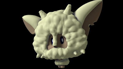
Alistair Nightmare!
Clarissa!
Natty!
Walter!
Flossy!
And not forgetting, Nigel Nightmare!
Once that's decided I can start thinking about branding and how the card will be presented. I'll get a 2D environment concept down to help with that and then it'll be onwards to 3D printing! :D


My inner Pokemon fanboy makes me wanna catch em' all.
ReplyDeleteHa! Aww thanks Tom! That means a lot to me and my love of Pokemon :D
DeleteMolly these are Amazing I can see this as an actual show :)
ReplyDeleteThanks Adam! I'm really glad you like them :D
DeleteGood to see the work progressing so well....however a couple of pointers;
ReplyDelete1) Your logo: Don't forget to carry the theme of the show into the graphics (typography). So the type / logo should exhibit a sense of cleaning and dreaming. Think sparkles / shine and dreamy clouds for example.
2) Lighting: You characters need a bit better lighting, particularly Alistair who is quite grey toned. Alistair, Nigel, and Flossy need rim lights too.
Thanks Alan! You're right about the logo, it should definitely be more sparkly and fluffy.
DeleteI'll have a go at the lighting again over the next day or so and grab your attention to see if it's working.