Thursday, 30 September 2010

Life Drawing Part 2...

I really enjoyed this session. We had the same lovely model and the different ways in which we were told to draw her were really interesting:

Even though the image isn't that great quality you can just about see that we had to emphasise  the light and the shadow for this drawing.  I'm quite happy with my really dark areas, I think they give a really nice shape to her torso but my proportions are still not quite right...


For these images we had to focus on certain parts of the models body.  I'm pretty proud of a couple of them, they're quite realistic but I was told that I spend too much time looking at the drawing and not at the model, and after I took that into account my drawing really improved...

This was the last of the drawings and it was also the one I most enjoyed.  We had to draw the figure using only three and four sided shapes and I found it quite freeing, probably because it didn't have to look particularly realistic.

Another really good session, I look forward to the next one :D

More Photoshop?!

Right! My second and third attempts at using Photoshop to paint my ideas:


That was just a quick try at making a creature with mostly human shape but HUGE dragonfly eyes.  Not necessarily something realistic but I do think their eyes are awesome.


My third attempt at something painterly.  I still tried to keep a human shape but put it in a really unnatural position.  I wanted to widen the hips and elongate the legs making the back end higher than the head, also showing the deformed tail-bone trying to be a tail.  I used the bigger eyes and tiny arms again in this image because I think they're still something that could be seen as a realistic side effect to the merged DNA.

Again, I still need to work on my lighting and shading, they're not very smooth and the depth is a little wonky but I'm still happy with this picture and although I won't keep all the elements of it, and the colouring's a bit off, it was definitely good for getting more ideas going!

Some Photoshop-ing...


My first proper go at using Photoshop to paint something and although my understanding of anatomy isn't that great yet I don't think it's so bad:


Bit of a jump here, I think I accidentally pressed 'save' instead of 'save as'...


I'm pretty happy with it really. I really like the idea of having a mostly human shape with elements of the dragonfly. For example, the eyes are bigger than normal and the back is thick and hunched with a very narrow waist to contrast it.  I also liked the idea of dividing the hands and feet into two, having some kind of merging of the toes and fingers to make it a bit more gross.
I'm not too keen on the idea of having wings, although it'd be my ideal, looking at it from a biological level I think it'd be a bit silly to conveniently be able to fly because of the splicing. However, I do like the idea of having some kind of disfigurement because of the merging DNA...
I still need to improve my use of light and shadow as I'm still not great at creating depth, but I'm generally pretty happy with this start and look forward to trying again!

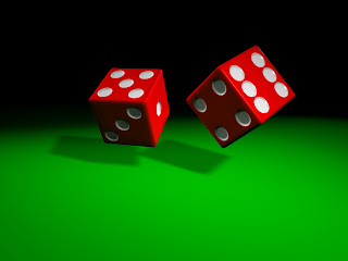
DICE!

I was really nervous about using Maya, it's the first time I've ever used anything like it and it was really intimidating to be honest.

However! With a lot of help, I managed to make my dice and I'm pretty darn proud of 'em:

The first renderred image I was happy with...


My final image I was happy with...


Now I was happy with my dice I wanted to play with lighting...

I probably would struggle making them again, but I'm so happy that I managed to make them that I don't even mind!

Wednesday, 29 September 2010

Jacques Tourneur's 'Cat People', 1942

This film I found VERY interesting!


The story is that this beautiful, exotic woman from Serbia, Irena, has found refuge in America and appears to win the heart of a businessman.  However, despite their marriage she can't have sex with him because if she does she will turn into a panther and kill him, as is the curse of her people.  Gradually through the film the husband pulls away from his troublesome wife and decides he loves his work colleague, an average American woman.  At the end of this film I was left feeling horrible for poor Irena as not only can she not kiss or have sex with the man she loves but he's decided to leave her as "he's no used to being unhappy" and has decided, with her help, that he loves his colleague as she's more normal.

I guess this can be looked at in a broader sense.  Irena represents an internal foreign element to the normal American citizens. This is supported in Empire's essay on the film "by setting the action in contemporary New York ...Cat People is among the first supernatural horror films to take place in a world its audience was familiar with", thus making it much more effective to the audience.  Irena is beautiful and has a hidden secret that later leads to the death of one man and a threat to the lives of others, which seeing as it's at the time of World War II, could be seen as a warning to the audience to not trust anything 'foreign' or mysterious, stick with what you know.  Also, due to her being from outside the USA she can be shown to have more of a sexual appetite than the American women can as they aren't allowed to have them in their culture.  There's one scene in particular when this is prominent, on the night of their wedding.


As she slides gently down the door, knowing her husband is on the other side, she gently caresses the wood and just as she thinks to reach for the handle a panther's scream is heard and she sits sadly and alone beside the door. One idea that I've found in David J. Hogan's book about sexuality in horror films is that Irena is "tormented not only by her peculiar talent but by an implied fear of sex".  This suggests that though she is frightened by her past, she still suffers from the cultures disapproval of sexual desire and can do nothing but try to stay strong.


Moving away from the narrative and into more of the suggestion. I can't review this film without mentioning the gorgeous use of lighting.  Visually, much like a Film Noir, it uses strong shadows and contrasting light to create the horror of suggestion.  My favourite scene is the one in which Irena stalks her husbands new love through a park.  The use of the sounds of two sets of footsteps and the bars of shadow and light dividing the pavement allowed the director create a moment in which you're watching both women walking and then all of a sudden one disappears.  A similar tone is created when Irena stalks the woman at her swimming pool, Sharon Packer accurately describes this as a "delicately handled shadow scene", one so successful that Val Lewton was then renowned for it.

This film was a pleasure to watch, although I was left feeling cheated for Irena, despite the cultural circumstances, she was less of a predator to her husband than the other woman was, atleast he wasn't married when she fell in love with him, but I digress. Cat People is a film that was visually stunning and chilling too, despite its age.

Jean Cocteau's 'La Belle et la Bete', 1946

This was another film I was really looking forward to seeing, obviously being brought up with Disney films I was excited about seeing where their ideas came from, and I definitely wasn't disappointed. As Empire have put it in their five star review: 50 years after its original release, and it remains the finest telling of the Beauty And The Beast fable.


Where it was made such a long time ago its dialogue and special effects haven't all aged that well but that said I still found it a thoroughly enjoyable film.  Once the small failings are taken into account it wasn't very hard at all to start warming to the characters and really enjoying the film visually and emotionally but feeling more for the beast than I did for belle.  I believe that although the beast has been visually portrayed as 'ugly' and 'monstrous' his behaviour is more than gentlemanly.  He obviously struggles to fight his nature as 'the beast', even when in the presence of Belle, the woman he wants to win the heart of more than anything. This is supported by Anna E. Altmann and Gail De Vos's view that "
the beast is a tragic figure of great power...he became the beast through no fault of his own". The audience, despite not being told of the origins of his curse, feel for him from the beginning because of his clear struggle to be as human as possible.  One of the signs I noticed was his constant playing with his jewels around his chest, this is an extremely human trait, to be busying your hands when your mind is restless and worried. A nice contrast would be Belle's brothers friend, though human and very handsome his inside is beastly, the most prominent example of this is when he's speaking to her brother about getting information from Belle as to the Beast's whereabouts, he says that he'll "tear the secret from her". This is an extremely brutal and beastly thing to say, especially about someone you're supposed to be in love with. Not only is he unpleasant vocally but in his actions as well, at the very beginning he tries to force Belle to kiss him and his brutish behaviour makes the mild mannered but tortured Beast seem much, much more appealing.


On the most prominent aspect of this film though, visually it's beautiful.  My favourite moments are as she's entering and running from the castle. She appears to run so slowly, almost as if in a dream sequence, preventing her escape. Not only does this slowing of her movement represent that dread you feel as you can't get away from something in a dream, but it allows the audience to see every piece of material move and flow behind her.  


It's an absolutely breathtaking piece of film to watch and I believe the directors background in theatre is what made it so beautiful to watch. He clearly understands how to create an atmosphere with very little material and limited tonal range, which is seen in the black hallway leading into the castle with only severed hands holding large candelabras to guide the guest. This is supported by John Howard Reid when he said "Cocteau deliberately preferred to employ fantastic on-camera effects...Cocteau reasoned that these devices would give the movie a unique atmosphere. He was right."  He also went on to say that the film was an "unbridled fairy tale, full of magic and fantasy" and I would definitely agree. I'd also like to mention the use of Ancient Greek mythology in the Beast's Pavillion to Diana. 


Its symbolism is extremely subtle, Diana the huntress is known for being chaste and punishing those that threaten this chastity.  One example of this is her turning Actaeon into a deer, then to be mauled and killed by his own hunting dogs, for looking at her while she bathed. Her presence in the Beast's pavillion could be seen as suggesting that she is the one that turned him into the beast to punish his family, she is associated with living in woods and the Beast's home is surrounded by nature. Had this been explained in the narrative with more than two lines than the end may not have felt so abrupt.


I must say, I really enjoyed the whole of this film, it flowed as elegantly as the silks, but the ending was so fast and outlandish I was left a little confused.  I think if there had been a bit more explanation as to what happened to the Beast to make him human and whether Belle actually loved him or his new face I wouldn't have felt as if I'd missed something. 


Sunday, 26 September 2010

More feet!


I just wanted to have a go at seeing what muscles do what in the foot so I can make sure when I'm spliced I can be as accurate as possible. This is how it looked:


It's a bit of a mess as I still haven't really improved my shading abilities but you can just about make out the muscles and tendons.  I'm mostly happy with this because at least now I'm getting the hang of drawing feet but whether I'll be able to remember what muscles go where and do what is another matter...Now for ideas and faces!

Wednesday, 22 September 2010

My feet!

My first attempts at drawing feet since life drawing:


I'm pretty happy with them so far! I completely forgot to do the soles of my feet like a numpty but I'll have a go at that when I do a bit more work on the skeletal bit.  Not a bad start though! :D

David Cronenberg's 'The Fly', 1986


The remake! Another film I was really excited to see. I've heard many different opinions but now I've seen it I'd say this quote from Empire Magazine succinctly describes it as David Cronenberg's "most accessible film, meshing his perennial obsessions with disease, decay and metamorphosis into an exuberantly handled, shamelessly melodramatic love story - albeit a love story in which one partner is a pus-packed bluebottle."


After watching it I noticed that despite it being a very different film to the original in content, there were a couple of similar themes.  The film is obviously of the horror genre and its narrative still features the female struggling to help her partner and stop him from becoming a 'thing', as it was put in the 1958 version. And the film is still used as a conduit to portray another cultural fear but this time of disease, and the most prominent of the time were HIV and AIDS.  During the 1980's there was a huge fear of this disease as no one really understood what it was but that is was transmitted through sex and so the gay and 'promiscuous' community was stigmatised because of it.  The idea that these 'dirty' things that happen behind closed doors will make you 'dirty'. 


The transformation that Seth (the unlucky scientist) has to endure is grosteque and appears to be very painful, much like the transition people have to go through when they've contracted AIDS or HIV. The lesions across his face and on his arms are a common ailment of these diseases and the gradual loss of nails and excretion of bodily fluids are other side effects of the body's gradual deterioration.  The bodily fluids are another reference to the sexual nature of the disease and how squeamish we are of them. The sexual aspect is again addressed when the 'honeymoon period' of his transformation starts, he feels energised and better than ever after his relationship with the leading lady lead him to use his teleporter and become, unbeknownst to him, combined with a fly. It's after this 'contraction' of fly DNA that his body starts disfiguring and so his "bodily transformation and sexual desire are linked". The character Seth adequately addresses the issue when he says the lead female character "can't break past societies fear of the flesh" and she then plays the role of the public's perception of the disease, being unable to understand the changes and therefore distancing herself from him.


On a more basic level though, the body horror used in this film is still extremely effective now.  The reason it's so effective is because  "the bodily interiors cease to be private spaces", humanity still keeps their body and its fluids at arms length and it's these films that address it directly.  It's the "invasion of external beings" that really disturbs people, the fact that something they don't know about or cant control has joined to them and all they can do is wait and watch as their bodies gradually reveal the pain and decay they have to suffer through.  David Cronenberg has mastered grabbing the audience and forcing them to watch the horrors of disease and decay that they try so hard to ignore culturally.


Overall, a vulgar and fantastic film that I can't wait to own!

Kurt Neumann's 'The Fly', 1958


I was really excited to see this film as I'd only ever seen the parodies of it and REALLY wanted to know what they were referencing. When I'd finally watched the film I was pleasantly surprised by it, though some parts of it were dated and the misogynistic views of the time were pretty dire (but humorous), I found some parts of it pretty chilling despite the minimal effort when it came to the fly hybrid.


The general story is a talented scientist discovers the secret to teleportation but as he tested it on himself a fly got into the machine and spliced parts of each of them together creating two human/fly hybrids.  Only his wife can help him but to do so she has to find the fly he's been spliced with before it's too late. Which sadly, it is, and she's then forced to destroy the parts of him that aren't human, killing him in the process.
However, one of the most interesting themes of the film was the mirroring of the cultural fear of science 'gone wrong'. The fear that meddling with the natural order will somehow come back to destroy you.  The film itself was released in 1958, the fifties and early sixties were rife with films containing this theme of science becoming too much for the scientist: "that, powered by science and technology, the engine of change is out of control, that 'progress' may not be the unqualified force for good that we presume it to be and that individual scientists - however well disposed- are neither responsible for, nor in control of, the outcome of their researches". This was at a time when the public had seen the Manhattan project create nuclear weapons, the devastating effects they had and now the ever increasing threat of them being used against them during America and Russia's Cold War. The scientist Andre "dared to play God" and has now assumed the "god/scientist role with atomic-age fears"
Despite this fairly heavy undertone I found the film, at points, to be very comical, perhaps without meaning to be.  One example is the scientist Andre's lack of sensitivity when it comes to using his family's pet cat as a guinea pig.  He's barely had a successful test with inanimate objects and he has no remorse when it comes to disintegrating the cat on a molecular level and explaining to his wife that he's "in space" now.


To redeem it a little though, I found the initial reveal of the fly mask and the tiny voice of the other fly hybrid to be pretty chilling.  The director of 'The Fly' 1986, David Cronenberg, described the the fly's shrill scream as "biologically unsound" and I would have to agree, there's something disturbingly unnatural about the tiny voice it has and that combined with a spider that's giant from the fly's perspective is all round creepy.
Overall I found the film really enjoyable and despite being a big fan of Vincent Price, I thought that even with it's age and unusual setting, it still has an eerie message to give, even if it's portrayed through an oversized mask and glove.

Life Drawing Part 1...

Even though I have done a couple of life drawing sessions (literally two) I'm still not so good at drawing the human form as I'm pretty awful at getting the proportions right. Despite my worries I just tried to enjoy it and improve really, here's how it turned out:


In the first image I was trying to incorporate the idea of 'the flesh' after watching The 1986 film 'The Fly'. To do this I used the tattoos the model had as the basis of some sort of growth. I tried to emphasize them with a darker pencil to try to make them look as if the patches were living.  I'm happy with it in that respect but she's definitely not at the right angle.


This second set of images were more about trying to focus on certain parts of the figure. Due to the model being in such an lovely position to draw for the first pose I decided to draw her fully (to try and improve my drawing skills) and then focus on her hand a little after. However, for the second position I decided to focus on drawing her feet and ankles as I haven't yet learnt to draw them correctly and also the way her hand held her shoulder as I'm still improving on drawing hands too.
I'm generally pretty happy though, I really enjoyed our first session and I can't wait to have another go and hopefully be slightly better this time round!

Random Hands...

Well, my hands for the most part. Here are some of my hand studies I've managed to do so far.


Once I got a rough handle on drawing the shape of my hand I thought I should probably have a go at seeing how they work:


After looking a bit at the skeletal part of the hand I then moved on to having a go at the muscular side of things:


I'll need to do a few more before I can say I know how it all works but I'm looking forward to it!

The first idea...

After those first few drawings my first idea was to bung some dragonfly-ish eyes onto a human head because it'd look pretty strange. This is how it looked:


After I'd drawn it I realised it looked a bit too clean cut, so to try and play with the flesh a bit more I got the idea of deforming the arms and hands because they wouldn't be normal human arms but they probably wouldn't be legs or wings either so I tried making them a bit more 'growth-y'.

It's a bit more of a start but after the brief was explained a little more in depth on Monday I realised it should be more of a hybrid and a real mix of the two. More ideas to come!

Sunday, 19 September 2010

A Small Start...

First things first, I want to try to be able to actually draw dragonflies so I can do it justice and so far I've done these few scribbles:


Sorry for the appalling quality, I had to take the photo with my phone :S
Still, I reckon I'll get there eventually. I'll have a go at colouring them soon when I've done a couple more drawings.  Exciting stuff though :D

Saturday, 18 September 2010

A Dragonfly you say?

I've been fortunate enough to be horribly spliced with a Libellula Saturata or Flame Skimmer, which looks a bit like this:

One downside is that it was a male of the species, but on the up side at least I'll have an awesome colour! :D

Internet Problems!

I've got no internet connection in the house I've moved into at the moment (I'm currently at home stealing their internets) so I'm REALLY sorry if I have big gaps between my images being uploaded. However, I have just bought a Pay as you go dongle so fingers crossed I'll be fine and this post will be completely pointless :D